Ceramics has always been a medium of touch, weight, and material truth. Clay becomes porcelain, glaze announces texture, and the object in your hand is usually exactly what it appears to be: a cup, a bowl, a plate, all proudly inhabiting their physical form. Yet some of the most interesting work in contemporary ceramics is doing the opposite. A new wave of designers and artists is using porcelain, paper, lacquer, and optical sleight of hand to make ceramic objects look strangely unceramic, or at least unlike what our eyes expect them to be.
Carte Blanche by Annebet Philips x Serax (also header image)
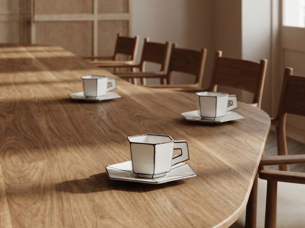
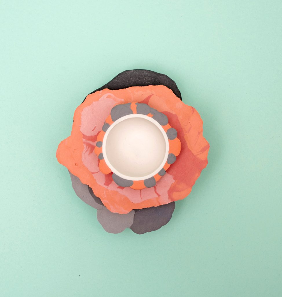
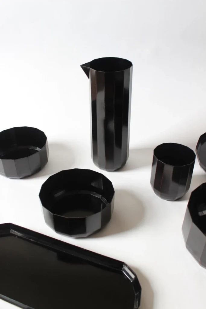
For most of ceramic history, the potter’s wheel has dictated the visual grammar of tableware. The wheel is arguably humanity’s oldest mass-production machine, capable of producing bowl after bowl with extraordinary efficiency, but it comes with a formal constraint built into its physics: anything thrown on a wheel is organized around a central axis. That is why bowls, plates, cups, and vases across cultures tend to share the same rounded logic. Serax’s Carte Blanche, designed by Dutch designer Annebet Philips, rejects that inheritance almost completely. Instead of smooth revolved profiles, the collection embraces faceted geometry, folded edges, and silhouettes that feel cut rather than thrown. More radically, it uses graphic linework to make a solid porcelain service read like a flat drawing.
Carte Blanche by Annebet Philips x Serax
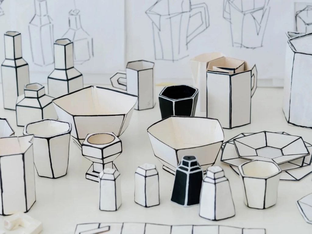
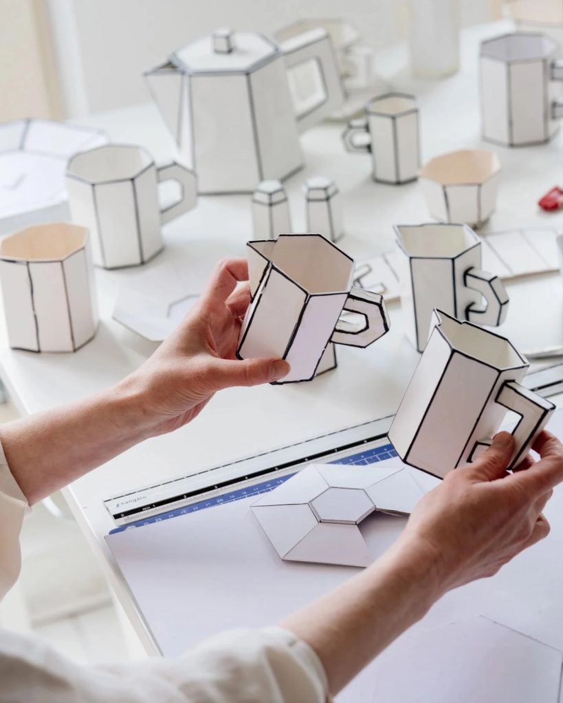
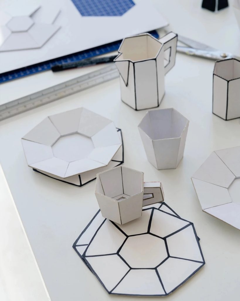
Philips began the project not in clay but in cardboard, an origin story that explains much of its charm and intelligence. She cut deliberately uneven, almost childlike shapes from paper and cardboard, treating the cutout as a generative design tool rather than a rough draft to be refined away. That sense of directness survives in the finished pieces. Creases, folds, and slight irregularities are translated into porcelain instead of being polished into submission. The result is a tea and coffee service that includes cups, saucers, teapots, plates, bowls, and table accessories, all of which seem to preserve the spontaneity of the paper maquette from which they came.
Carte Blanche by Annebet Philips x Serax
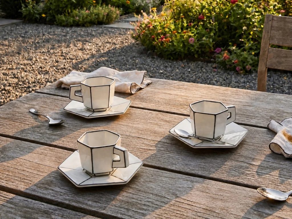
The real coup, however, is visual. Hand-painted black lines trace every fold, seam, and edge, flattening the porcelain into something that looks uncannily like an illustration. The octagonal and folded surfaces help by catching light in crisp planes rather than in the soft gradients of a round cup. Seen straight on, a vessel can collapse into what looks like a cartoon rendering of itself, with the handle reading less as a ceramic appendage and more as a doodled loop. Ceramics is one of the most stubbornly three-dimensional of all applied arts, yet Carte Blanche repeatedly convinces the eye to treat it as a sketch on a page. It is not pretending to be paper in a literal trompe-l’œil sense. It is pretending to be the idea of paper, or more precisely, the idea of a drawing.
Carte Blanche by Annebet Philips x Serax
Rather than reproducing the texture of another material, Philips preserves the gesture of drawing itself: the fold, the outline, the graphic shorthand by which an object first comes into being in a designer’s sketchbook. No two pieces are perfectly identical, which gives the industrially produced porcelain a residual wobble of individuality. And crucially, these are still functional objects, microwave- and dishwasher-safe, able to live on a breakfast table rather than behind glass.
If Philips’ project turns ceramics into drawing, the next work heads in the opposite direction. Instead of flattening the vessel into an image, it treats the vessel as a stage for movement, capturing fluidity on the brink of becoming form.
Liquid Series by Alissa Volchkova
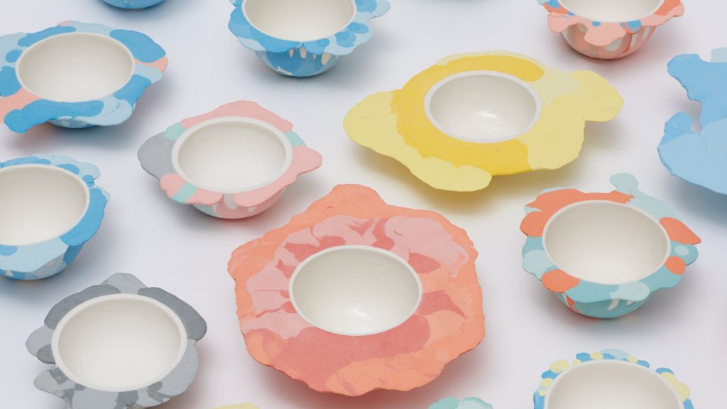
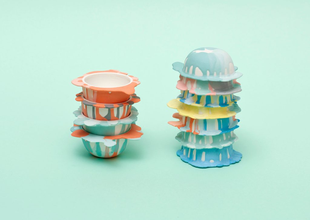
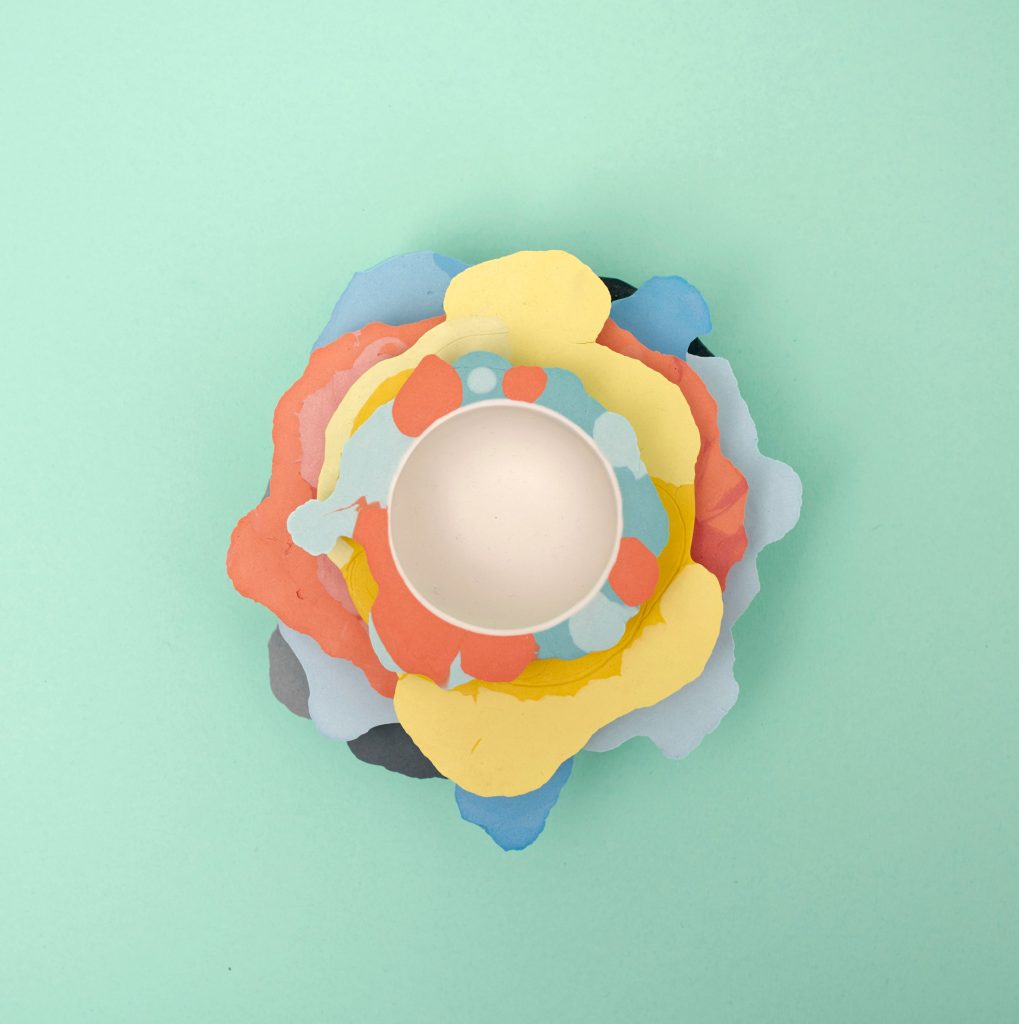
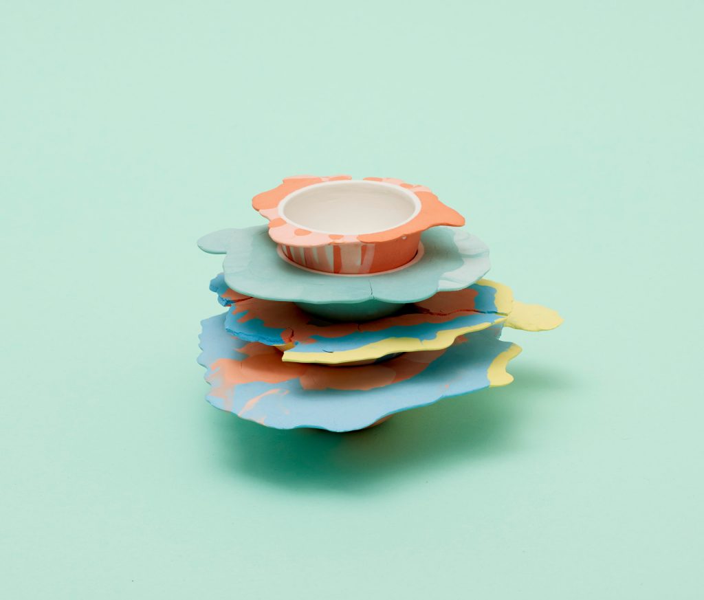
Developed as a thesis project at the Royal College of Art, Alissa Volchkova’s Liquid Series begins with a fascination that sits at the heart of ceramics but often disappears by the time a piece reaches the table: clay as a fluid material. Ceramics usually presents itself to us as resolved, hardened, and complete. The kiln closes the story. Volchkova reopens it by making liquidity visible again. Her porcelain vessels, bowls and plates most prominently, do not simply contain liquid. They appear to have been interrupted by it, marked by a flow that has landed, spread, and frozen into the object’s skin.
Liquid Series by Alissa Volchkova
The process is central to the effect. Each vessel starts with a conventional slip-cast form, a smooth and controlled base that belongs to the language of industrial production. Volchkova then disrupts that order by pouring dyed slip over the surface in spontaneous paths and allowing it to dry where it falls. This second gesture introduces chance, gravity, and timing into a process that would otherwise read as controlled and repeatable. The finished object therefore contains two modes of making at once: the discipline of casting and the unpredictability of pouring. One establishes the vessel; the other almost vandalizes it, though in a way that feels tender rather than destructive.
Liquid Series by Alissa Volchkova
Visually, the pieces are compelling because they do not quite behave like decoration. The colored slip does not sit on the vessel like a neat motif or graphic print. You are seeing process, not merely pattern. The streaks and pooled surfaces imply motion, yet the porcelain locks them in place with the finality of fired clay. There is a beautiful contradiction here: the collection uses one of the most permanent craft processes to preserve one of the most unstable states of matter. And by foregrounding fluidity, it reminds us that clay was once slip, glaze was once liquid, and every pristine vessel has a messier, more vulnerable prehistory.
Liquid Series by Alissa Volchkova
Where Volchkova captures liquid in the act of becoming solid, the final project plays a different game with expectation. It looks like substantial lacquered tableware, but beneath the finish is a material associated less with durability than with drafts, models, and throwaway prototypes: paper.
21 Grams by Seungbin Yang
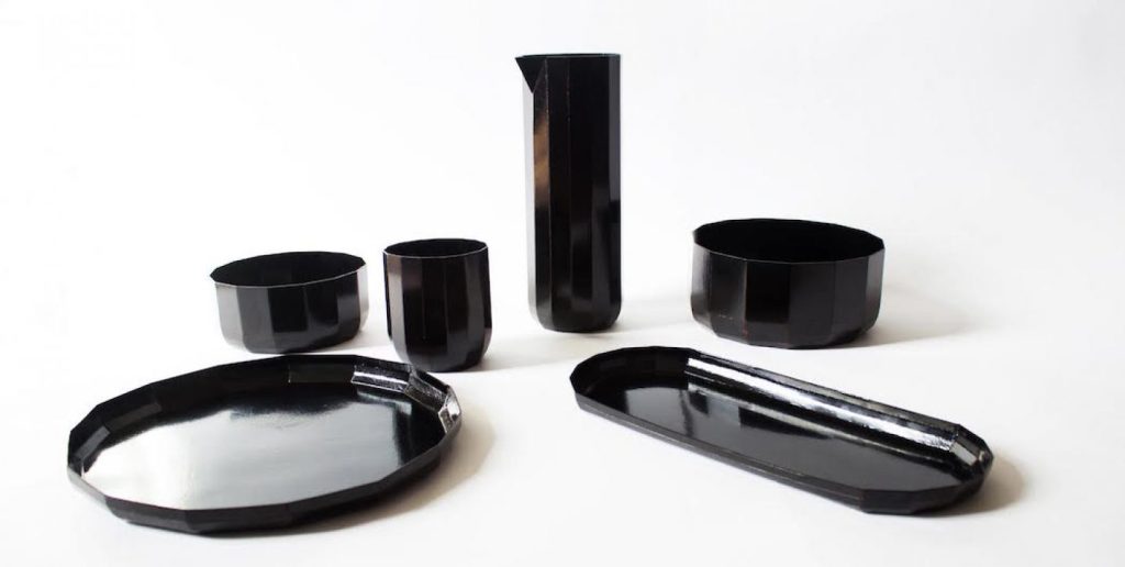
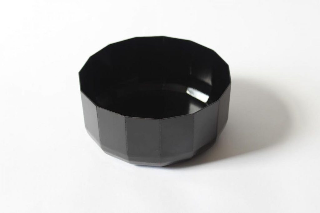
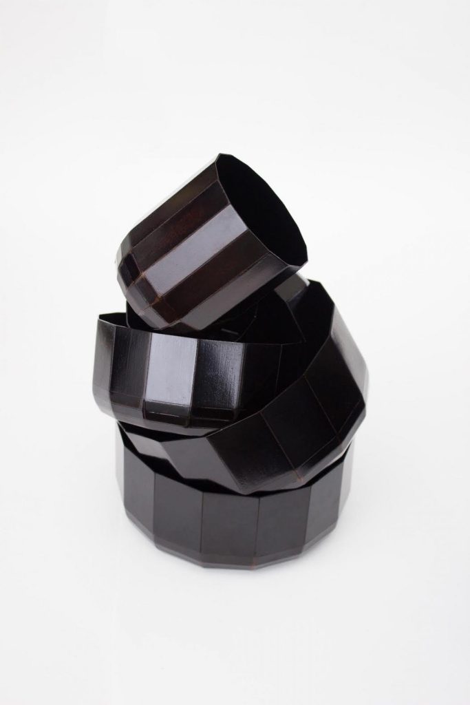
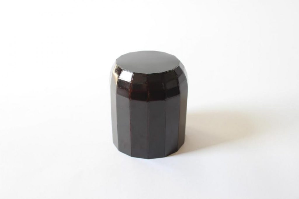
Seungbin Yang’s 21 Grams collection begins with a craft tradition under pressure. Ott-chil, a traditional Korean lacquer technique made from the sap of the ott tree, is valued for its durability, waterproofing, hygienic qualities, and depth of finish. It has long been associated with fine tableware and a level of craftsmanship that borders on the ceremonial. It is also endangered. The number of craftspeople carrying the tradition forward has dwindled, with many retiring without successors. Yang’s project, developed from his Eindhoven-based practice, approaches that problem not by preserving ott-chil in amber, but by changing the substrate beneath it and asking whether a threatened tradition might survive through adaptation rather than strict fidelity.
21 Grams by Seungbin Yang
The surprise at the center of 21 Grams is that these objects are not built on wood, as one might assume from their appearance and the history of lacquerware, but from laser-cut paper. Yang applies ott-chil lacquer using a method aligned with tradition, yet the underlying structure radically shifts the object’s identity. The result is tableware that looks grounded, polished, and reassuringly substantial, but is in fact startlingly light.
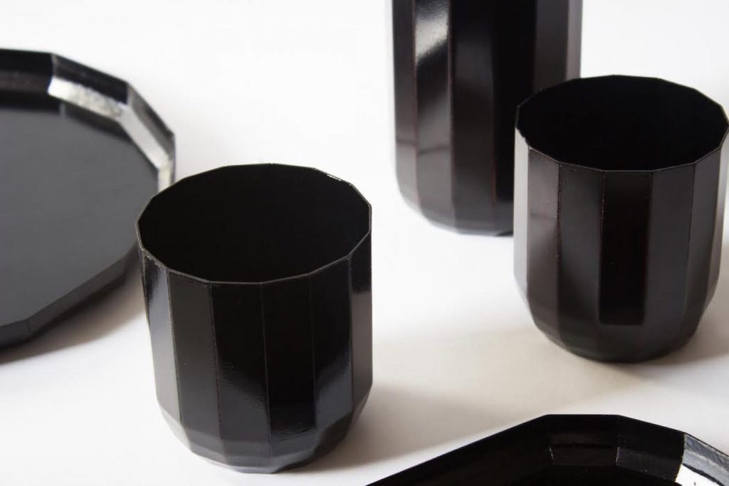
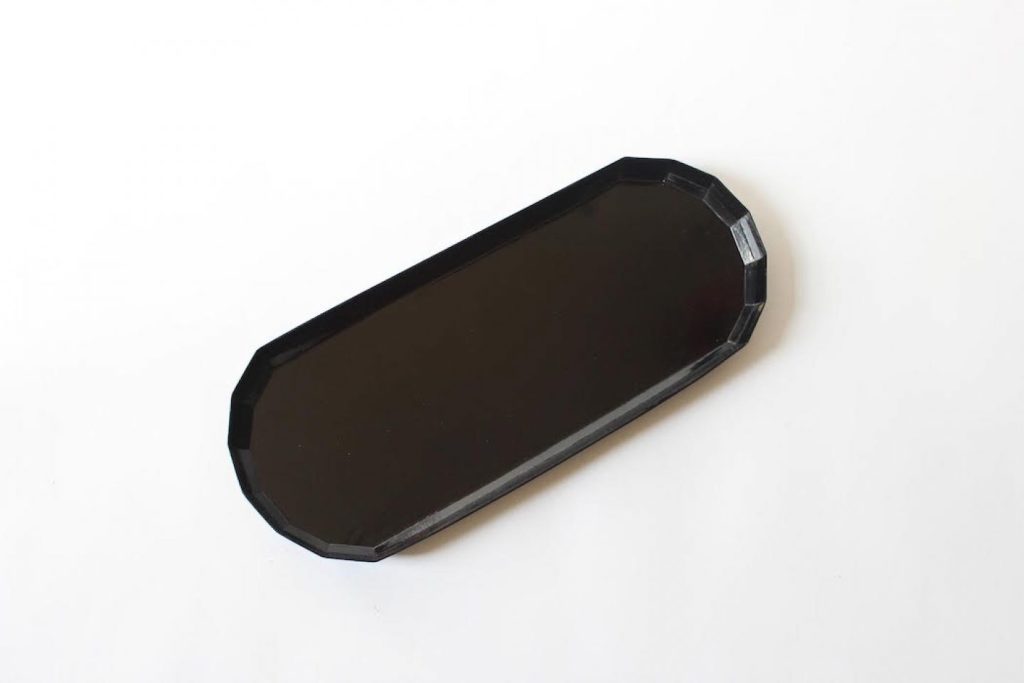
21 Grams by Seungbin Yang
What makes the collection effective is that the material contrast is not a gimmick detached from function. Yang emphasizes the lacquer’s practical strengths, including durability, waterproofing, sterility, and sustainability, and uses paper as a way to reveal them afresh. In a sense, the project strips away our assumptions about what makes an object feel valuable or robust. We often read weight as quality and heft as permanence. 21 Grams challenges that instinct. It asks whether a bowl can feel precious without feeling heavy, and whether a traditional finish can gain new relevance when paired with a lightweight, contemporary base material.
21 Grams by Seungbin Yang
More broadly, Yang’s work offers a compelling model for innovation within heritage crafts. Design often talks about “reviving tradition,” but revival can easily become a euphemism for nostalgia, producing objects that honor the past while remaining culturally static. 21 Grams avoids that trap. The collection does not merely preserve a craft. It gives that craft a new problem to solve, which is often the most respectful thing a designer can do.
21 Grams by Seungbin Yang
What makes these works especially compelling for design is that the illusion is never just surface-level theater. In each case, the visual trick grows out of process, material experimentation, or a deliberate collision between tradition and innovation. These are not novelty objects playing dress-up. They are carefully constructed arguments about how we read form, how craft traditions evolve, and how designers can use deception not to obscure meaning but to sharpen it.