Milan Design Week is the world’s most important design fair, which takes place in the Italian city each April, with countless installations and events spread throughout the city. The 2024 edition of the Design Week focuses on circularity and inclusiveness and the promotion of young talents.We have rounded up some outstanding installations by some of the world’s best-known designers and architects for leading brands.
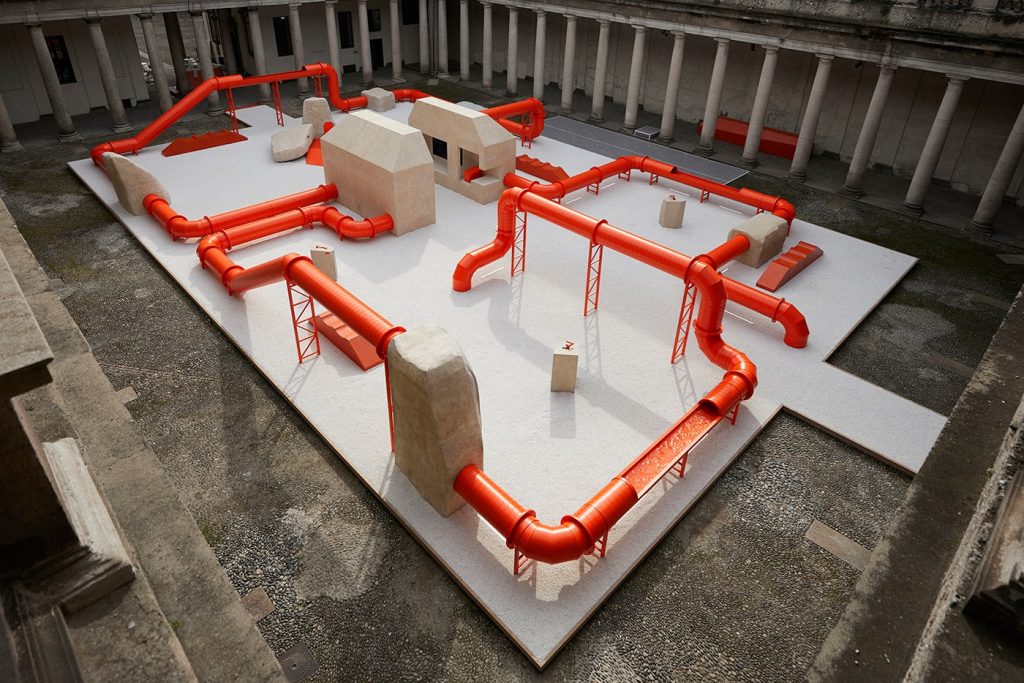
Named Terminal 02, an installation created by British designer and artist Samuel Ross in partnership with bathroom brand Kohler has marked the launch of the team’s collaboration – Brutalist Formation 02 toilet. Against the Baroquebackdrop of the Palazzo del Senato, Ross has created an orange-coloured maze-like network of giant industrial pipes that takes its aesthetic cues from Brutalist details.
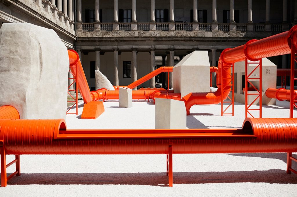
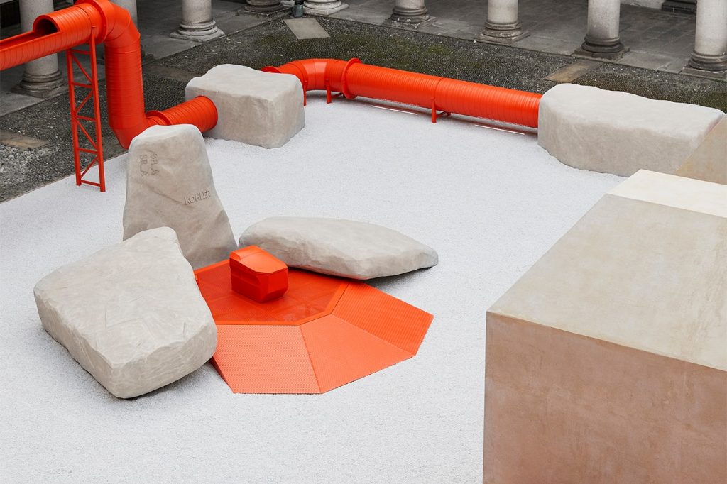
Terminal 02 by Samuel Ross for Kohler (also header image)
Both the Brutalist design of the toilet and the pipe installation that feels distinctly industrial seem are claimed to take inspiration from the power of water in nature. As visitors walk around the pipes, which are sometimes closed and sometimes open to reveal the water they carry, they follow the flow of water, with Ross hoping that it provides new perspectives on “the journey water must embark upon.”
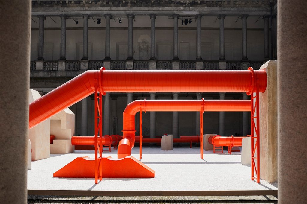
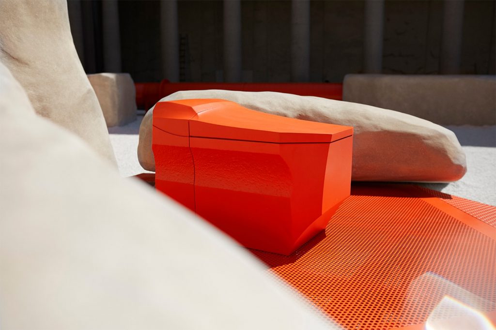
Terminal 02 by Samuel Ross for Kohler
The color utilized across the installation – Haptic Orange – that pays homage to a product by Kohler released in 1967, named Tiger Lily, is repeated across the toilet designed by Ross for Kohler. to create the angular shape of the toilet, which looks to have been carved out of rock, the designer made use of unique molding and tooling techniques.
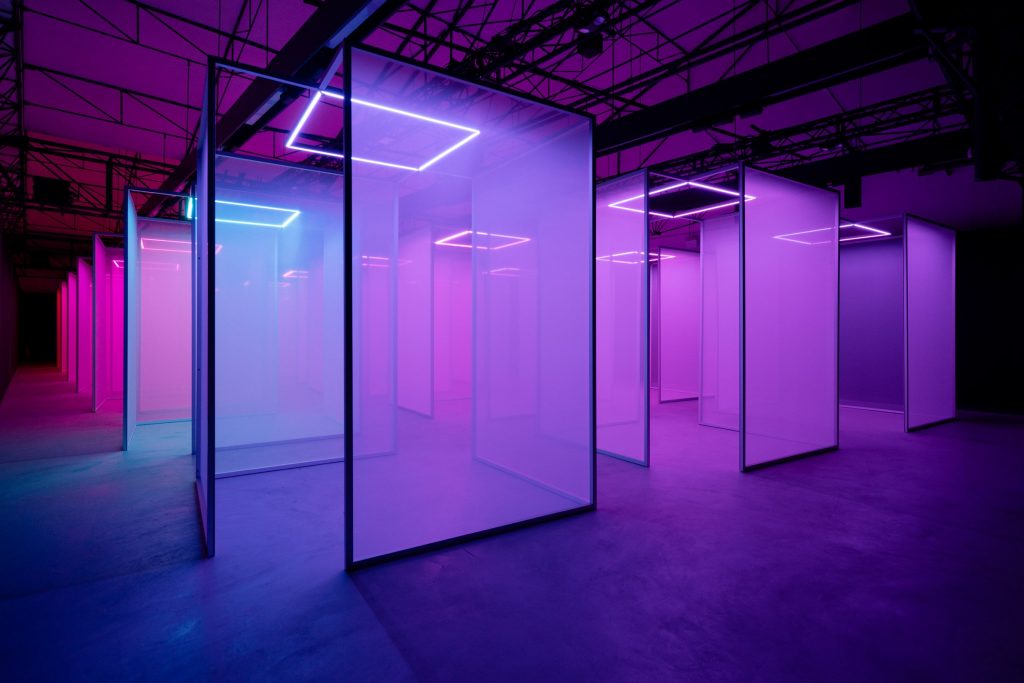
Making Sense of Color by Chromasonic for Google
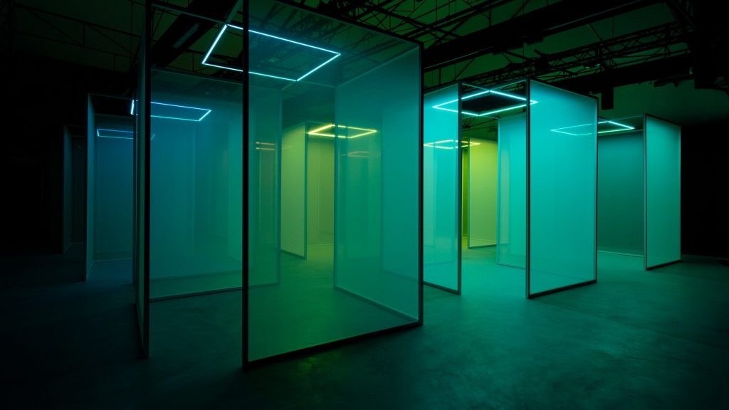
Stretching across 600 square metres inside a redeveloped industrial building near Porta Venezia, Making Sense of Color installation designed by research studio Chromasonic for Google takes visitors on a sensorial journey through a maze of semi-transparent screens. Changing patterns of coloured light are projected onto these screens, accompanied by localised sound from 24 speakers in frequencies equivalent to the real wavelengths of the various shades.
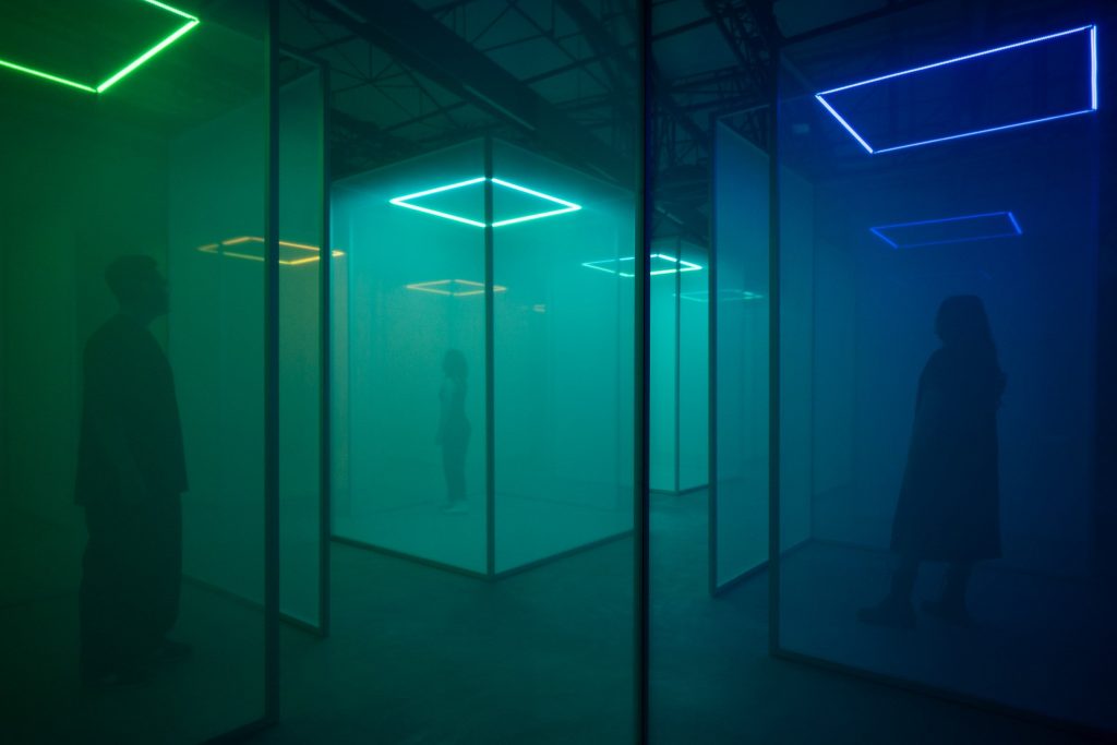
Making Sense of Color by Chromasonic for Google
For example, while red light has the longest wavelengths and therefore generates the lowest sound, yellow, green and blue have progressively shorter wavelengths that result in higher-pitched sounds.
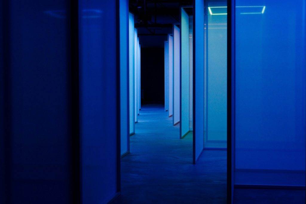
Making Sense of Color by Chromasonic for Google
In this way, the kaleidoscopic installation allows visitors to experience the colours through two different senses simultaneously simulating the experience of having synesthesia, a perceptual phenomenon where people experience one sense through another. In other words, it makes light audible and sound visible.
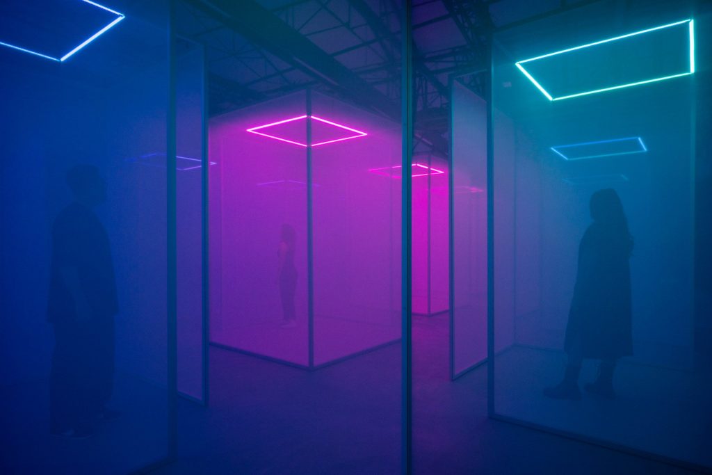
Making Sense of Color by Chromasonic for Google
To achieve this, the studio developed a “refrequencing” software that algorithmically links light and sound. Basically, it can take any waveform – whether light, sound or even the frequencies of our bodies – and translate it into another. As a result, participants get the experience approximating that of mindfulness meditation, enhancing feelings and bodily sensations in the here and now.
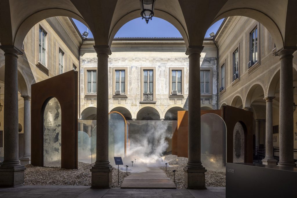
Porta by Maxim Velcovsky for Lasvit
Titled Porta, an outdoor installation by Czech glass-making brand Lasvit encompasses a maze of large glass panels created using an artisanal fused glass method. Created by the brand’s art director Maxim Velcovsky, the installation is made from glass panels created in Europe’s largest glass kiln to demonstrate the brand’s technical expertise.
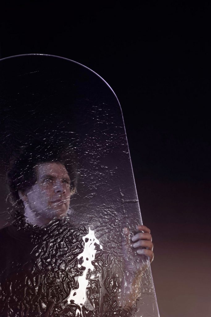
Porta by Maxim Velcovsky for Lasvit
The technique involves heating glass into a molten state before pouring it over a hand-crafted mould. The liquid glass naturally spreads and settles under its own weight and gravity, which determines its unique organic textures within the material. Thus, glass becomes a canvas for the artist and gives the opportunity to create relief surfaces of large dimensions.