“I have always imagined Paradise will be a kind of a library,” Jorge Luis Borges once said. Essential in a process of providing people with an access to knowledge, today libraries are being transformed from silent sanctuary of books into dynamic spaces where technology and traditional co-exist. Yet, experimenting with form, architects manage to keep intact the fundamental experience of choosing a volume from a bookshelf-lined wall.
Maya Somaiya Library by Sameep Padora & Associates
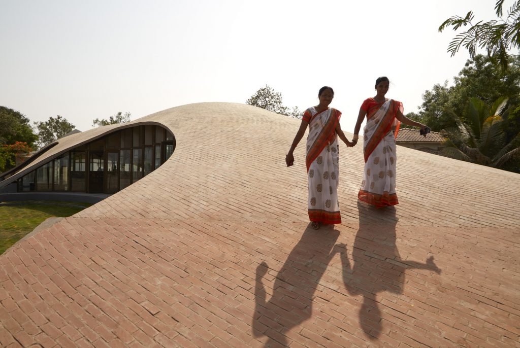
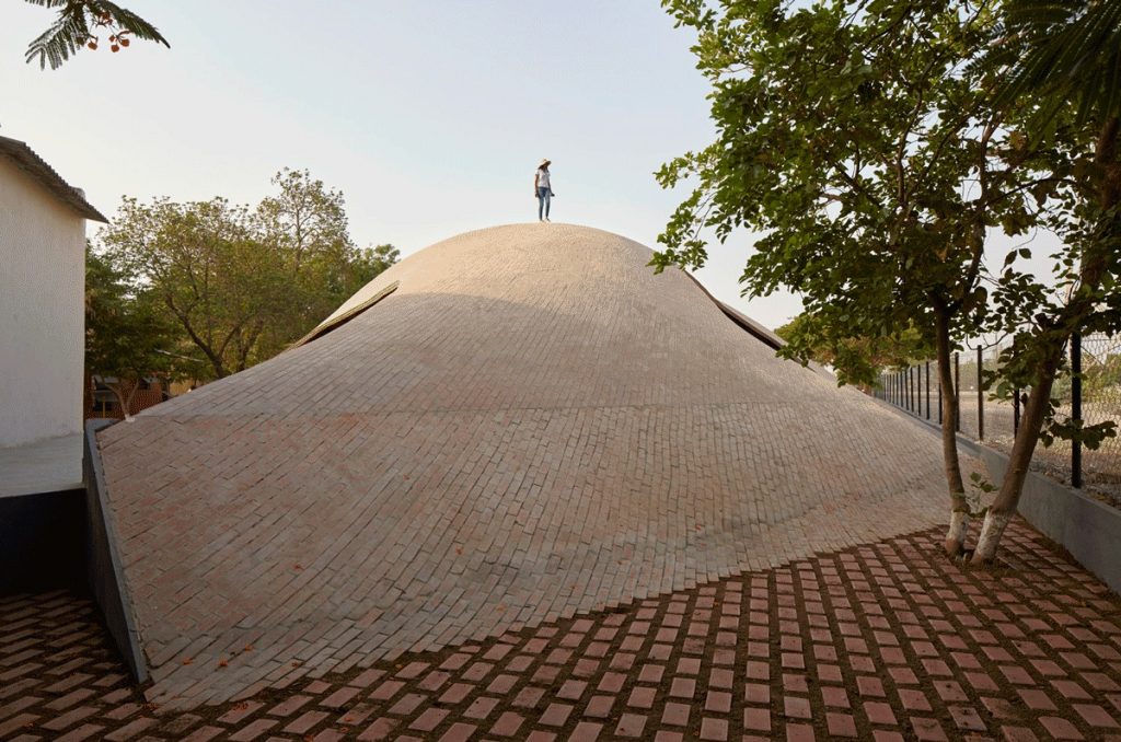
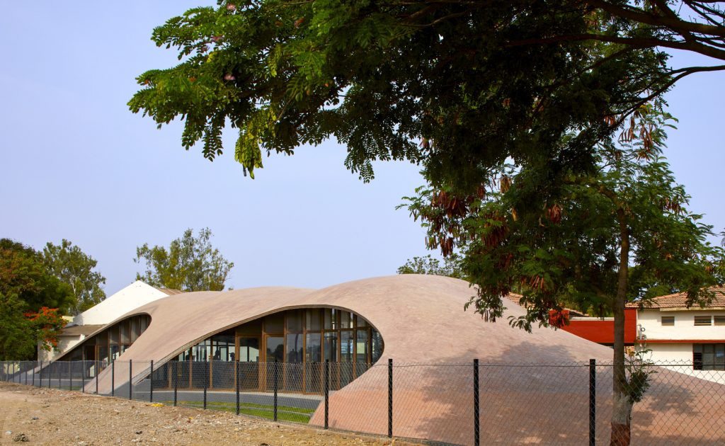
Maya Somaiya Library is a small addition to Sharda library in rural Maharashtra, India, developed by Mumbai-based Sameep Padora & Associates (sP+a). The team conceived the library building to be a formal extension of the ground, an architectural landscape that lies at the intersection of a student’s daily routine. The pavilion is designed to be accessed from multiple sides, so that students could engage with books while traversing through the library or over it.
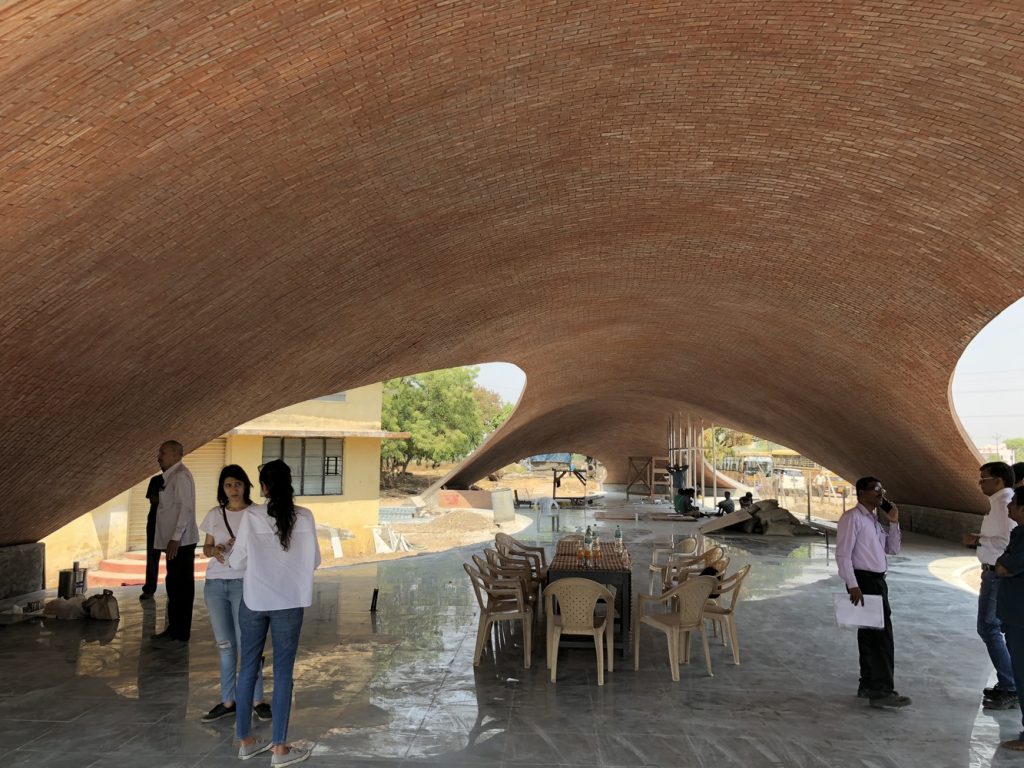
Maya Somaiya Library by Sameep Padora & Associates
Seeking to “enrich the regional or local through the extended capacities of the global,” the team used a hybrid of construction principles ranging from the Catalan tile vaulting system from the 16th century, its use by Gustavino in the early 19th century, and finally the compression ring detail from the work of Eladio Dieste in Uruguay, to using a form finding software plug-in made in Switzerland. In the meantime, the building is made from locally sourced brick, a traditional material, which was chosen for its tactility, availability as well as its utility as insulation against the strong sun.
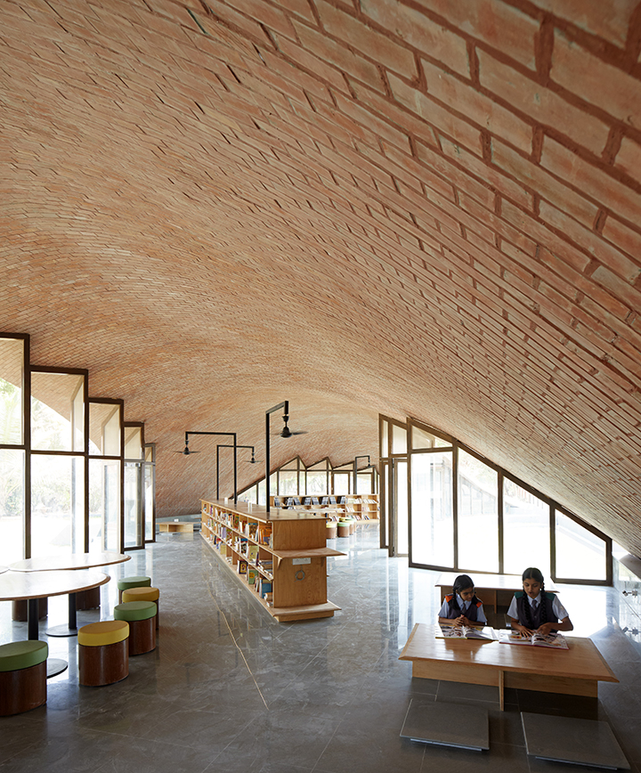
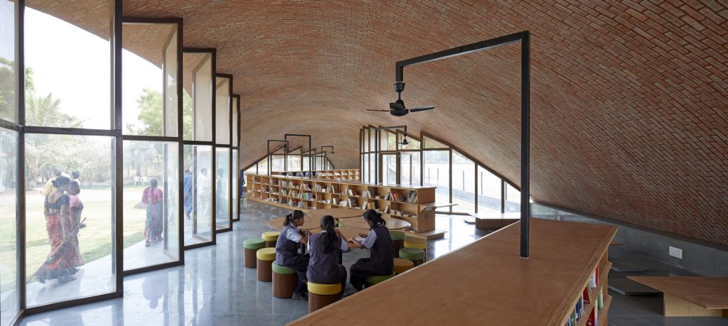
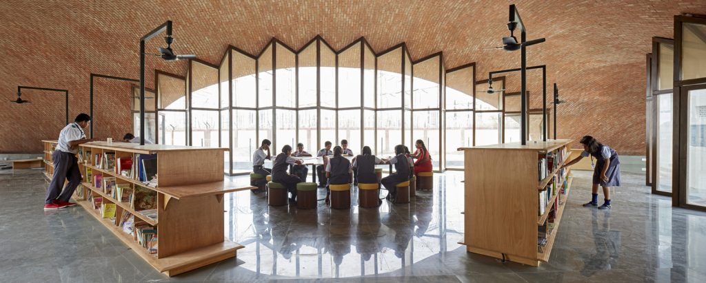
Maya Somaiya Library by Sameep Padora & Associates
The library interior offers a range of spatial solutions and seating systems. While tables and stools for collaborative study are located in the centre of the space, there is a floor stool system at its edges for more privacy. The self-structured window bays are composed of striated profiles, which helps increase stability and allows using economically sized glass panes, while retaining the full-height glazing feature.
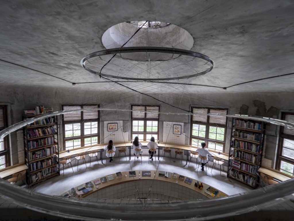
Not Just a Library by J.C. Architecture
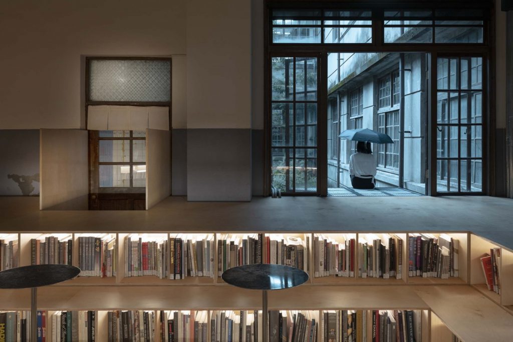
In Taipei, Not Just a Library by J.C. Architecture, a multidisciplinary design firm with bases in New York and Taiwan, is set in a renovated 83-year-old bathhouse for female employees of a tobacco factory that ceased to operate in 1998. As its name suggests, the place is designed to be a multiple-use cultural venue and accommodate various events, including concerts and lectures.
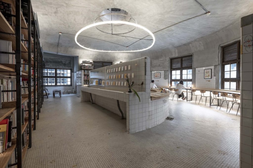
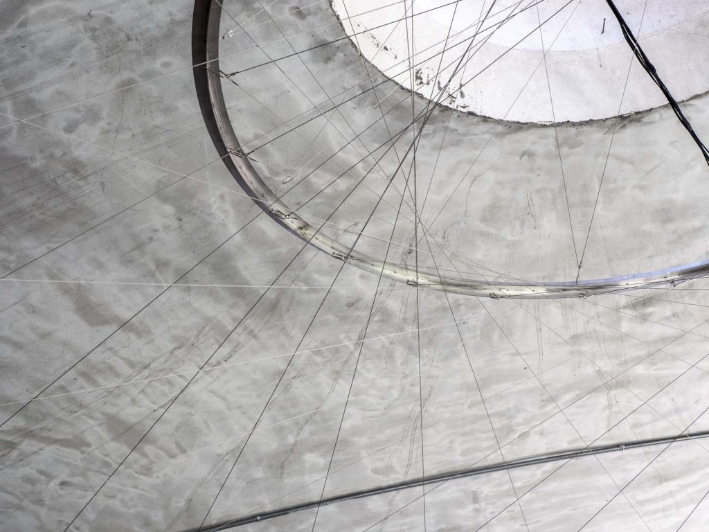
Not Just a Library by J.C. Architecture (also header image)
Transforming the concept of an original bathhouse into an experimental showcase of literature, the studio has adopted the approach of “respecting the imperfections and architectural limitations of historic buildings without adding more steel bars and screws.” This resulted, for instance, in filling cracks in the original tiles with golden details intended to present the beauty of wabi-sabi, a notion in traditional Japanese aesthetics celebrating imperfection.
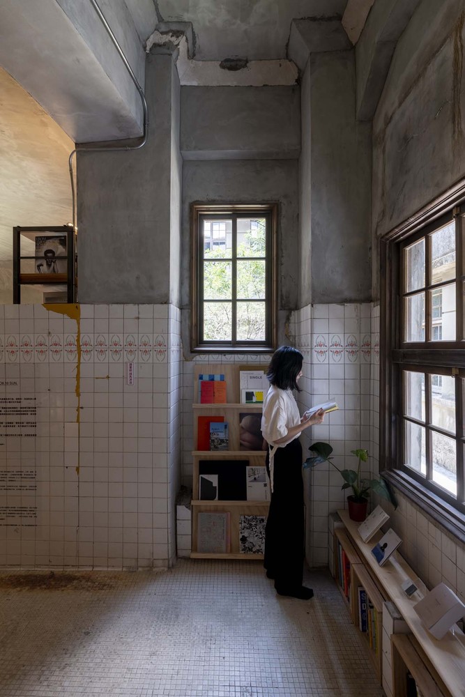
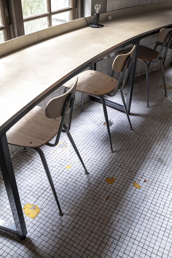
Not Just a Library by J.C. Architecture
The original wall and floor tiles of the bathhouse, as well as features including a semicircular bath have been retained, creating an interplay between the space’s history and its new use. Above the preserved bath structure, which is now used to display books and called a “book pool”, the architect has created a suspended circular light feature made of woven steel cable. Alongside plywood desks and bookshelves, the visitors are offered to use a sunken reading space, featuring in-built shelving and free-standing tables, which designates what the architects call “bathing in spirits and knowledge.”
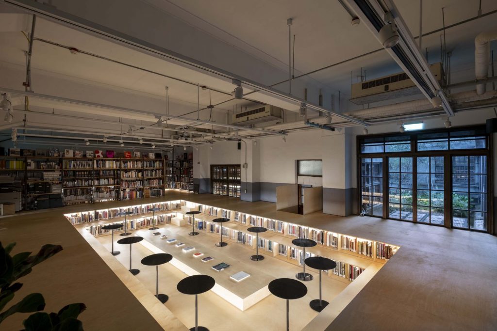
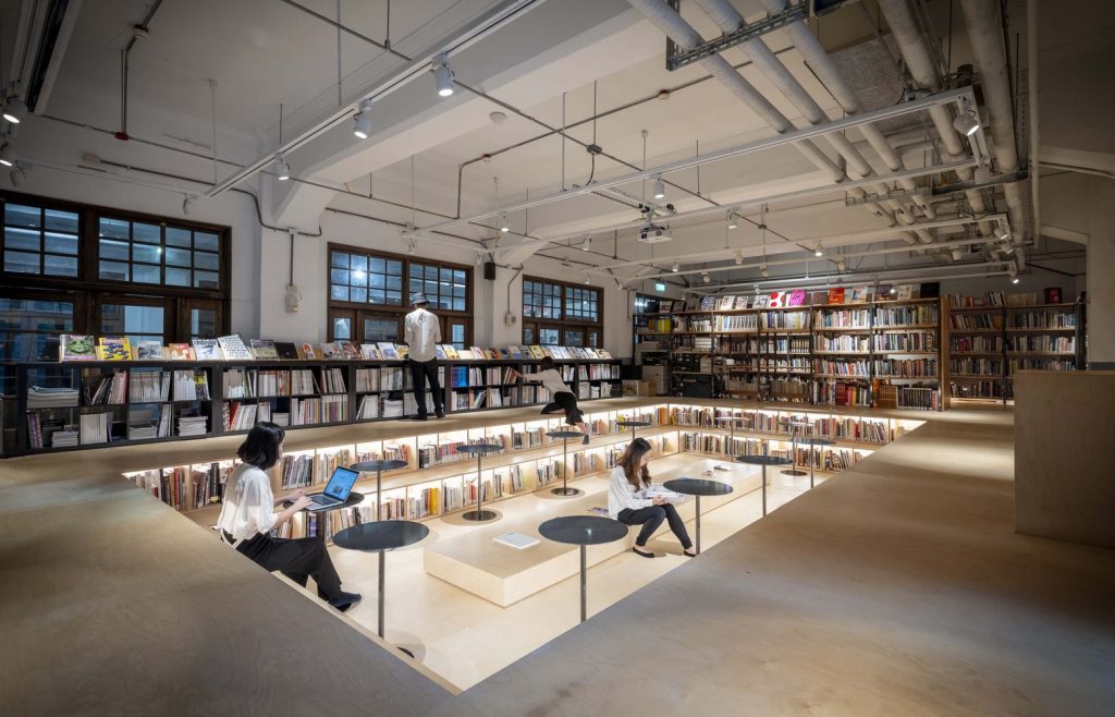
Not Just a Library by J.C. Architecture
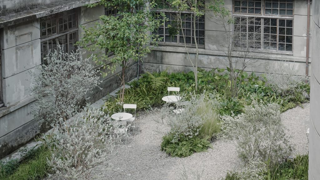
Not Just a Library garden by Motif Planning & Design Consultants
Outside, a 224 sqm space adjoining the library has been also transformed by Taipei-based Motif Planning & Design Consultants into a private and tranquil garden for reading and socialising. The designers used anti avant-garde materials encouraging people to consciously let go of superfluous things of everyday bustle. At night, when the trees and flowers are illuminated by floor lamps, the garden seems to be immersed in a mysterious and silent world, quietly revealing the history of the place.
Taketa city library by Takao Shiotsuka Atelier
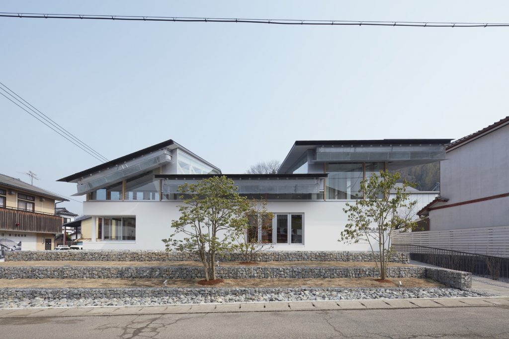
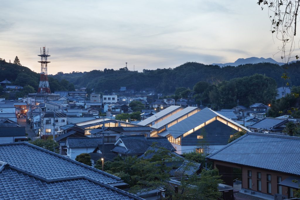
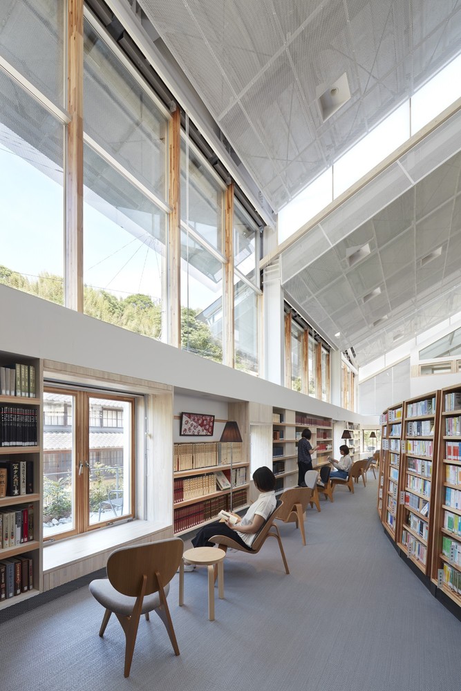
As part of Castle Town Revitalization project in Taketa, Japan, which aims to encourage citizens to take more walks about the city, local architecture practice Takao Shiotsuka Atelier has rebuilt the city library.
Taketa city library by Takao Shiotsuka Atelier
Taking cues from the surrounding architectural context, the architects topped the structure with a gabled roof. But to make the structure distinct, they made it offset through creating gaps between the rood and the walls, in an attempt to incorporate the castle town’s “environment of light and wind” into the building’s DNA.
Taketa city library by Takao Shiotsuka Atelier
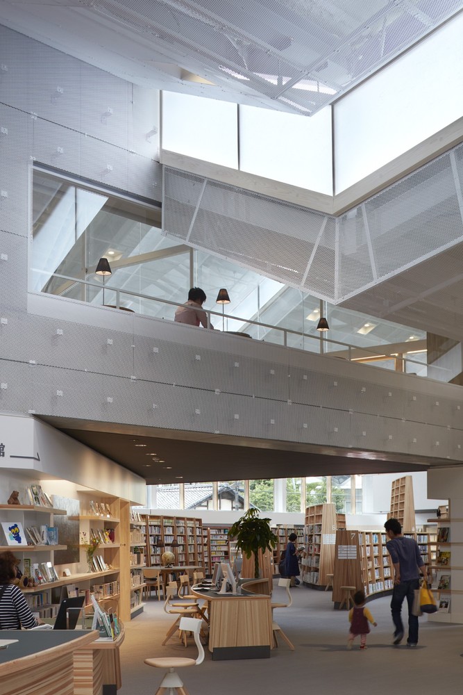
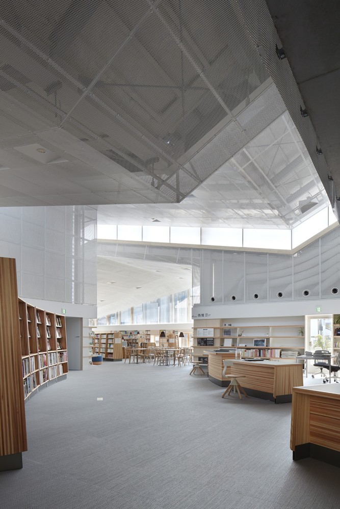
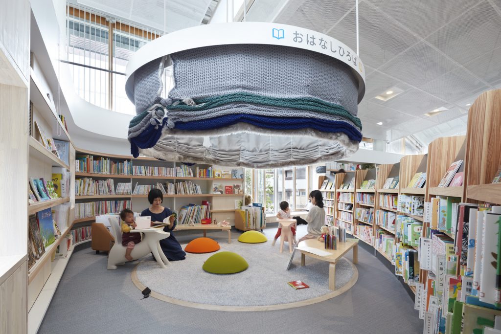
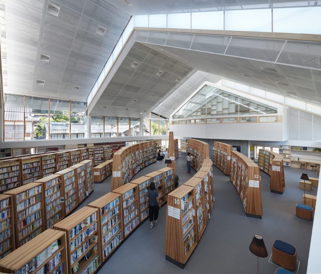
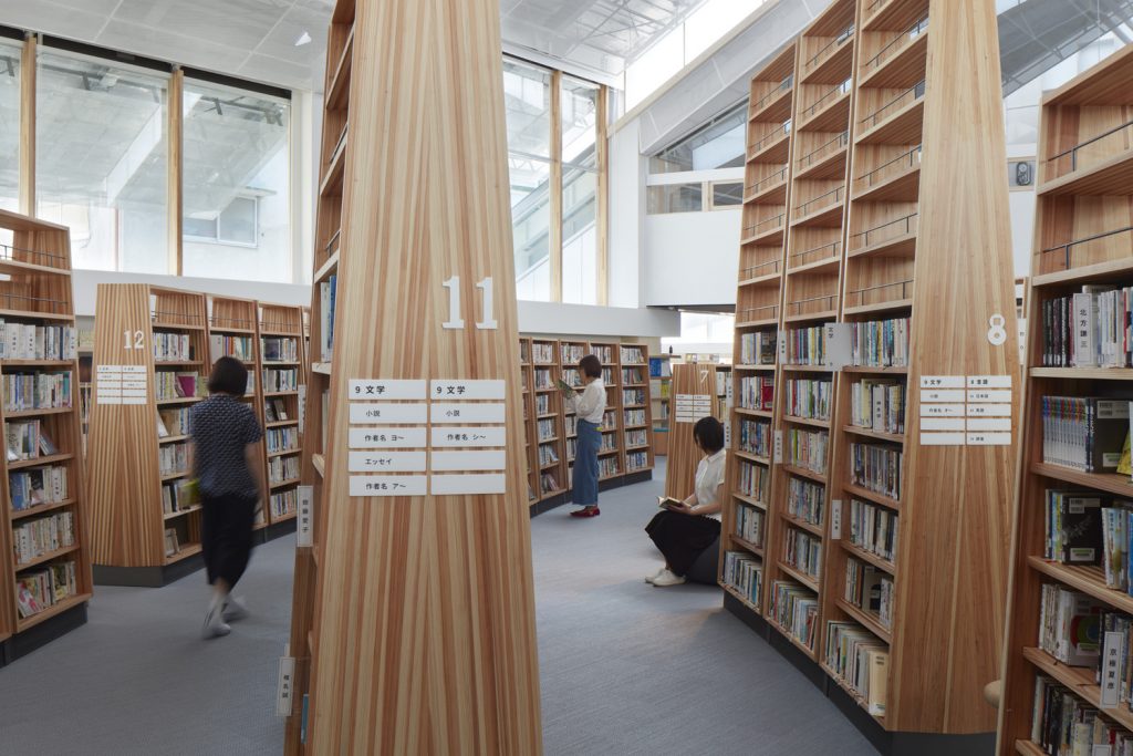
Internally, the library comprises a large open-plan space, with book stacks gently curving around the library like water and wind currents, serving to divide the volume into different zones. The book stacks encourage visitors to move around, and the various heights of the stacks create a space that corresponds to the location. For example, the south-facing stacks resemble a bright plain, those in the north are reminiscent of a quiet forest, while the stacks on the second floor are meant to be associated with an intimate cave.
Find more reading on modern libraries here.