Back in 1909, psychologist Kate Gordon stated that curved edges and surfaces are more graceful and flexible and, therefore, more beautiful than those with harsh straight lines. We have delicately picked several curved buildings that incredibly fascinate us compared to the boxy volumes we see daily.
Parconido bakery by Sukchulmok
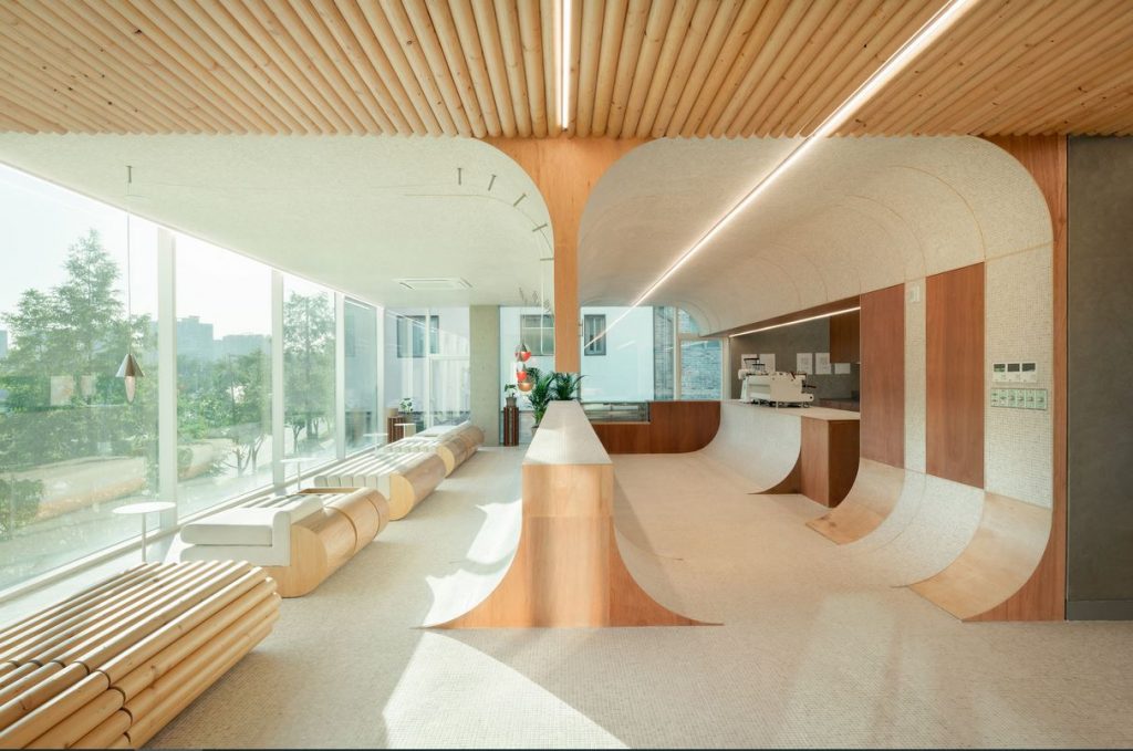
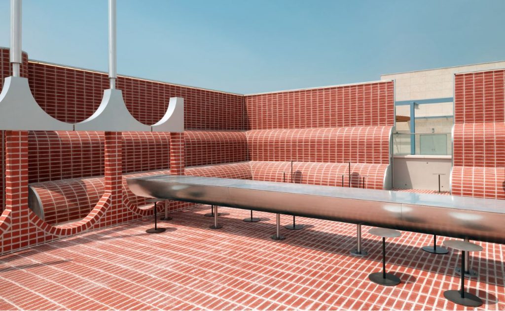
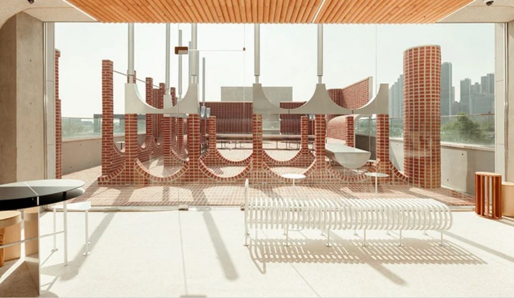
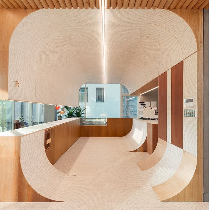
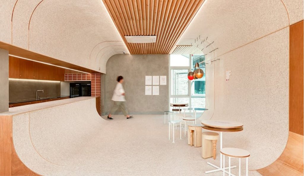
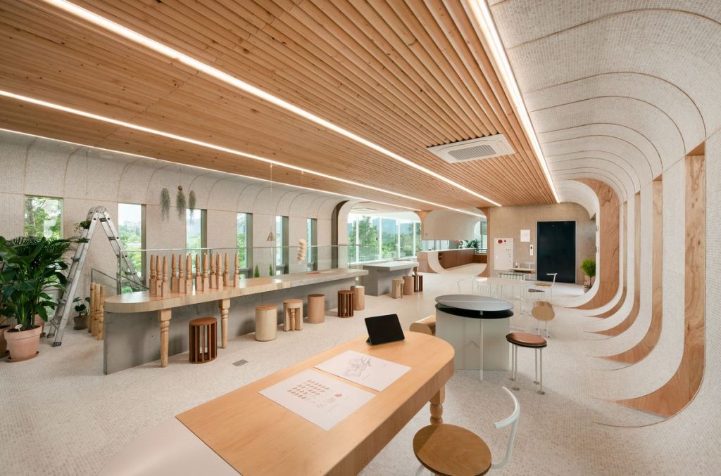
Simple rounded forms create a unified atmosphere in Parconido bakery cafe in northern Gyeonggi-do, South Korea, developed by design practice Sukchulmok.
Parconido bakery by Sukchulmok
The design is created in layers stuck one by one with columns that surge everywhere and rounded walls wrapping the open layout. Although the walls and columns compose different shapes, they all present a radius of 600 mm, which acts as the key design rule and allows to generate a sense of unity while still avoiding monotony.
Parconido bakery by Sukchulmok
The furniture, manufactured in perfect circles, is appropriately blended into the space in various forms, such as concrete castings, combined wooden textures, and overlapping circular pipes. The custom-made fittings highlight the round spaces while travertine limestone, usually suitable for the fountains in squares of Europe, is designed to cover the floor, walls, and ceiling of the rooms. The angles in the indoor space are smoothed out in round shapes blurring the boundaries of each zone.
Wooden Cave by Tenon Architecture
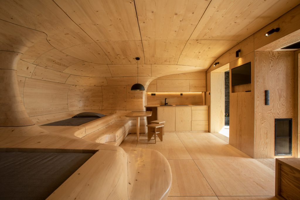
Wooden Cave is a suite created by Greek practice Tenon Architecture as a part of Hyades Mountain Resort in the village of Trikala Korinthias, which lies on the slopes of Mount Kyllini in southern Greece.
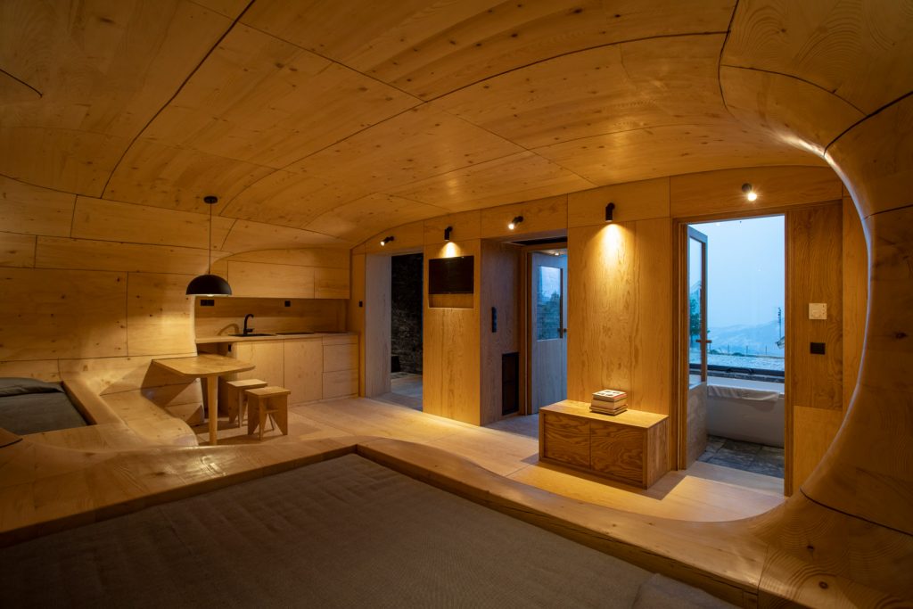
Wooden Cave by Tenon Architecture
The studio decided to split the suite into two halves, each completed in different material palettes. The front half of the suite is conceived as a hard, ‘protective’ linear shell and is decked out with dark stone tiles that were sourced locally in Trikala. They cover the walls of the sitting area, which includes a fireplace, and the bathroom.
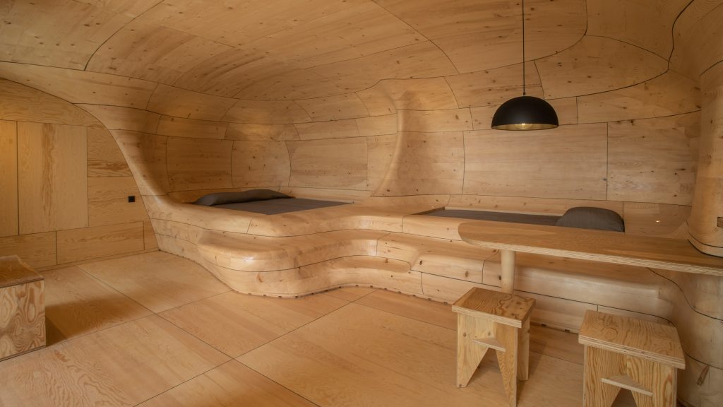
Wooden Cave by Tenon Architecture
The rear half is reminiscent of a cave that has been used as a refuge and a haven throughout human existence. Made almost entirely from wood, it comprises 1,112 pieces of spruce. An algorithm-based programme was used to draw out the required shape of each timber piece before they were cut to size on-site by two architects at the studio, Apostolos Mitropoulos and Thanos Zervos. The pieces were then slotted together to form 55 large modules, which were shaped and smoothed by hand before being assembled into the final cave-like structure.
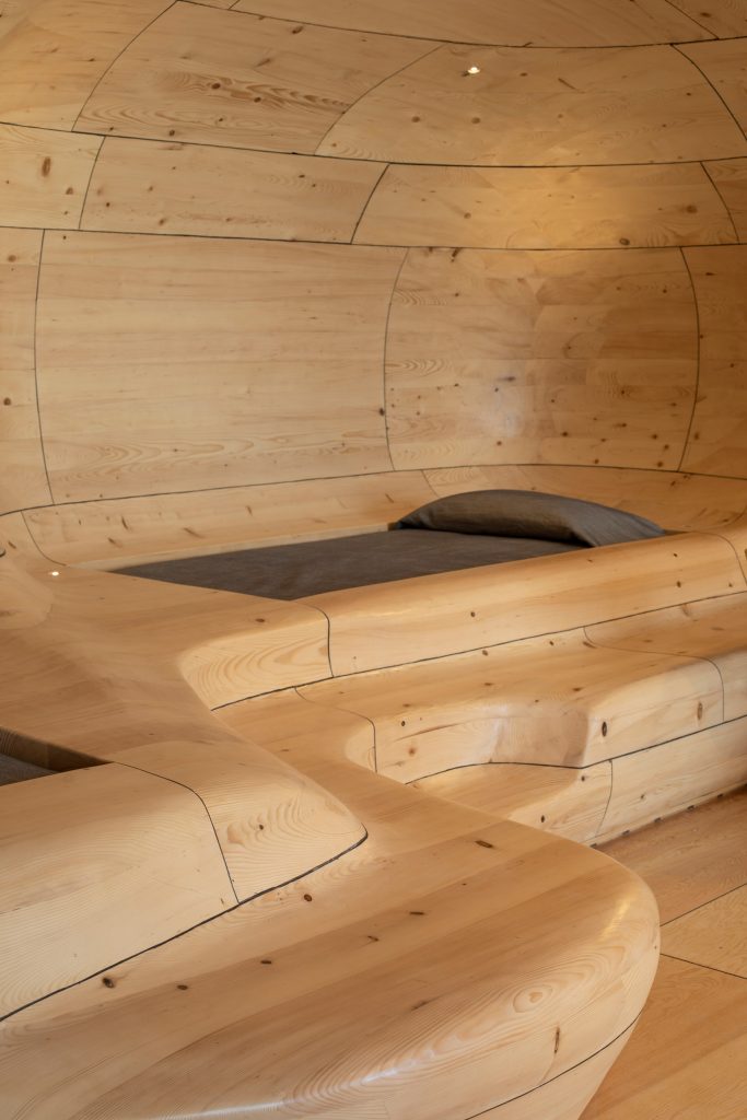
Wooden Cave by Tenon Architecture
A curving platform in the rear side of the suite incorporates accommodate the double and single beds. It is also made wide enough so that, when necessary, it can serves a bench seat. The furniture in the room is also crafted from knotless pinewood.
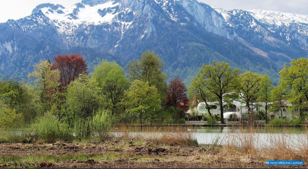
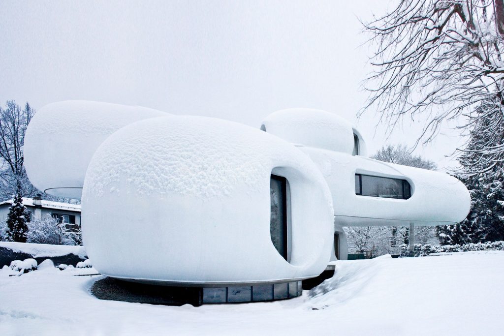
Amorph Livingsculpture by Lechner & Lechner Architects (also header image)
The basic concept behind Amorph Livingsculpture by Lechner & Lechner Architects was to visually connect the living space to the surrounding landmarks that include the Leopoldkron Castle, the Leopoldskorner pond, the Hohensalzburg fortress, and the Untersberg. The starting point for this sculptural design was the position of the property on the pond, but not with direct access. Therefore, the morphological structure of the building was shaped towards the pond in order to take up the quality of the proximity to the water.
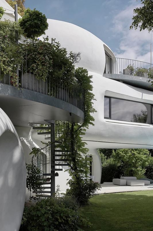
Amorph Livingsculpture by Lechner & Lechner Architects
The architectural context of the house is a unique layering of modernism, contemporary refinement, and historicism. The residential sculpture is formulated as a walk-in landscape. Spiral staircases are used both indoors and outdoors. This creates several paths through the building and the resident can move through the house as through a landscape. The green space enters into a symbiosis with the sculpture. The building’s free-form floor plan and three-dimensional shape maximize these visual relationships.
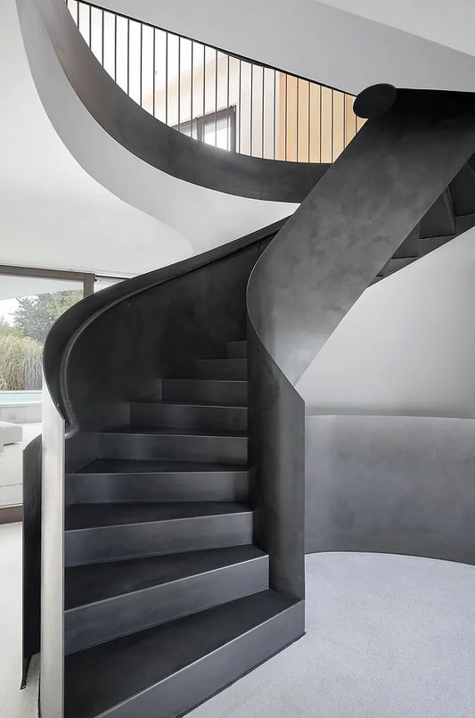
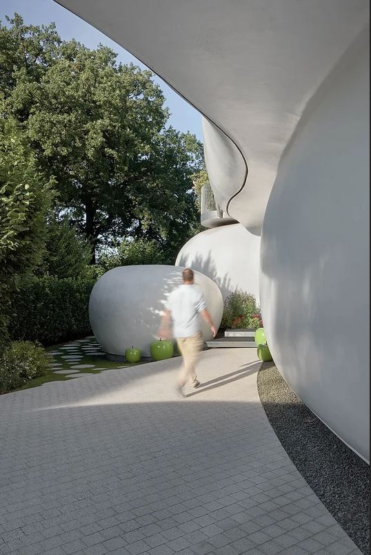
Amorph Livingsculpture by Lechner & Lechner Architects
The upper floor is turned parallel to the pond, here, too, swings are used to offer each room a direct line of sight to the water surface. Second-order viewing axes give every window that does not offer a direct view of the pond a view of the Untersberg or the fortress. This additionally increases the complex composition of the floor plan configuration. In order to do justice to this complexity on a three-dimensional level, the outer walls are rounded, following the logic of the floor plan. The final consequence of the three-dimensional interweaving is also continued in the shape of the windows and door openings.
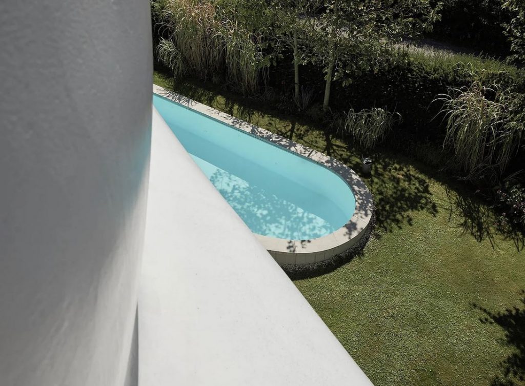
Amorph Livingsculpture by Lechner & Lechner Architects
The ground floor spaces are linked to nature by their shape and the garden’s exterior design. This creates a cozy atmosphere on the ground floor, like in a hobbit cave.