Let’s admit it. If you are not a wine expert, the label is one of the key factors in making a decision about what bottle of wine to pick. That is why wineries are looking to wine label design to help set them apart, and graphic designers and artists see the labels as tiny canvasses to tell their stories.
Librottiglia by Reverse Innovation and the Matteo Correggia winery
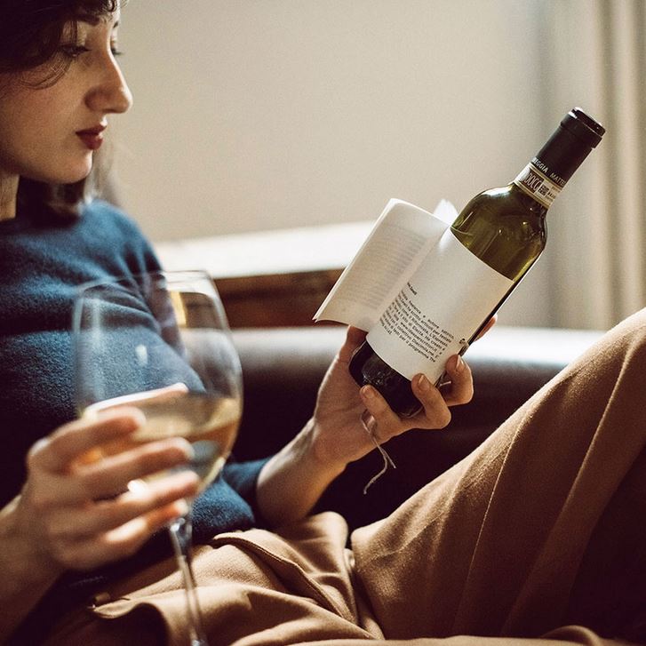
Italian studio Reverse Innovation has teamed up with the local Matteo Correggia winery to create a perfectly balanced “oeno-literary experience” – the project named Librottiglia matches the characteristics of each wine to a narrative genre. As suggested by its name, which comes from a smart combination of two Italian words: libro (book) and bottiglia (bottle), the project comprises a collection of wines, each paired with a hand-picked short story.
Librottiglia by Reverse Innovation and the Matteo Correggia winery
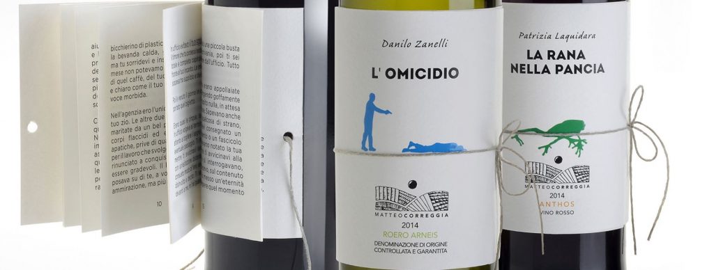
The creative team seeks to put an end to years of discussion about analogue vs. digital. A small and elegant book bound to the bottle that also doubles as a label serves as an analogue alternative to digital reading from screen of computers, tablets and mobile phones while enjoying a glass of your favourite wine.
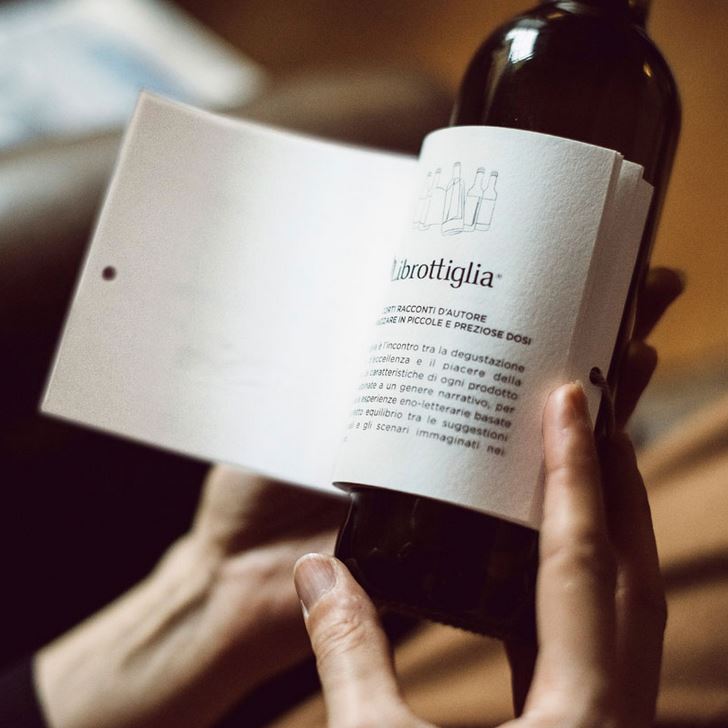
Librottiglia by Reverse Innovation and the Matteo Correggia winery
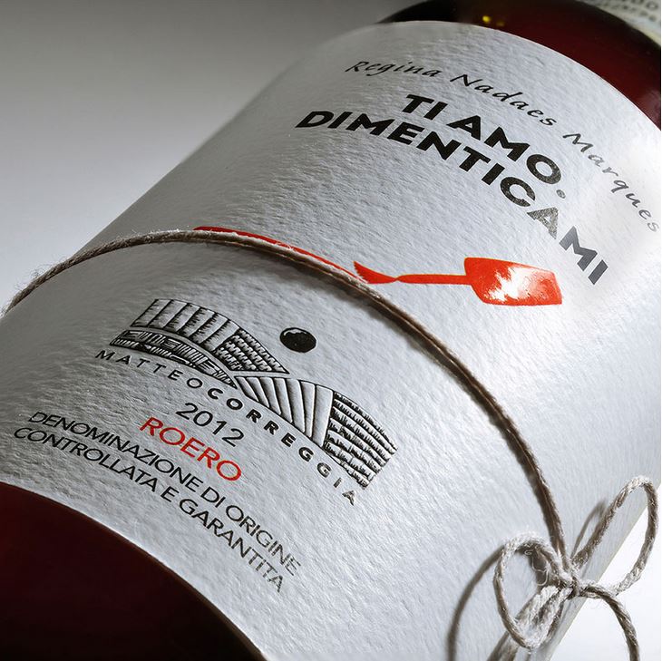
The label comes with a minimal vignette that gives a brief insight both into the nature of the story, and the character of the wine. For the project, the studio collaborated with three authors in recruiting stories for the project. A fable ‘La Rana Nella Pancia’ (The Frog in the Belly) by Patrizia Laquidara blends with the red Anthos; while a love story ‘Ti amo. Dimenticami’ (I love you. Forget me) by Regina Nadaes Marques accompanies the nebbiolo roero; and a satirical mystery ‘L’omicidio’ (Murder) by Danilo Zanelli complements the red anthos.
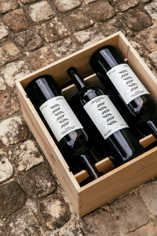
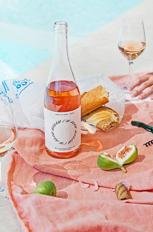
Château Picoron wine labels by OlssønBarbieri (also header image)
Norwegian studio OlssønBarbieri was commissioned by an Australian family to design a brand identity and packaging design for the Château Picoron winery (dating back to 1570) they had bought in Bordeaux. Home to some of the world’s most prestigious wines and strictest self-imposed regulations, Bordeaux has begun to lose its appeal to new generations. That is why the creative team made up their minds to break with the tradition of the region “shaking the snobbery of the region, making wines more fun while honouring their legacy.”
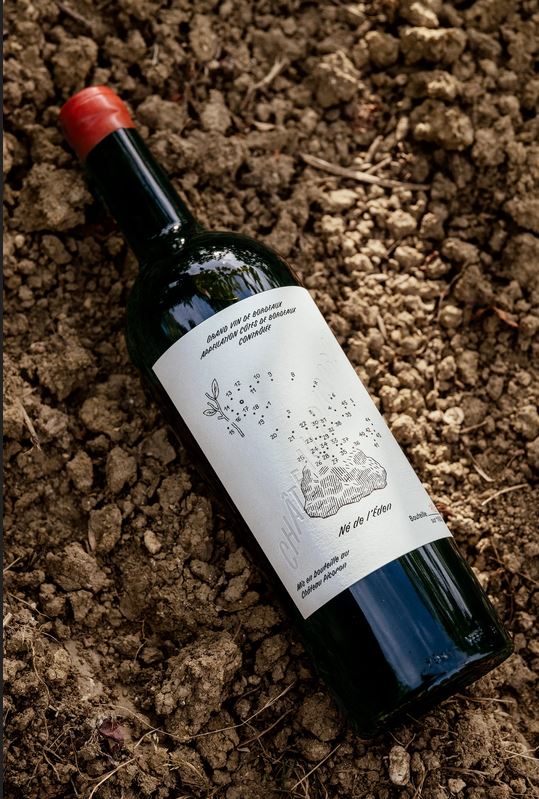
Château Picoron wine labels by OlssønBarbieri
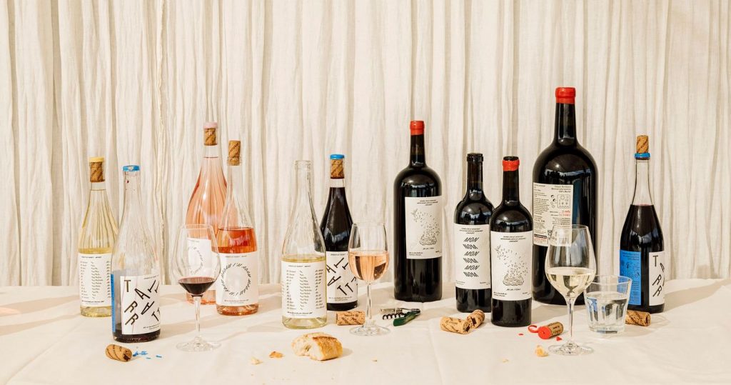
To reference the restrictive winemaking regulations in Bordeaux, such as using particular grapes, harvesting methods, ban on irrigation, and length of maturation, OlssønBarbieri introduced their own constraints on the design. The team used only one font that can slant 45 degrees in both directions, which allowed them to play with typography, and named the wines only by palindromes, i.e. words or phrases that read the same backwards and forwards – both in French (Le bon Nobel, Ne de l’Eden and Mon Nom) and English (Tattarrattat, Madam I’m Adam and No Lemon, No Melon).
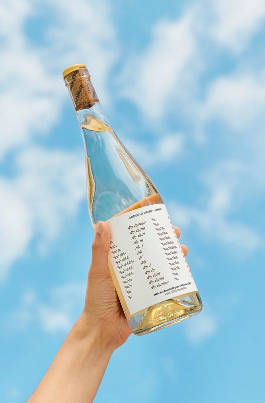
Château Picoron wine labels by OlssønBarbieri
All of the wines are based on the Merlot grape, which is named after the Merle blackbird, so the designers adopted this bird as the mascot and “brand’s storyteller”. The illustrations were created in collaboration with French artist Jochen Gerner, who managed to describe the winemaking constraints utilizing visual language.
Château Picoron wine labels by OlssønBarbieri
The project also seeks to initiate discussion on climate change and the future of Bordeaux wine, as according to the team, the warm summers of the past years have made it difficult to control the sugar level and therefore alcohol content of the wine.
Feroz wine label by Franziska Studio
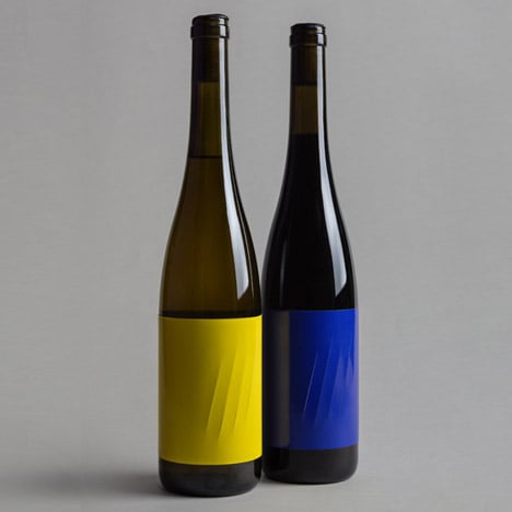
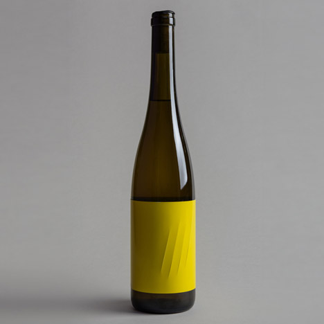
Spanish agency Franziska Studio was tasked to find a way to represent the degree to which the strong body of an artisanal wine produced by David Rodríguez Vineyards. Aptly named Feroz (Spanish for “fierce”), the wine is described as having a “pleasant fruity smell” but a very strong body that “scratches you from inside.”
Feroz wine label by Franziska Studio
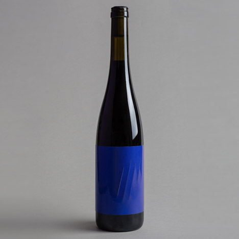
The team communicated this with a series of claw marks that slash high-density paper of the block colour label. The labels were printed using a conventional press, and then applied to the bottles by hand, with care not to glue down the openings made by the scratches that look like something done by an animal. The bottles were created in a limited edition of 1000 with yellow labels for white wine and 1000 with blue labels for red.
Feroz wine label by Franziska Studio
The only text on the label is printed in a small typeface and reads: “He gave a blow. Howled, but nobody listened to him, the sheep were already immune, they were not afraid of a poor wolf lost in their city.”