Eating out with kids might be a tricky task – toddlers throwing a tantrum or preschoolers running around while waiting their orders is not exactly a picture of a perfect restaurant experience. Despite the many hassles of designing a family-friendly restaurant, however, more interior designers succeed to create a family-friendly dining space, which could meet the needs of both children and parents.
Family Kitchen by Mizzi Studio
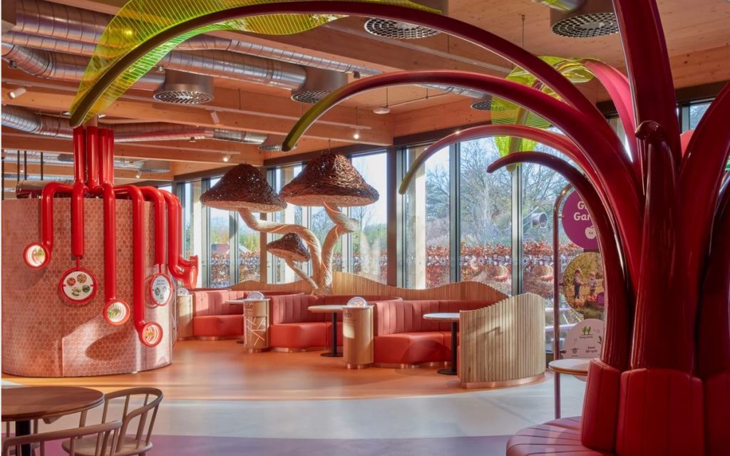
Design practice Mizzi Studio has designed the interiors of Family Kitchen, a kids’ restaurant in in Kew Gardens, a UNESCO World Heritage Site in southwest London. The studio aimed to create a place where the entire family can learn about our ecosystem – how the sun works, how plants work, and how food is grown. To encourage children to investigate the natural world, organic produce and healthy food preparation, the floorplan is divided into four zones, each having a designated colour scheme. The signage and exhibits give visitors insight into plants and farming techniques.
Family Kitchen by Mizzi Studio
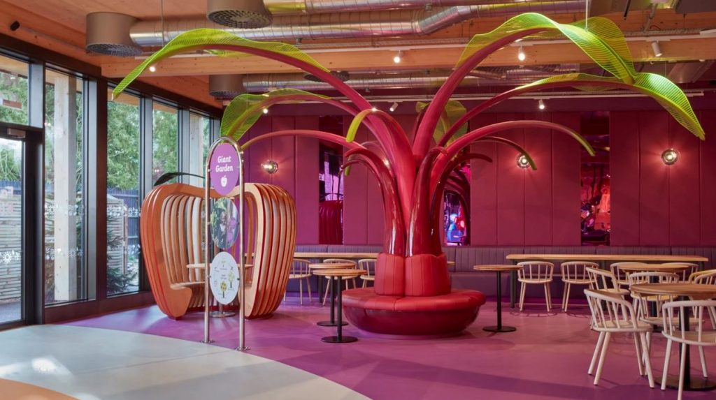
Each zone is distinguished by bright colours ranging from berry pinks to leafy greens and an array of whimsical installations such as an apple-shaped seat, giant mushroom sculptures in handwoven willow created by artist Tom Hare and a magenta-coloured Ethiopian Enset tree.
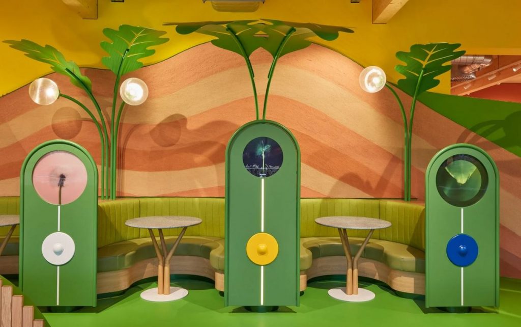
Family Kitchen by Mizzi Studio
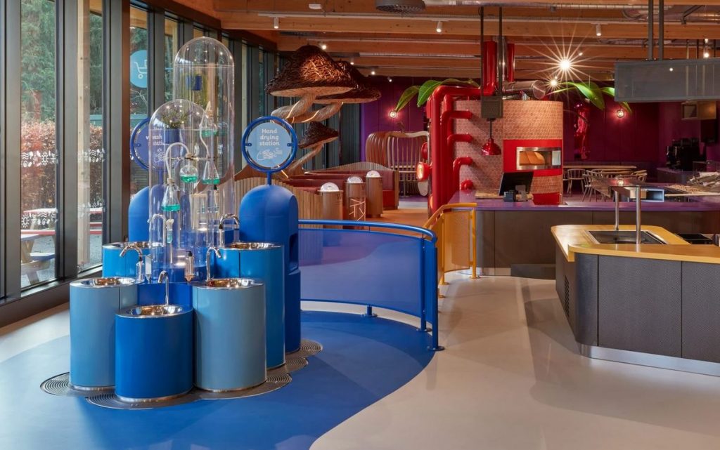
Through this, the designers sought to create a magical world of gardens forests and woodlands, where human beings appear to have been shrunk to the size of small creatures. For example, the Spring section encompasses a green grassy zone with a seating area enveloped by giant sprouting plants and interactive displays that show the growth cycle of plants. Another section includes a sanitation station that helps children uncover the importance of hygiene, while also learning about the antibacterial properties of plants like lavender and rosemary.
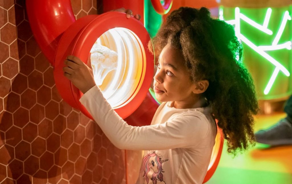
Family Kitchen by Mizzi Studio
The open-plan kitchen and pizza-topping station allows children select their own ingredients and educates them on the process of food making. Young diners can peek through bright red infinity mirror periscopes around the pizza oven and look at a range of harvested vegetables inside.
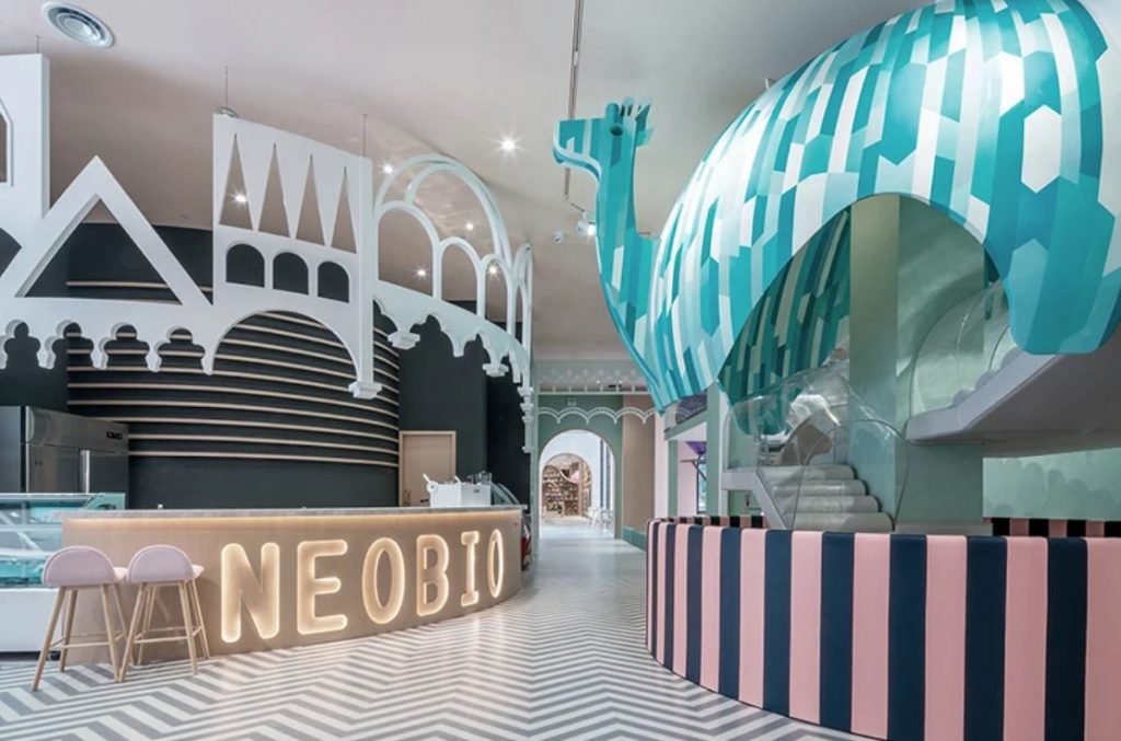
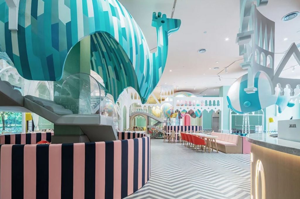
Neobio Family Park by X+Living (also header image)
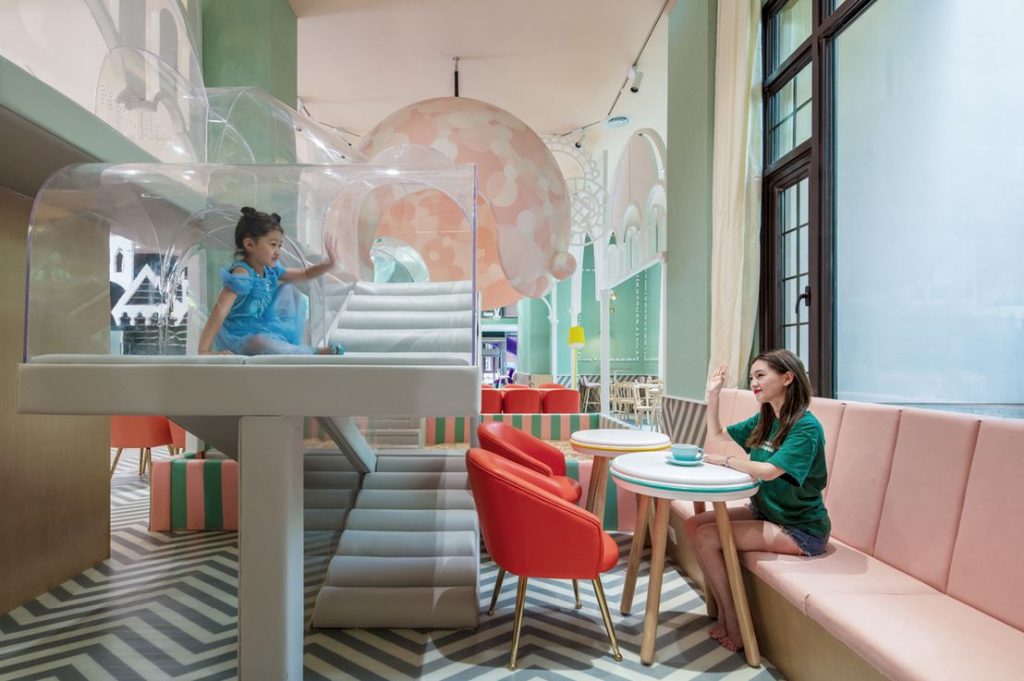
Chinese design firm X+Living has created a functional layout, which meets the needs of both parents and children for a family-friendly restaurant in Neobio Family Park in Shanghai. The design concept came from an imaginary picture where a colorful hot air balloon rises up from an ancient castle — showing a strong power that carries a new life.
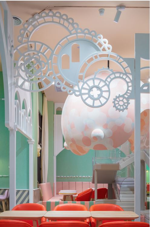
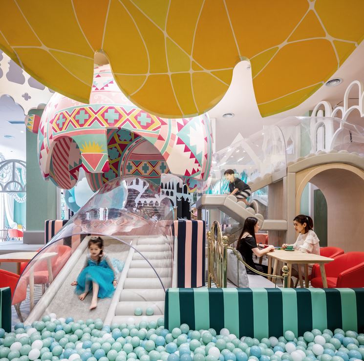
Neobio Family Park by X+Living
The most eye-catching part is an S-shaped slide, from which the children could slide directly to the dining area on the first floor. Parents could bring their children to enjoy food in the dining area after the children had a great time playing all around. Here, lots of balloon-like hanging Game Boxes are situated, all of which are connected by transparent crawlways, so that children could have fun crawling all around.
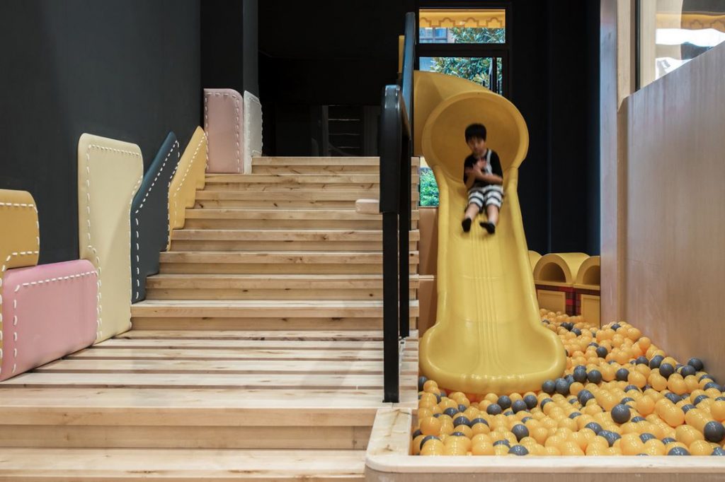
Neobio Family Park by X+Living
The Game Boxes feature different kinds of pools, some pools are filled with bubbles, some are with sand and some with toys. Some climbing ladders might reach to 2 meters high and then descend to the next pool, so that it allows parents walk under the crawlways. Made of transparent acrylic, the winding and wavy crawlways let parents look after their kids as they play inside. They can also do that while dining, as there are dining tables around these boxes. Two VIP rooms are designed for families who require private space.
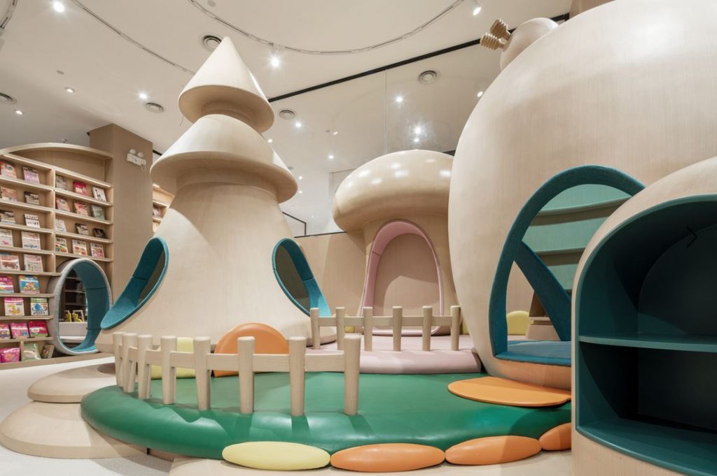
Neobio Family Park by X+Living
In the basement, children could hold birthday partyin one of the party rooms with various themes such as Indian, desert and Mediterranean. Special King and Queen chairs are designed in every party room to make every child the real hero of their party.
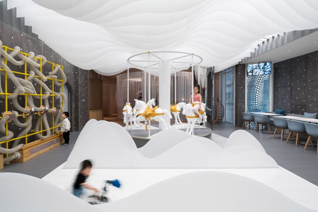
Lolly-Laputan kids café by Wutopia Lab
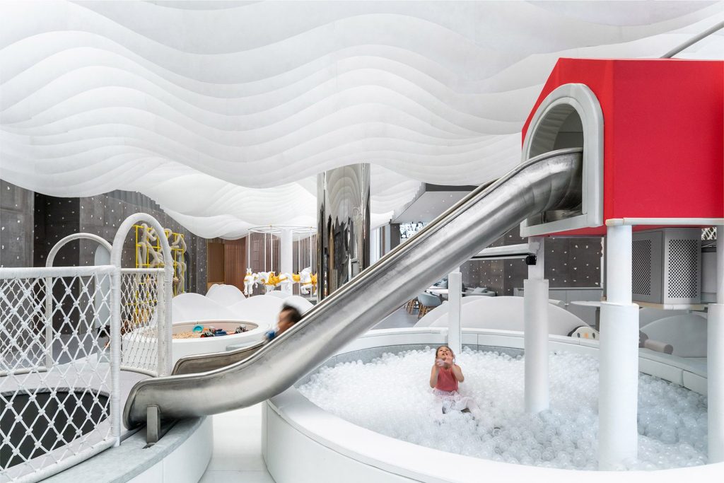
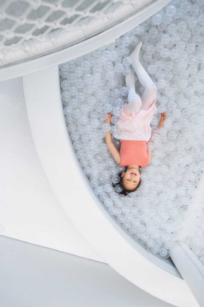
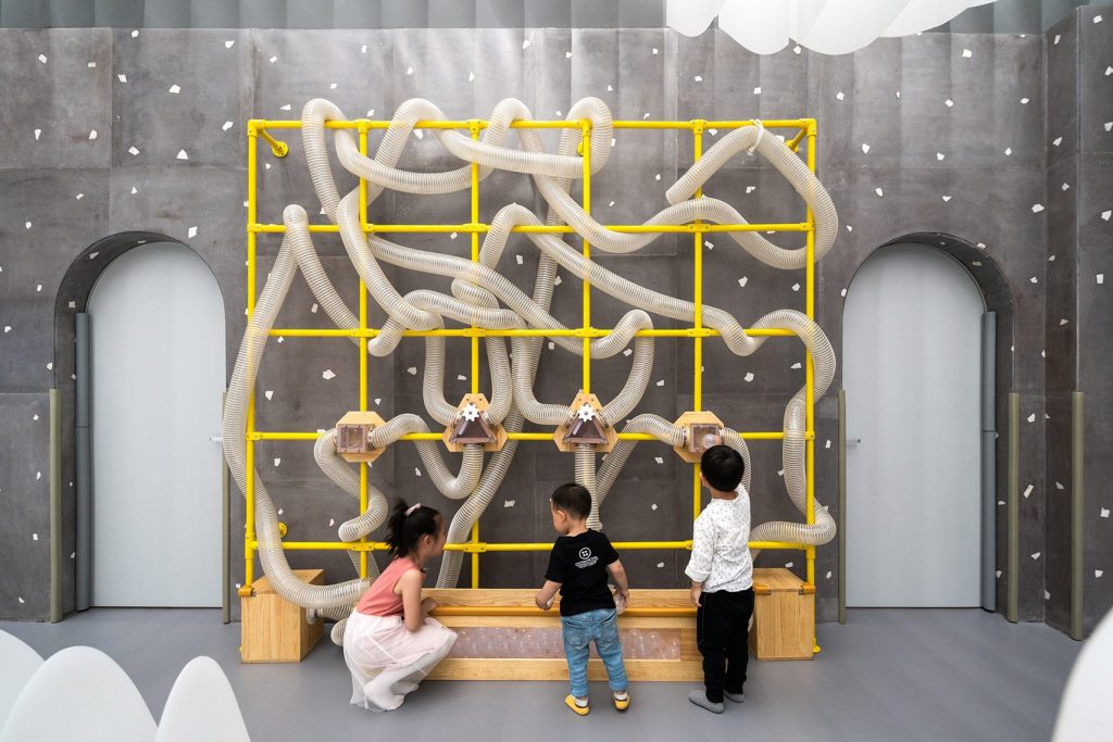
A drawing of an imaginary fairyland created by the daughter of the founder at Wutopia Lab inspired the design of Lolly-Laputan café in Dalian, China. Described by the studio as “the first educational family restaurant in China”, the restaurant features whimsical decor details and an array of learn-play areas, such as a carousel, hidden tree-houses, slides and a ball pit.
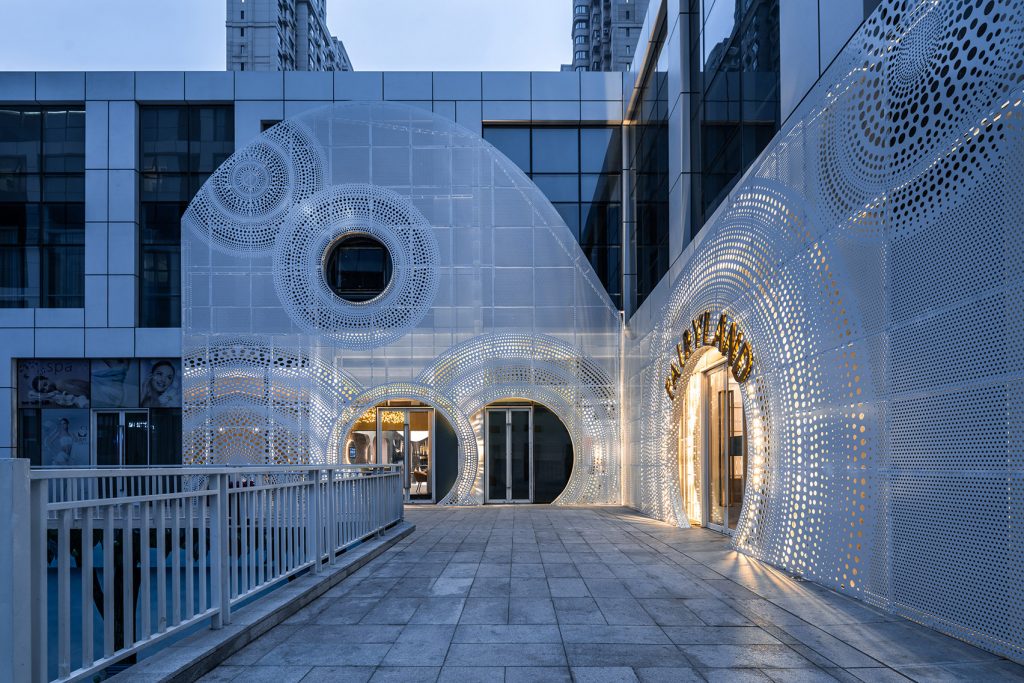
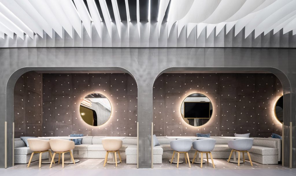
Lolly-Laputan kids café by Wutopia Lab
Upon entering, visitors find themselves in a circular front lobby where seating is surrounded by what the designers describe as a “forest of lights”. Made up of 1,000 acrylic tubes hung in a ring-shaped formation, the lights are meant to simulate the effect of sunlight shining through dense layers of leaves in a forest.
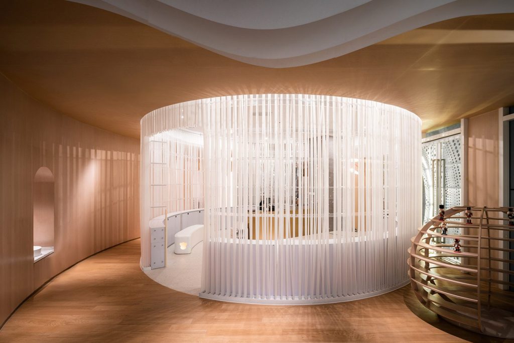
Lolly-Laputan kids café by Wutopia Lab
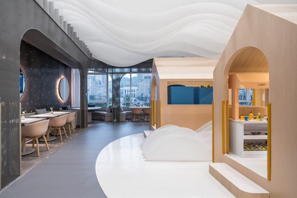
The adjoining open-plan dining area is situated around a central area coined Cloudy Town, which is defined by rows of undulating white acrylic panels that run across the floor and ceiling, bench seats and armchairs upholstered in pale-blue fabric. A series of house-shaped timber structures in this area contain miniature kitchen and supermarket playsets.
Lolly-Laputan kids café by Wutopia Lab
Accessed via a short flight of steps, a gabled structure with an arched front door named the Golden Castle provides a more private environment for young visitors. The structure accommodates a quiet dining area with a fireplace, artificial candlelights and shiny silverware, all scaled down to kid-size.