For centuries, Sun has intrigued poets, philosophers, artists, and everyone who has somehow been touched by its invisible warmth. What if we could tame the star, so that the sunshine to bring the sunshine in any time of the day? These interior designs are inspired by the Sun and feature it as the most prominent feature.
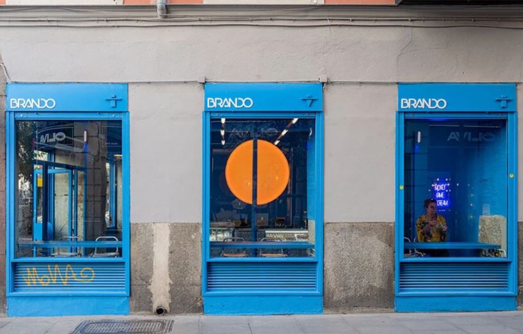
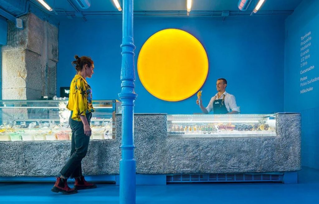
Brando ice cream store by Solar and Marta Jarabo (also header image)
The most prominent feature of a small ice cream store in the heart of the Spanish capital is a large sun-like lamp that illuminates the interior. The luminous piece is made of stretch fabric and changes colours throughout the day. Not only it draws the attention of pedestrians outside, it also brings an immersive experience to the space.
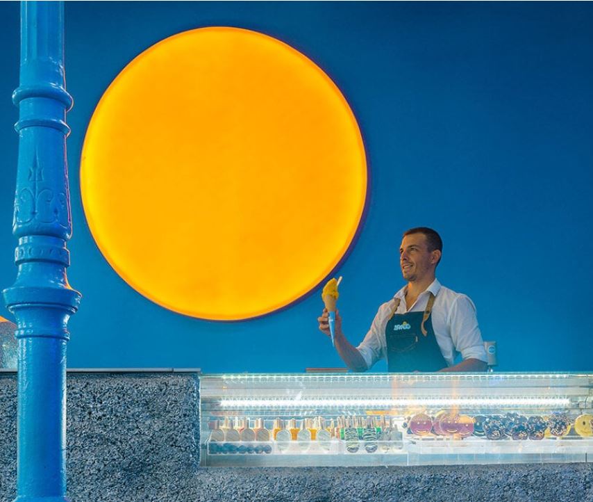
Brando ice cream store by Solar and Marta Jarabo
The creators of the concept – Madrid-based studio Solar and Marta Jarabo – faced a number of limitations while executing the project: low budget, and limited execution time. They have painted the whole interior, including floors, ceilings, and furniture, in bright shades of blue, which helps create a recognizable image.
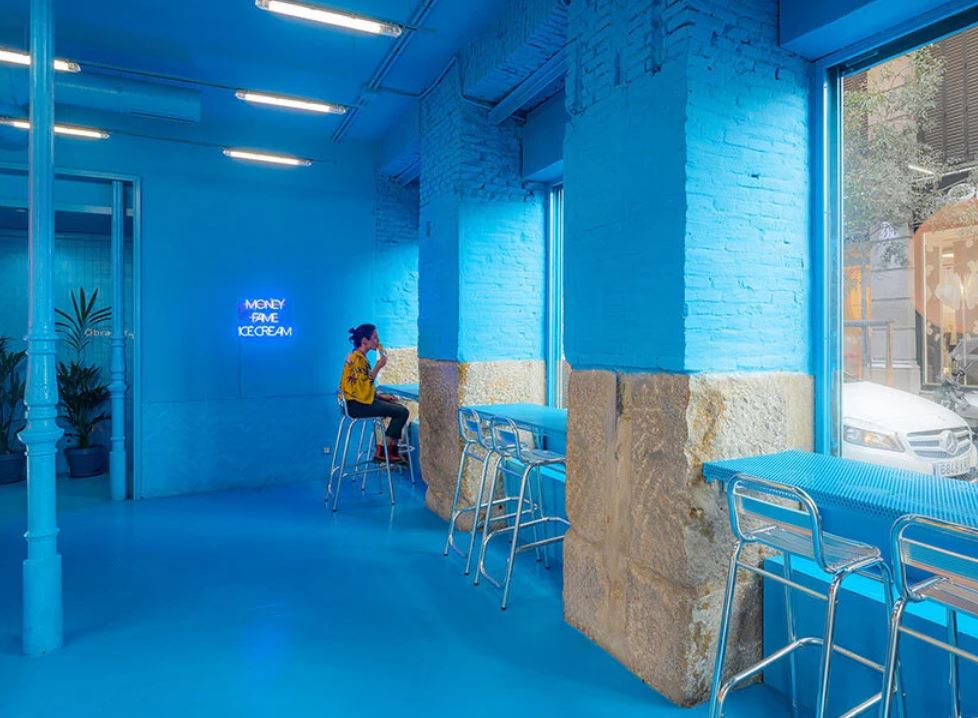
Brando ice cream store by Solar and Marta Jarabo
The architects have divided the place into two parallel bands with protruding polyurethane foam-covered sections that serve as counters, bars, and worktops. This solution allows maximum flexibility and breaks the continuity of the space.
Besides, according to the designers, this strategy responds to an economy of means as an ecological manifesto, unifying the space and revealing the different historical layers of the site while avoiding demolition and minimizing waste generation.
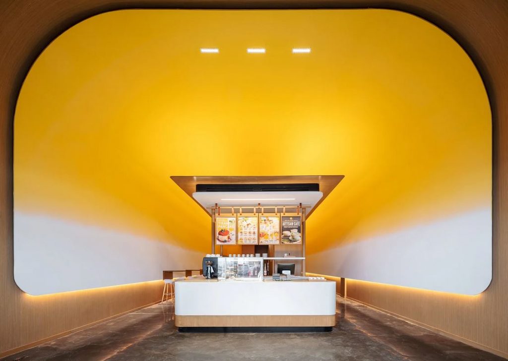
Fuwa Fuwa café by Studio Yimu
Local interior design firm Studio Yimu has also turned to the image of the largest celestial body to create an atmospheric experience in the Golden Square branch of Fuwa Fuwa in Toronto, Canada.
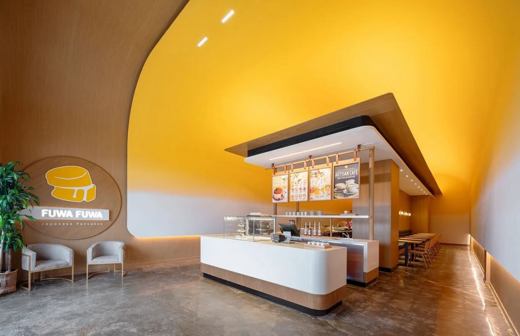
Fuwa Fuwa café by Studio Yimu
Visitors of this Japanese style pancake and dessert café are greeted by the soft curve and bright yolk yellow of the high canopy as it frames a modern temple-like structure. Light emanates from it, softly brightening all corners of the space. It is flanked by corridors on either side. Accompanied by the whir of the coffee machines and the drink’s invigorating aroma, this element brings in the feeling of a sunshine-filled morning.
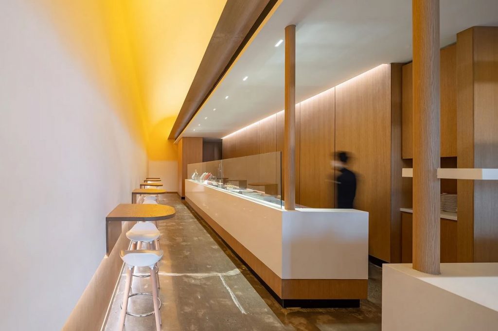
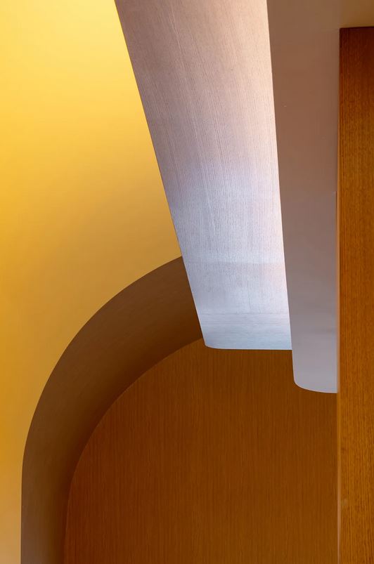
Fuwa Fuwa café by Studio Yimu
The team sought to combine both the visual aesthetics of a grab-and-go cafe with its youth-led culture and the solidity of a sit-down restaurant. Two experiences become available: the hustle and bustle of pancake flipping and “the cosy feeling of being tucked away in a small pocket of space.” The design team managed to accomplish this mission by the progressive effect of the colour transitioning from bright yellow to white and the use of noble natural materials, such as wooden canopy and backdrop, and marbled floor.
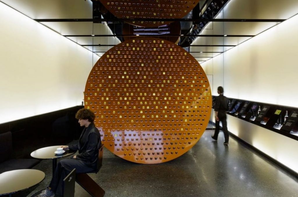
Zzip honey café by Laboratory of Architecture #3
Developing the interior design for the first café/shop for honey product company Zzip in Tbilisi, Georgia, local architectural practice Laboratory of Architecture #3. To create a strong statement that represents the core values of the new brand, including proximity to Nature, the designers have integrated an oversized sun-like circular structure for displaying different types of honey.
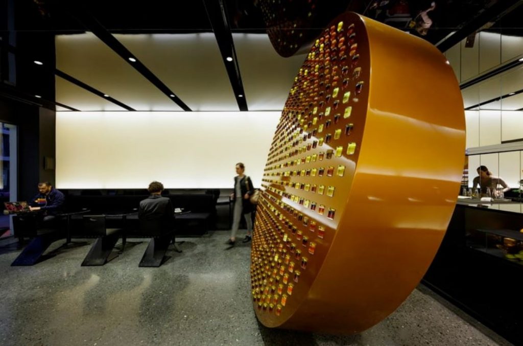
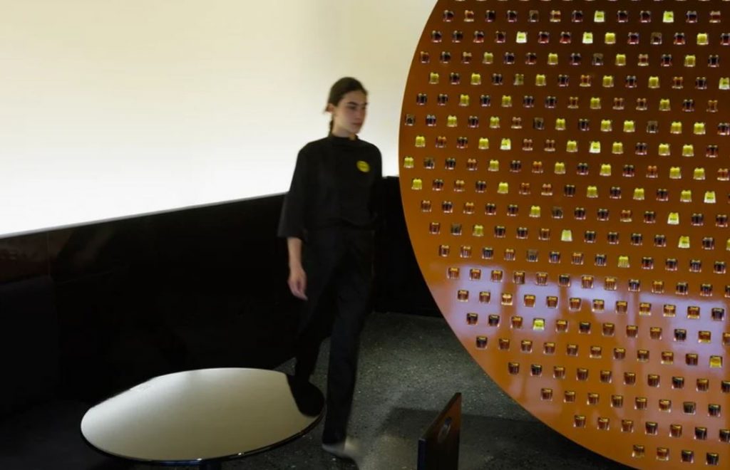
Zzip honey café by Laboratory of Architecture #3
The colour palette is otherwise neutral and consists of mainly black and white. Using white on large-scale spaces, such as the walls, creates a calming museum-like atmosphere in the shop and brings focus to the striking spherical element.
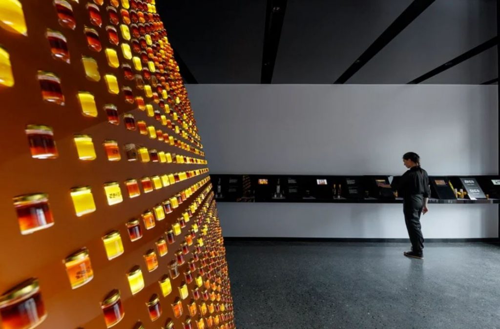
Zzip honey café by Laboratory of Architecture #3
On the main wall, the architects displayed small products alongside screens and descriptive texts. During daytime, the natural light is reflected on the ceiling clad in mirrors, making the space feel brighter and more atmospheric.