It is no secret that Chinese architecture is undergoing a massive upsurge. Within the last decade, the country has emerged as the globe’s largest construction market, and as a result, many noteworthy modern projects have been built. In today’s post we are focusing on bespoke Chinese bookstores that merge aspirational architecture and interior design with the spiritual world of reading.
Duoyun Bookstore by Wutopia Lab
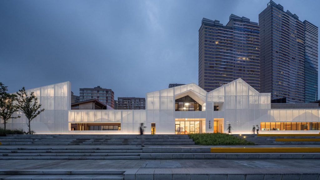
Rather than demolishing two disused buildings on the banks of Taizhou’s Yongning River outside Shanaghai, architecture studio Wutopia Lab has wrapped them in panels of white perforated aluminium to transform the structures into a bright and modern bookshop for the Chinese retailer Duoyun.
Duoyun Bookstore by Wutopia Lab
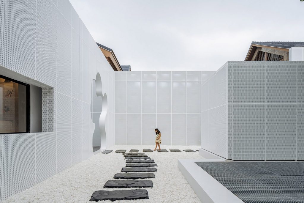
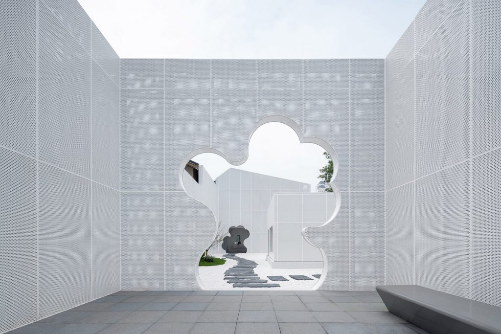
Undulating cloud-shaped cutouts in the façade offer varying levels of translucency. By controlling the perforation rate, the façade creates a cloud of layers hiding the original buildings. The architects have reimagined the original plan of the site to include a number of small gardens as well as an internal courtyard organized around a central tree and lined with white pebbled and stone paths. The have also used a fence between two other, privately owned buildings on the site to mark out a small front yard and entrance for the bookstore.
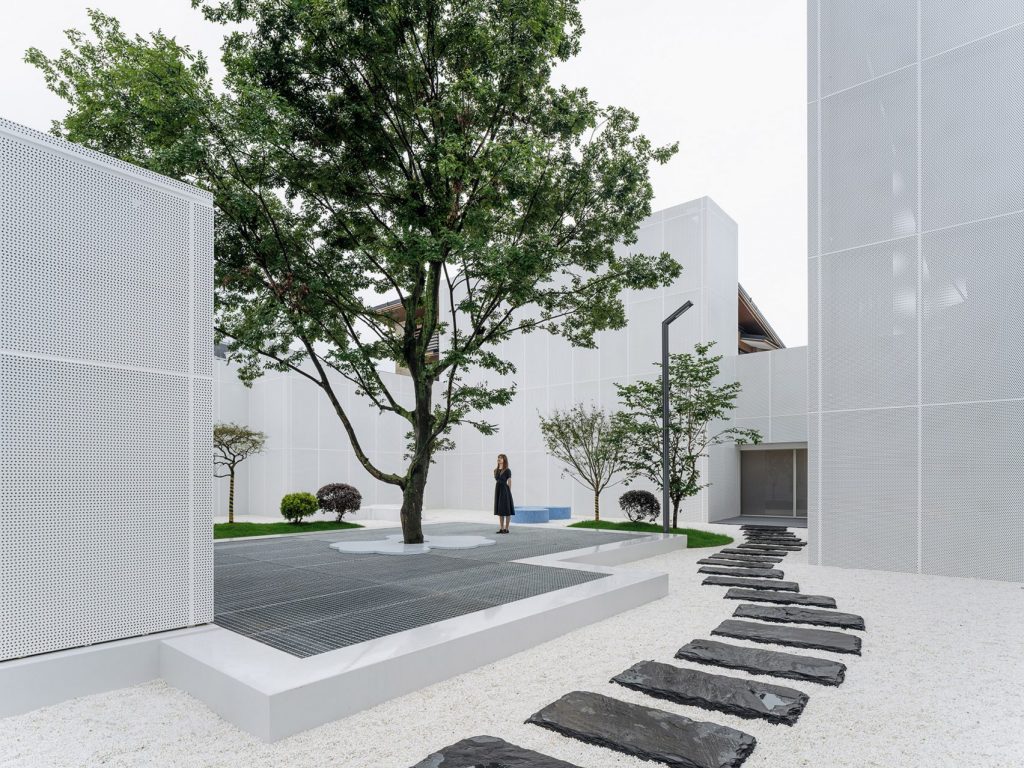
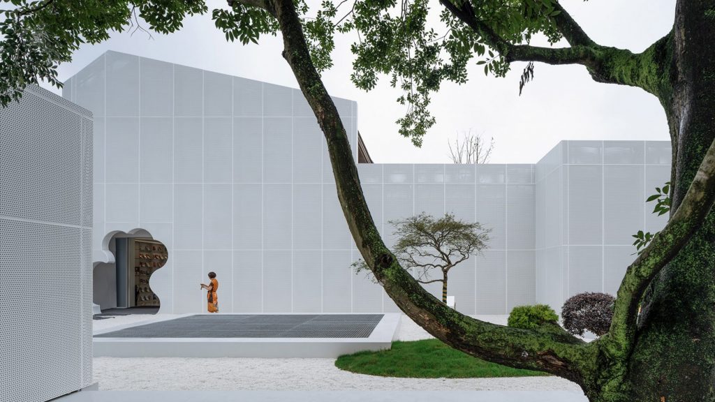
Duoyun Bookstore by Wutopia Lab
Inside, the Duoyun Bookstore is divided into five colour-coded zones that are distributed across two levels. On the ground floor, customers can find a section dedicated to lifestyle books, displayed on a triangular orange stand that pays homage to a 1967 installation by South African artist Roelof Louw comprising 6,000 oranges stacked into a pyramid.
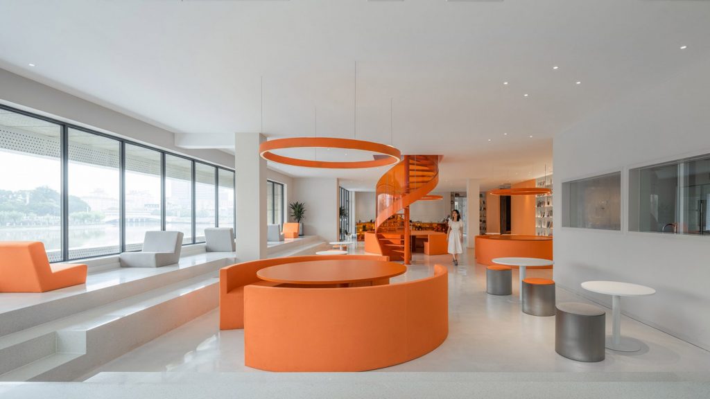
Duoyun Bookstore by Wutopia Lab
Following the path through the store on the ground floor, visitors are guided to a cultural and creative zone defined by dark petrol blue hues. This zone houses two different reading rooms as well as the shop’s main retail area with a triangular, translucent acrylic cashier counter.
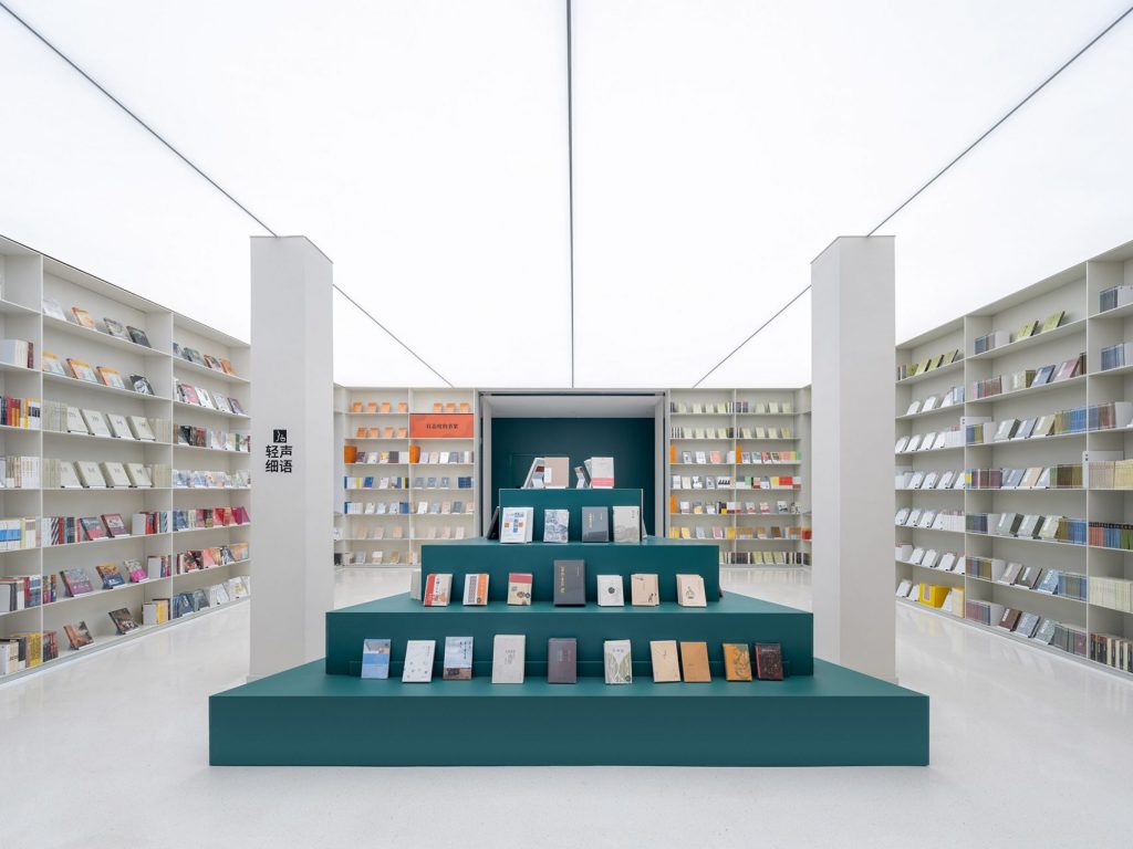
Duoyun Bookstore by Wutopia Lab
The first floor is accessed via an orange spiral staircase or a wood-panelled stairwell with an integrated display area for reproductions of rare books. The level accommodates a pink and purple exhibition space and a red stepped lecture theatre as well as a neutral-toned meeting room. These are connected to each other via different terraces, including a children’s play area, a discussion terrace with a fire pit and an outdoor cafe.
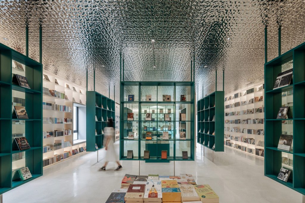
Duoyun Bookstore by Wutopia Lab
Here, the architects installed a blue glasshouse made from a special glass that becomes transparent at the touch of the button to reveal views of the Yongning River beyond.
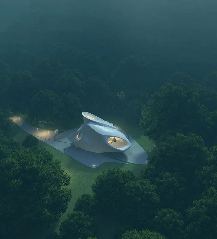
Catch the Sound from the Ocean concept by 00group
Chinese firm 00group has imagined a sculpted bookstore nestled at the foot of a mountain in Shenzhen. Conceived as a small spiritual lighthouse and poetically named ‘Catch the Sound from the Ocean’, the proposal encompasses a white organically shaped building with three large openings pointing towards the sea, sky, and woods.
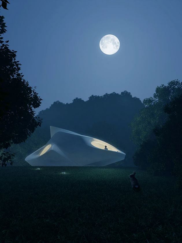
Catch the Sound from the Ocean concept by 00group
The architects chose not to embed any apparent boundaries between the indoors and outdoors. Instead, nature seems to wander gently into the room with its wooden floors and seating. ‘It is like filtering the natural environment in this small container of a space,’ comments the team.
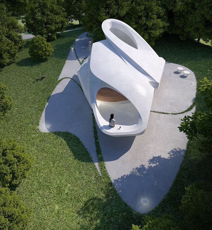
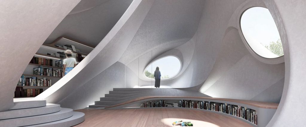
Catch the Sound from the Ocean concept by 00group
As the sun changes positions throughout the day, the circular light spots created by the openings indoors begin to move with it. The core of the space, therefore, captures the touching moments of coexistence between humans and nature on site.
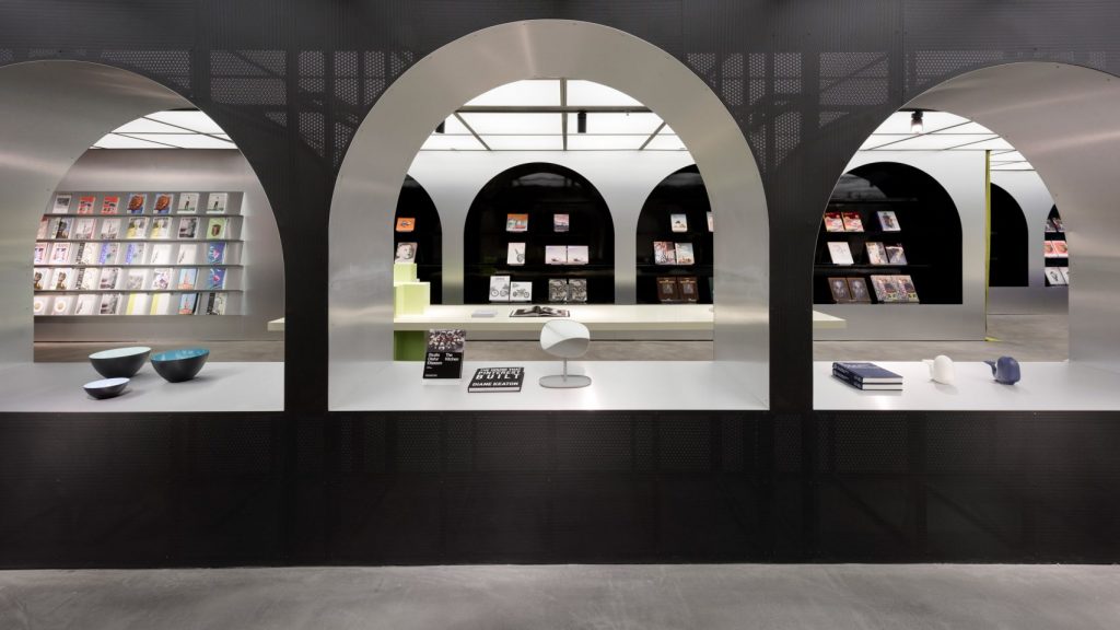
Harbook by Alberto Caiola (also header image)
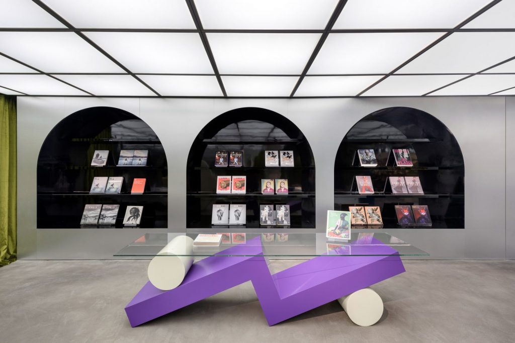
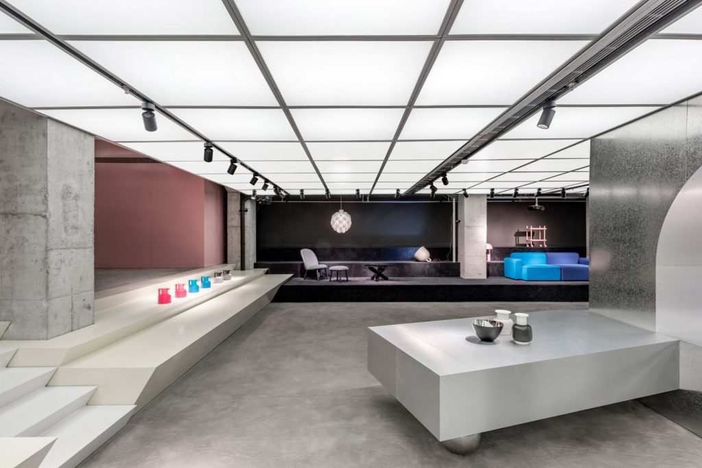
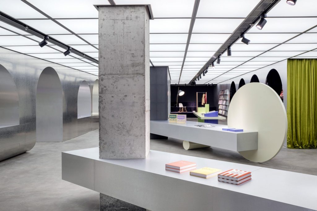
To appeal to the young urban consumer, a 600sqm bookstore Hangzhou, China, is designed by Shanghai-based studio Alberto Caiola based on the contemporary-meets-traditional principle. Named Harbrook, it features a series of imposing steel arches that are intended to evoke classical Italian porticos and postmodern-looking display stands compiled of intersecting geometric shapes that are arranged like towering sculptures. Thematically connecting Harbook’s urban elements of socialising, cultural exchange, shopping and dining, these design elements create a quite literally immersive dialogue between eras and cultures, providing a sensual journey through the space.
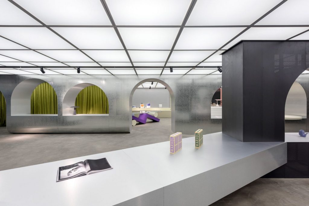
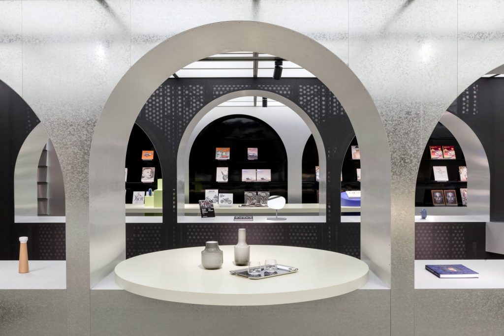
Harbook by Alberto Caiola
He space is mostly open plan, however, different areas are clearly defined by the change in floor level and material. Laid out over stepped shelving, the furniture display is dark grey while a set of stairs lead to a raised cafe area identified by dusky pink.
Harbook by Alberto Caiola
Overlooking the city’s West Lake, the café is conceived as a “dream-like” space where customers can meet with friends, work, or read. To pay homage to the location that has inspired writers, philosophers and poets for centuries, the floor of the café is made of traditional, locally-sourced Chinese, while a gridded LED light installation on the ceiling serves as a metaphor for the enlightenment attained through reading.
Mumokuteki Concept Bookstore by LUO studio
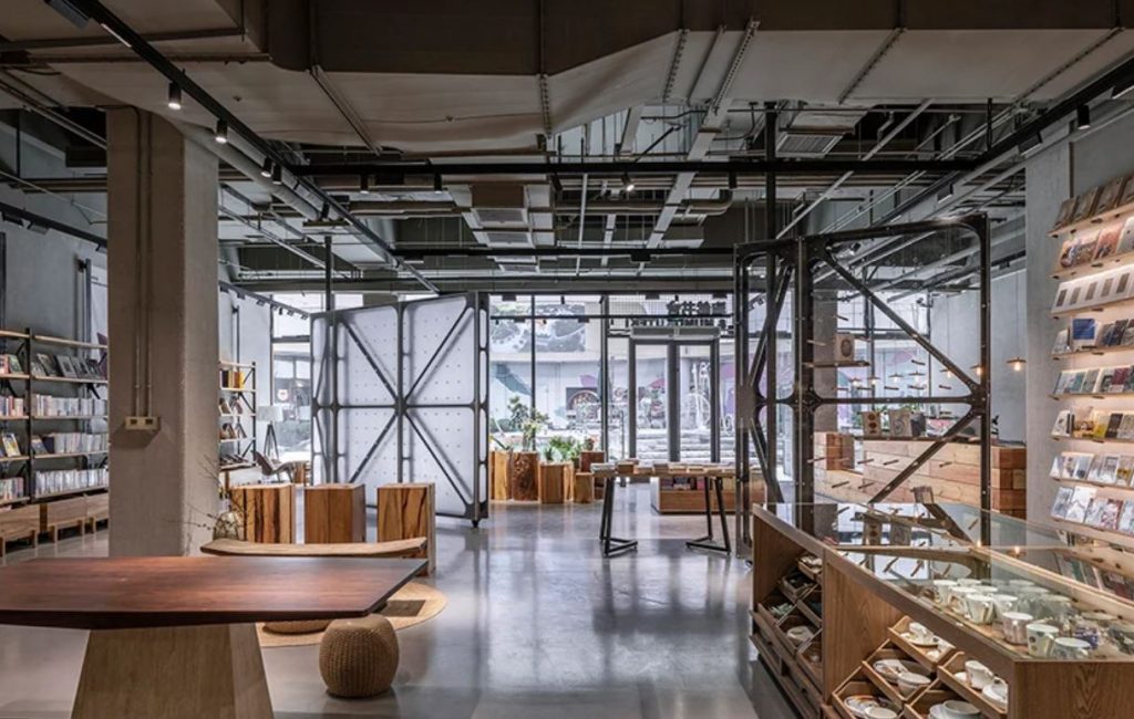
Mumokuteki Concept Bookstore by LUO studio is located in the underground space of a shopping mall in Beijing, China, which implies a certain amount of architectural limitations for the designers. Due to different area requirements of various tenants that could occupy the space, the volume f the large commercial building was divided unevenly, and the walls and columns were separated and arranged disorderly. This brought the team to come up with an unconventional interior design comprising transparent rotating walls and exposed pipes.
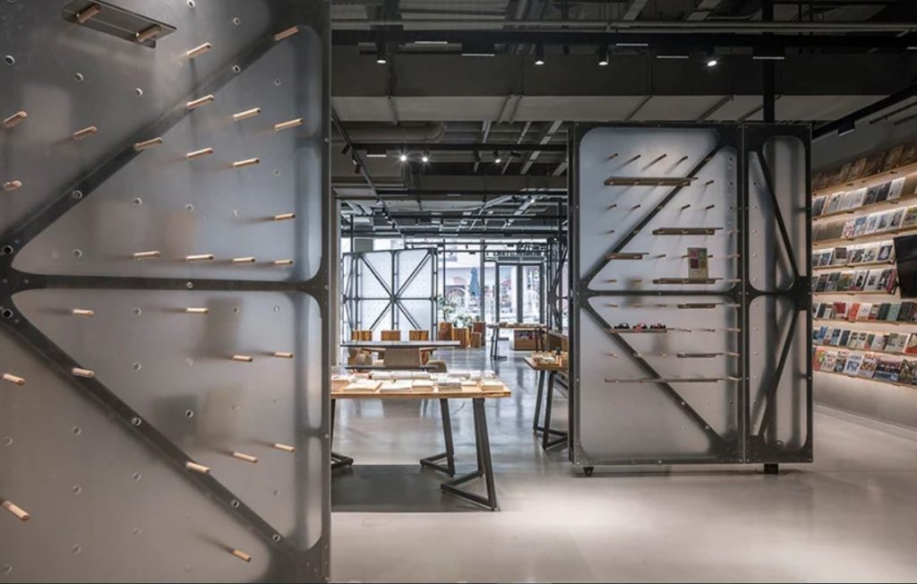
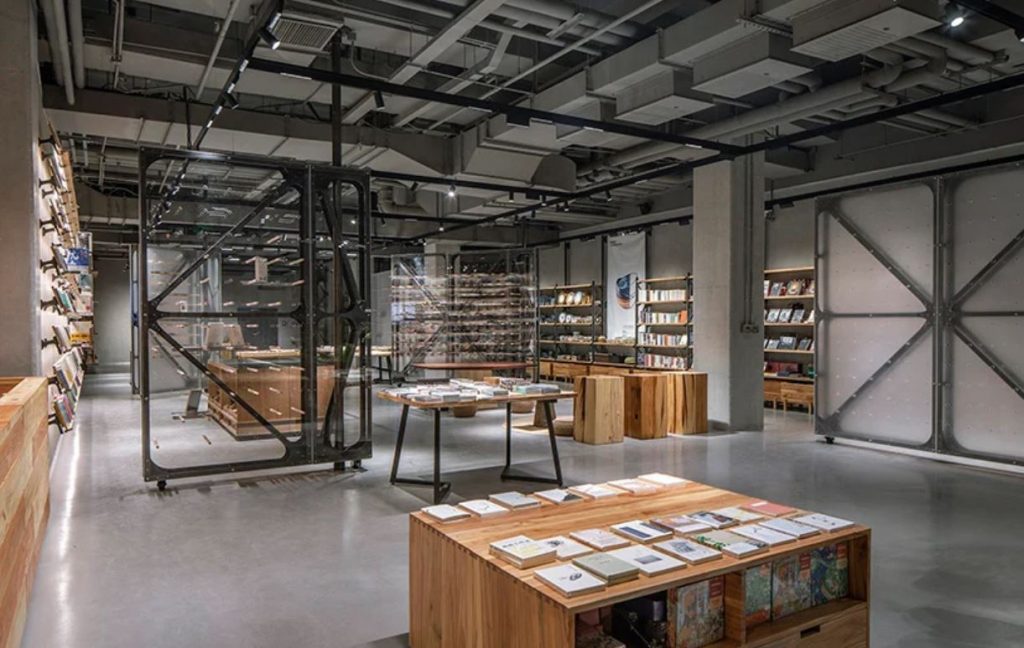
Mumokuteki Concept Bookstore by LUO studio
The key principle behind the project was to present the authenticity of the space without adding wrapping elements to original spatial structures. Therefore, rather than hiding the intricately mounted and dense ceiling pipes dominating the space, the original ceiling structures were retained and oainted grey. The white coating of the walls and columns was removed to showcase the unique character of the space.
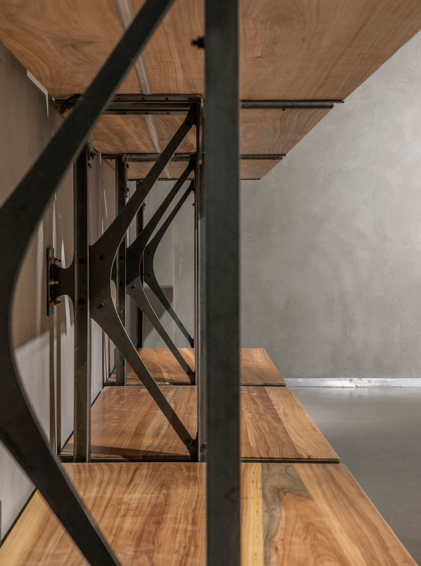
Mumokuteki Concept Bookstore by LUO studio
As the walls were built with non-bearing hollow blocks, which made it difficult to meet the client’s requirements to set shelving against the walls, the team decided to bring in and place metal shelves against the walls that feature a broad and long base, and the walls were endowed with many anchor points to offer more support. The shelves also double as partitions that help to increase flexibility of the space.
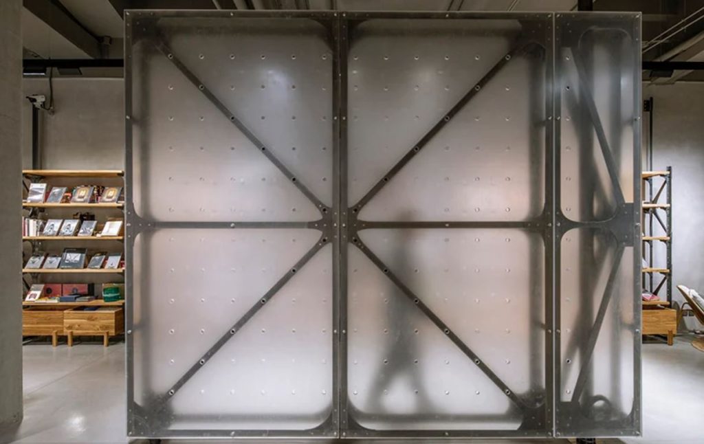
Mumokuteki Concept Bookstore by LUO studio
Also serving to enhance variability are rotating walls, which can be set either to make the store open and transparent, or parallel to the entrance interface to enrich the sense of layering and depth of the space.