In this post, we continue to explore engaging works of architecture that both suit the specific needs of a higher education institution and create an inspiring learning environment to boost creative thinking among students and make the schools flourish.
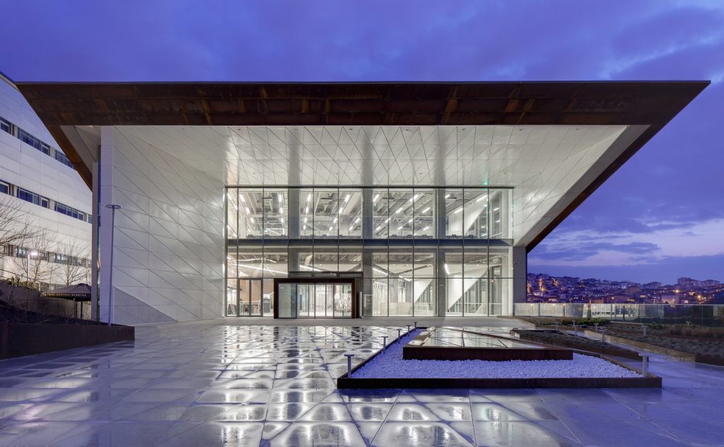
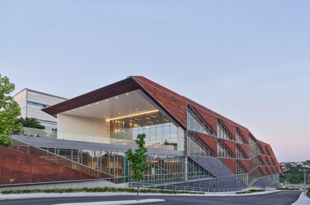
Faculty of Architecture and Design Building at Ozyegin University by ARK (also header image)
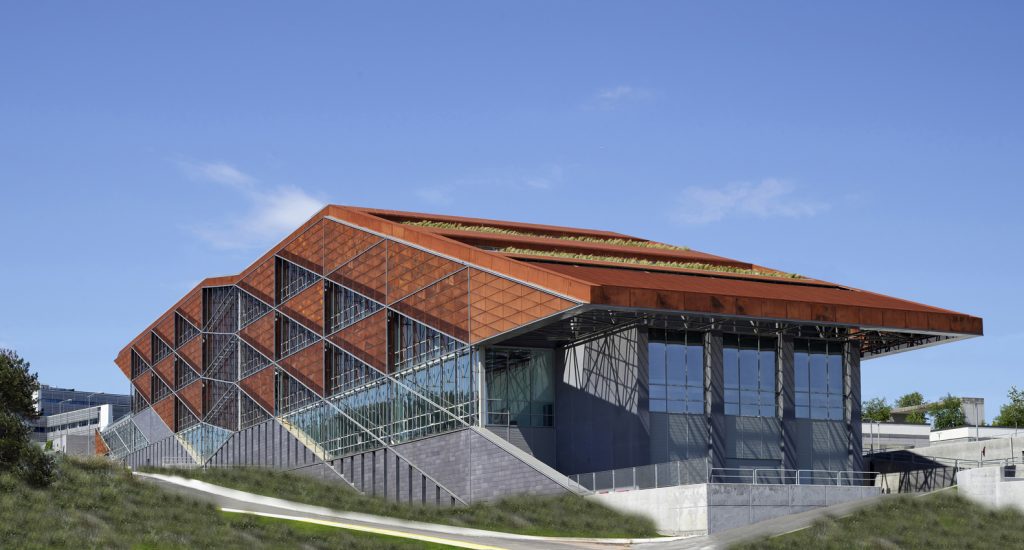
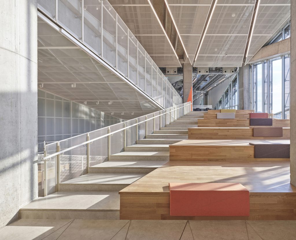
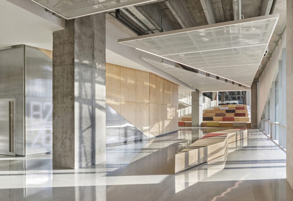
ARK-itecture, an emerging design studio with offices in Princeton and Istanbul, has collaborated with local BG Architects to develop a new building for the Faculty of Architecture and Design (FAD) at Ozyegin University, Turkey, which provides over 25,000 sqm of creative education facilities. The design is founded on a timeless yet exciting architectural language. It fully integrates the perimeter building diagonally back to the existing campus quadrangle designed by ARK a decade earlier, while dramatically transforming the use of the original programme.
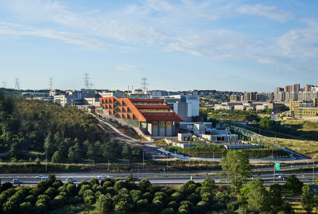
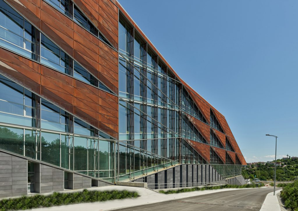
Faculty of Architecture and Design Building at Ozyegin University by ARK
The overall triangular geometry of the building informs every complimentary part of the composition including mitigating the low angle sun on the western façade with the unique and iconic triangular weathered steel panels. This panel system also allows the long building façade to elegantly transition down the sloped site and adjacent forested hillside.
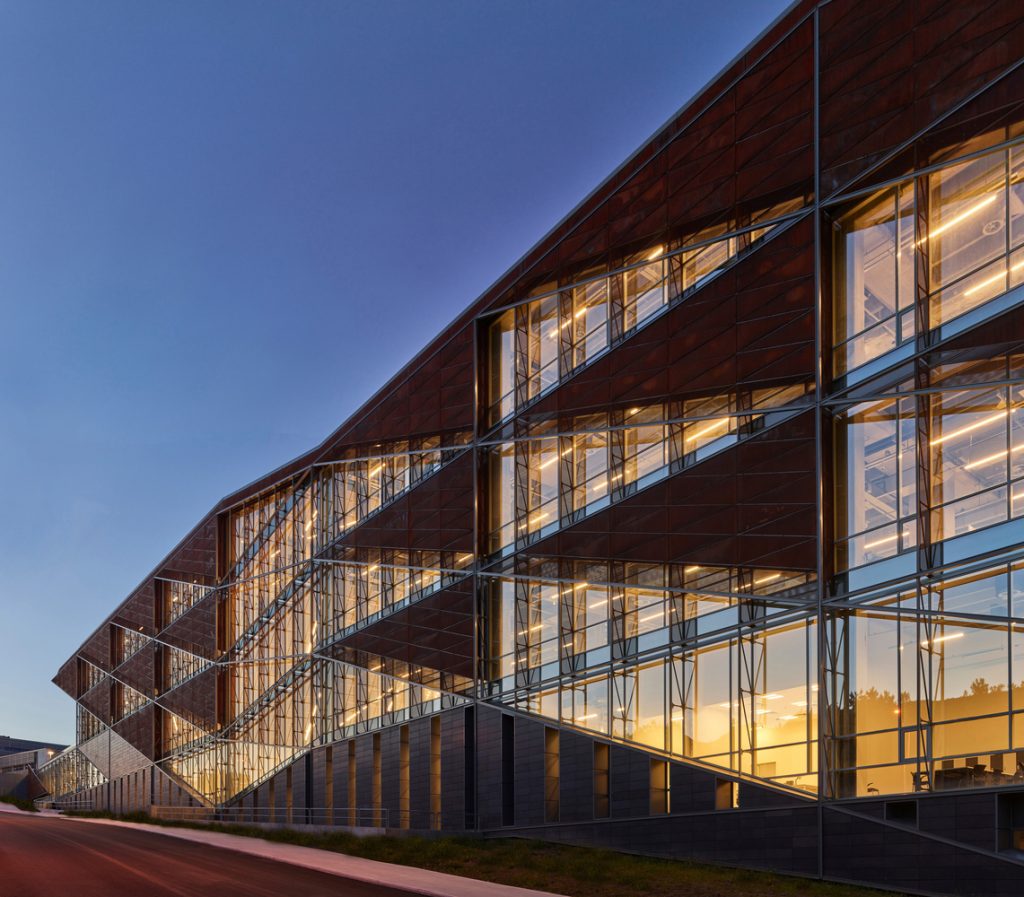
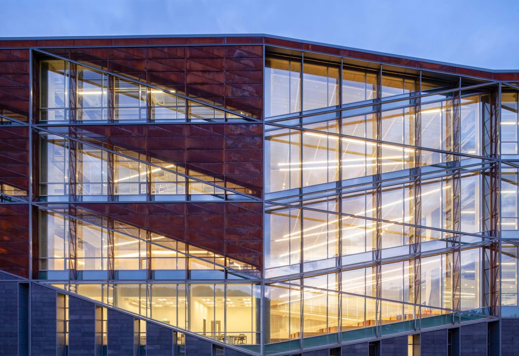
Faculty of Architecture and Design Building at Ozyegin University by ARK
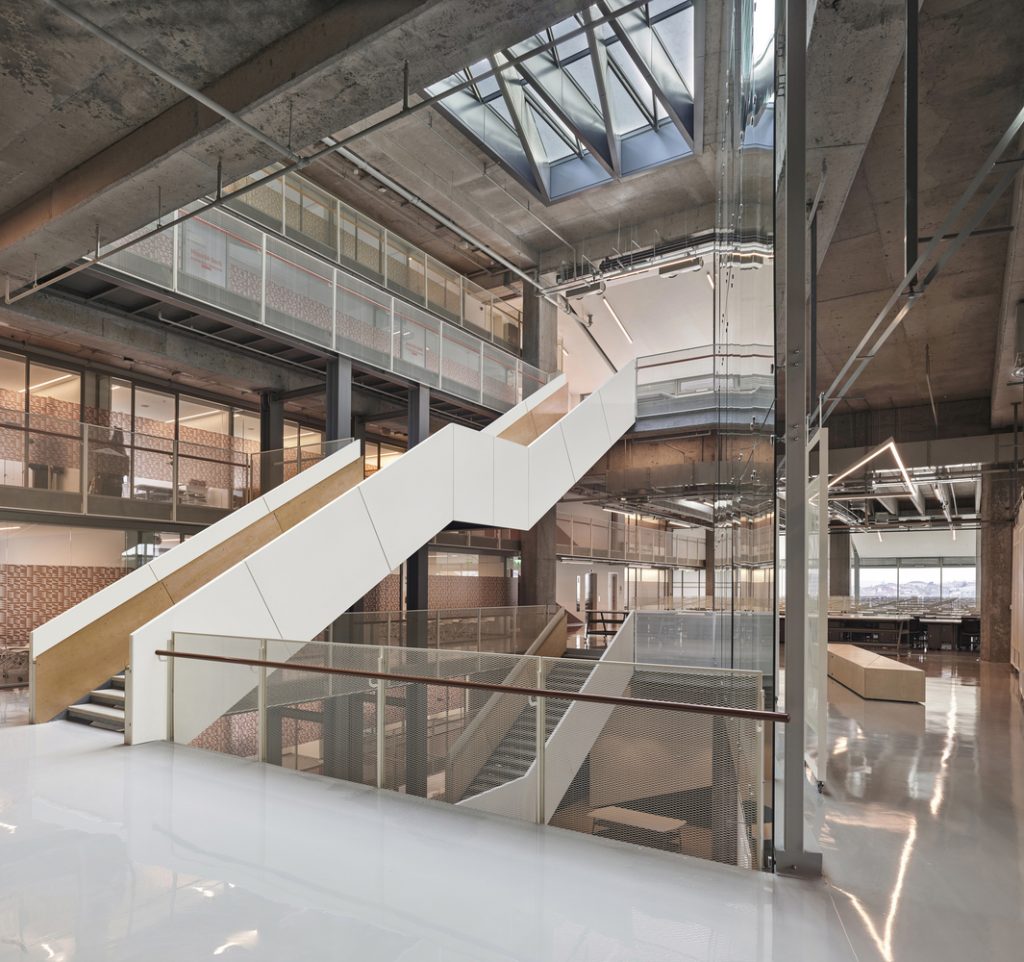
The same triangular geometry defines the diagonal spatial flow of the interior and informs the unique split-level studio section at the center of the building that creates a vibrant social and critique space for all the studios, while connecting all spaces visually and physically.
Department of Radio and Television Building at the University of Silesia, Poland by Grupa 5 Architekci, BAAS Arquitectura and Małeccy Biuro Projektowe (ph: Jakub Certowicz)
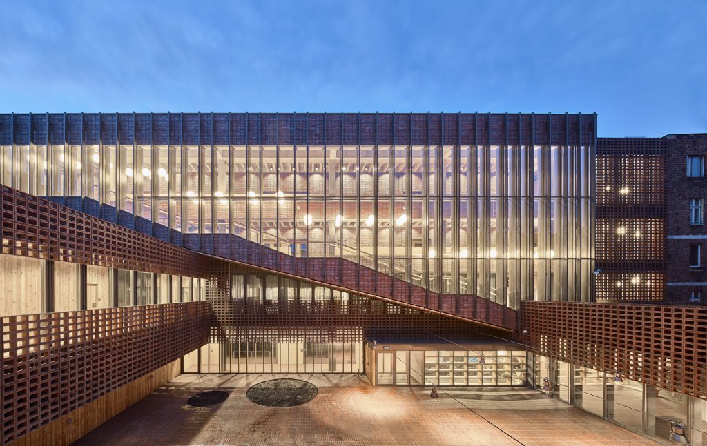
Warsaw studio Grupa 5 Architekci, Barcelona firm BAAS Arquitectura, and local office Małeccy Biuro Projektowe have teamed up to design a new building for the Department of Radio and Television building at the University of Silesia in the Polish city of Katowice.
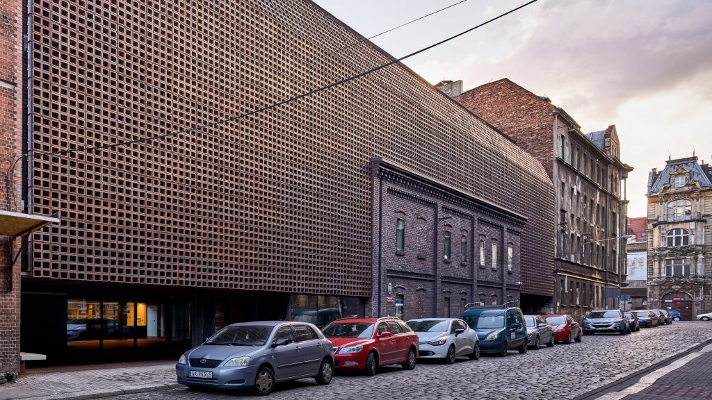
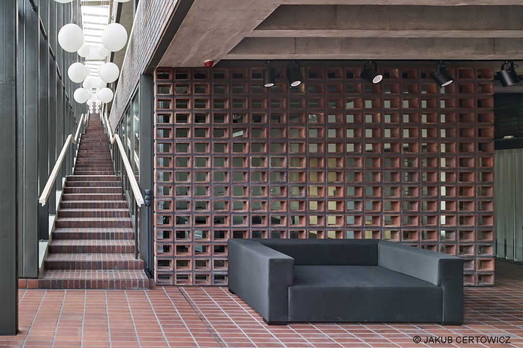
Department of Radio and Television Building at the University of Silesia, Poland by Grupa 5 Architekci, BAAS Arquitectura and Małeccy Biuro Projektowe (ph: Jakub Certowicz)
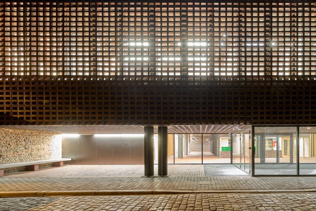
According to the project team, their biggest challenge was to seamlessly integrate the new facility into the existing historic streetscape. To connect the new building with the past, the team chose hollow clay bricks for the building’s gridded façade that tonally match the palette of the existing neighbouring brick tenements. Following the Iberian approach to the façade design, which sees a façade as a screen protecting the structure from the sun, the external openwork serves as a kind of a ‘net curtain’ that has been put onto the building.
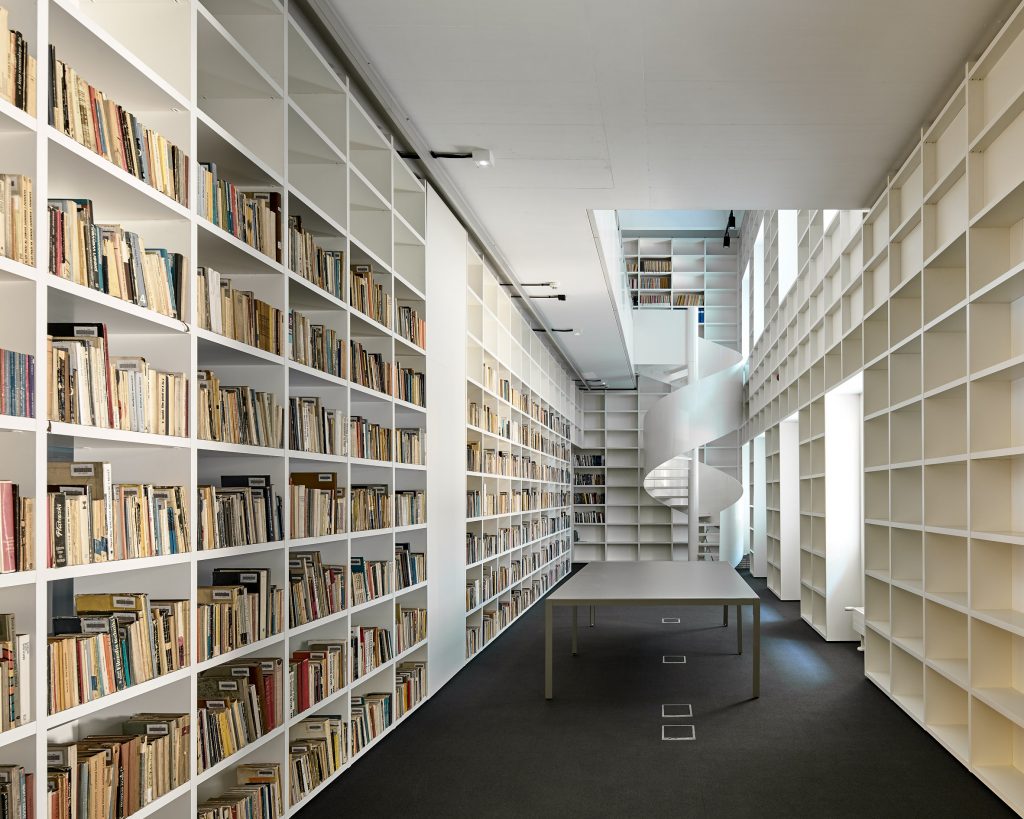
Department of Radio and Television Building at the University of Silesia, Poland by Grupa 5 Architekci, BAAS Arquitectura and Małeccy Biuro Projektowe (ph: Jakub Certowicz)
The solution provides privacy and shade to the interiors while still allowing daylight to enter through glazed surfaces behind the blockwork. Light penetrating through the grid of hollow ceramic bricks produces an ever-changing geometric pattern of light and shadow on the walls and floors of the rooms and neighbouring structures.
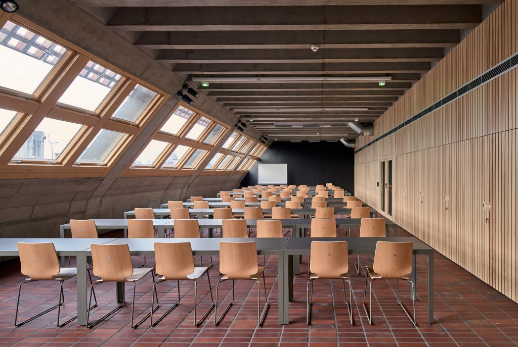
Department of Radio and Television Building at the University of Silesia, Poland by Grupa 5 Architekci, BAAS Arquitectura and Małeccy Biuro Projektowe (ph: Jakub Certowicz)
The use of the brickwork extends throughout the building, where it is applied to internal walls and floors. A brick-lined staircase ascends the full height of the building connecting all levels of the building and providing an impromptu meeting place for students. A large central courtyard is also finished with the reddish ceramic blocks, which helps the new structure to blend in with the historic buildings found on the street, which are visible around its edges.
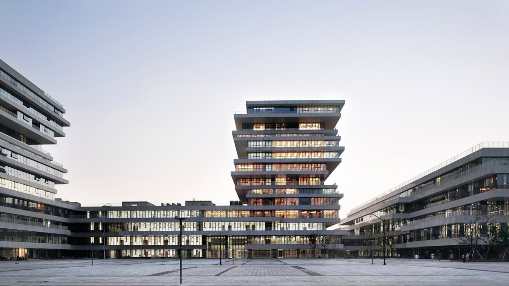
Hangzhou Normal University Campus Complex by WSP Architects
Chinese studio WSP Architects has developed a central administrative building for the Hangzhou Normal University, China, that caters for more than a dozen independent colleges the institution comprises. The complex incorporates archives, the institute of Hangzhou urbanisation, an adult education centre, library, teacher and student activity centre, hotel, international conference centre and theatre arranged around a central plaza.
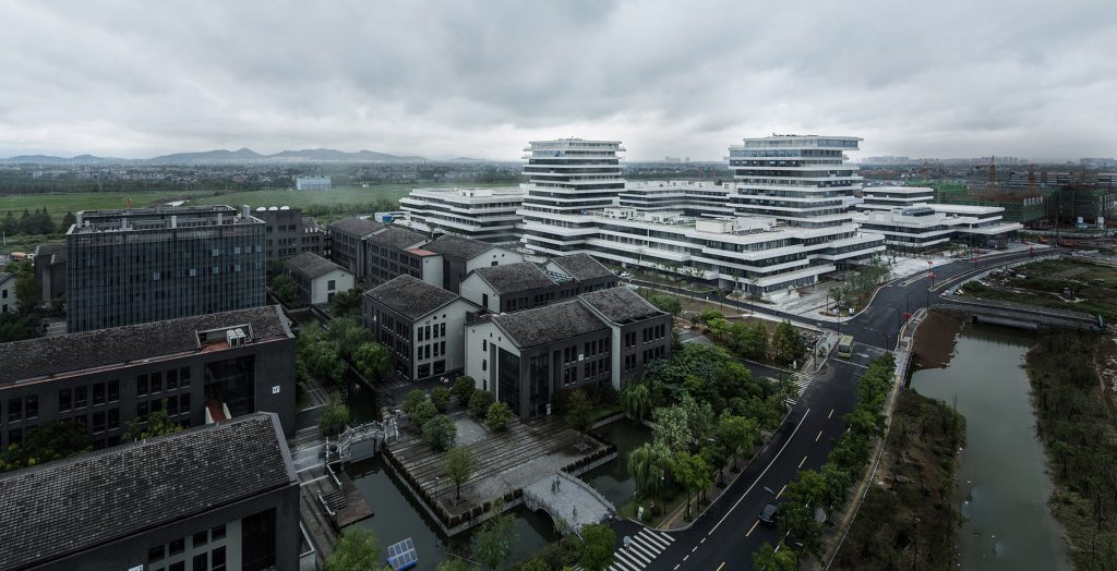
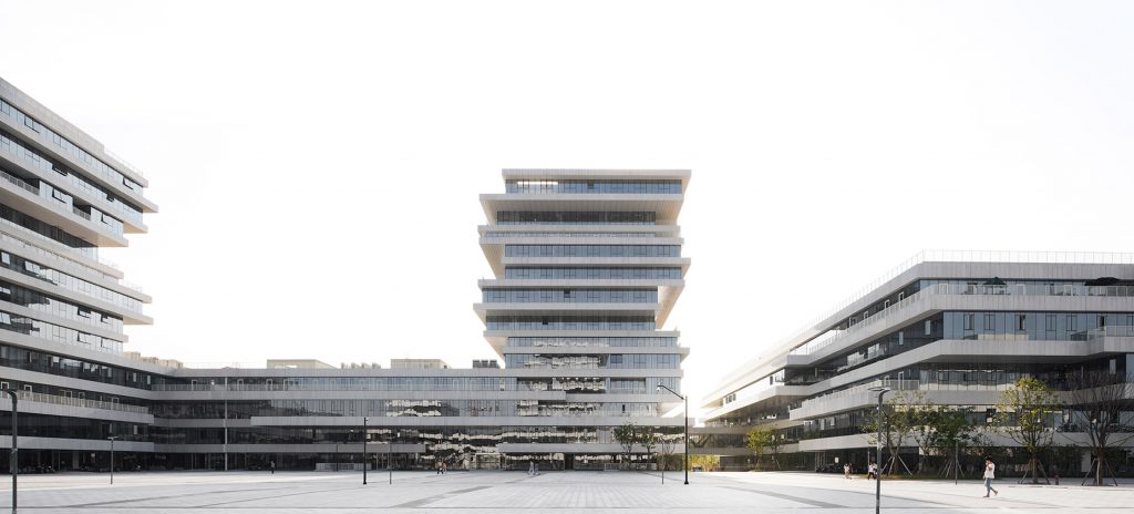
Hangzhou Normal University Campus Complex by WSP Architects
The architectural design is based on a strict modular system, which is used to control the plane, elevation and details of construction of this complicated functional complex. The building is thus divided into a cluster of smaller-scale blocks with irregular stacked floors that each contains a single dedicated function, but are also linked to each other and open to the surrounding colleges. The blocks are arranged around a series of courtyards, the largest of them forming a space for campus activities.
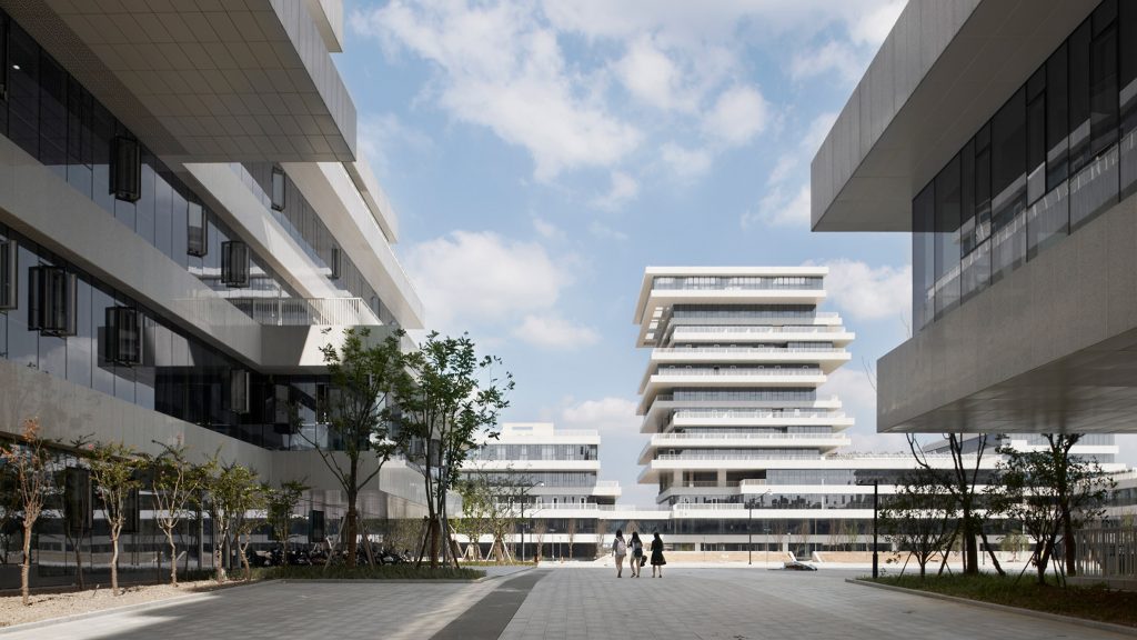
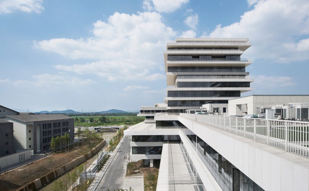
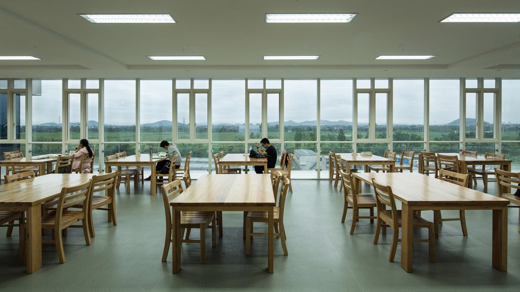
Hangzhou Normal University Campus Complex by WSP Architects
Externally, the structures are clad in alternating bands of stone and glass that create a visual contrast of weight and lightness. This, together with the modular construction, creates a unified aesthetic across the complex, with gentle changes in the building heights helping to distinguish the various programmatic areas.