Retail design was born in the middle of the 19th century, and has reached its heights in the 21st. Each brand seeks to be distinguished by not only its products, but the retail space it offers them at as well. The aim is to provide a bespoke, satisfying, comfortable and enjoyable shopping experience to customers.
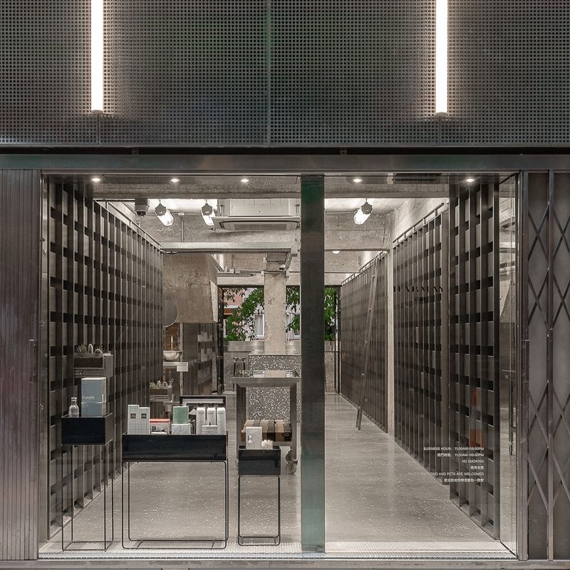
Developed by the Shanghai based design studio AIM, HARMAY’s new Hong Kong store is an innovative and bold retail space where an old-school apothecary meets a modern day boutique.
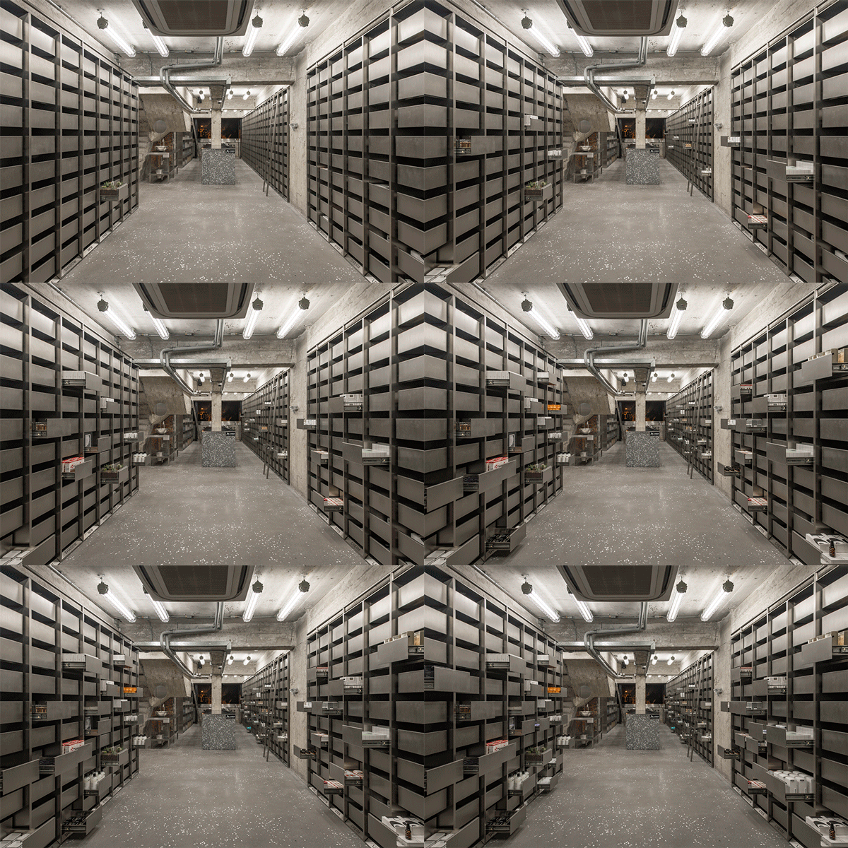
HARMAY HK by AIM
The perforated steel facade, LED lighting, a distinctly organized, almost austere interior is designed to entrap both a curious consumer and a casual passerby – they walk in expecting one thing and find something quite different. Being originally an online cosmetics retailer, HARMAY sought to offer its customers an experience, that would not at all be about shopping (as today’s shopping is largely scrolling and clicking), but about discovery.
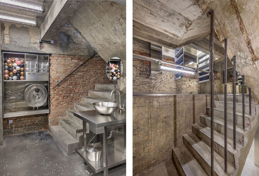
HARMAY HK by AIM
Stainless steel drawers line most of the walls, stainless steel mirrored cabinets with rubber insides are suspended from the ceiling with reflective surfaces hiding their existence – all this creates an intimacy with the products. The design places products straight into the hands of shoppers and immerses them in the tactile experience of traditional shopping in a non-conventional setting.
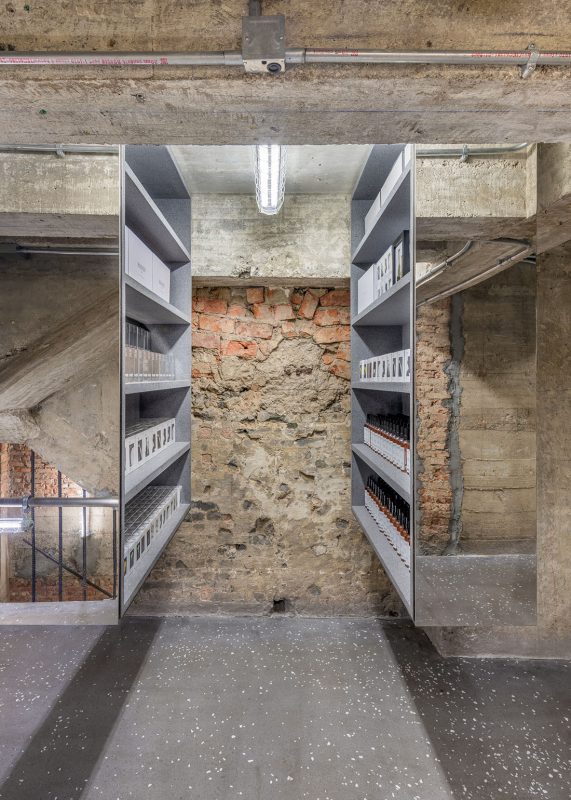
Suspended mirrored cabinets at HARMAY HK
London based Waldo Works studio was engaged by the famed Fabergé dealer Wartski to produce an interior makeover. The studio was tasked to draw elements from the brand’s classic design heritage and subtly combine it with avant-garde detailing. The outcome, hidden behind a wood-paneled façade of an Edwardian building, at first seems teasingly traditional, but inside there is a different and unexpected story.
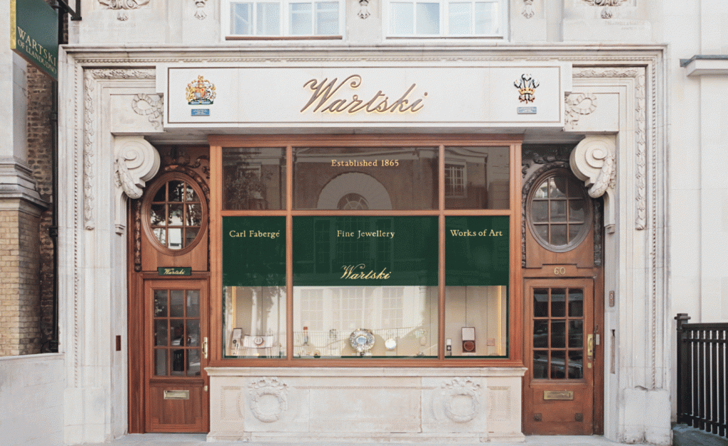
Wartski façade
The space’s beautifully finished concrete wall panels and a bespoke faceted cornice seamlessly merge into a classic coffered ceiling. The upper walls of ribbed concrete are flecked with chips of slate from quarries in North Wales to suggest Wartski’s origins. The shop’s expansive display cases slide open electronically. Woven wool carpeting in Welsh green is the finishing touch rounding up the whole concept.
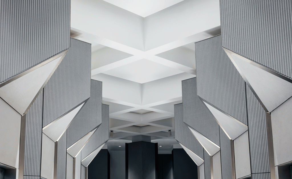
Wartski ceiling by Waldo Works studio
Shanghai based Kokaistudios designed the interiors of Assemble by Réel fashion store. The project looks to take the shoppers to “a journey through an eclectic, curated assortment of styles and lifestyles”.
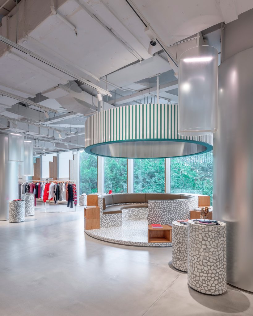
Assemble by Réel by Kokaistudios
The 1,037-square-metre store is created to carve up the open-plan space with structural interventions based on typical city sites: a gallery, church, public park, and skatepark.
On a functional level, this expansive space creates a thoughtfully constructed circulation, with the layout designed to take customers on a journey of discovery both literal and figurative.
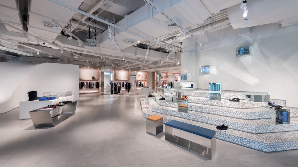
Assemble by Réel by Kokaistudios
By way of example, its skatepark-style area will present streetwear collections and intend to appear “palpably urban”, while a gallery-inspired area located towards the rear of the store displays lifestyle accessories such as books, candles, and potted plants on bright white hanging shelves or in perforated boxes.
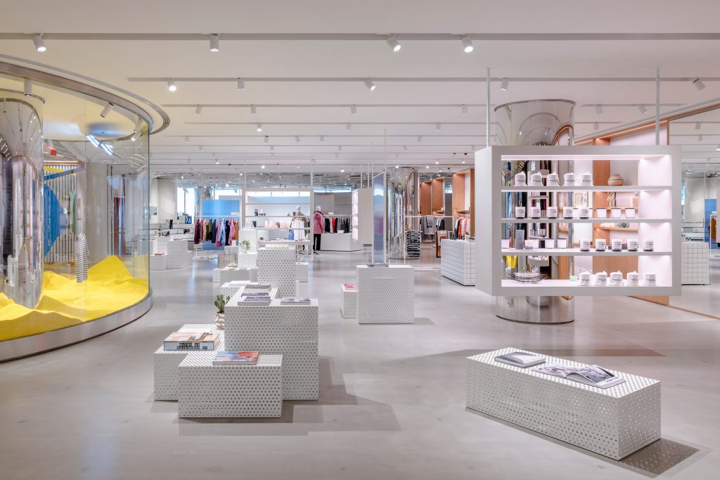
Assemble by Réel by Kokaistudios
An ultimate urban shopping experience.