Architects are fantastic at finding a use for awkward spaces — using them to full potential where others might only see narrow gaps. These projects are perfect examples of those skills.

Parasite by Za Bor Architects
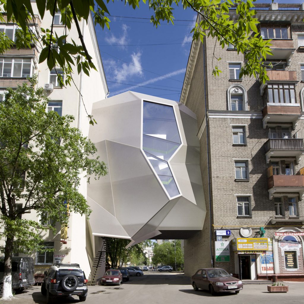
For instance, the Parasite office, a concept created by Za Bor Architects — an architectural workshop founded in Moscow in 2003 by architects Peter Zaytsev and Arseniy Borisenko. This design, conceived while the two were designing their own studio, uses free spaces between buildings forming original and economically viable offices which do not block the courtyard access. The project offers three-floors with an accessible roof area, divided with modular floor panels. The framework which shapes it is a single structural unit clamped between the blind facades of the houses. The polygonal main facade is made from light and durable cellular polycarbonate, while the facade turned to the courtyard is flat and completely glazed.

Archway Studios, Photo by Candice Lake
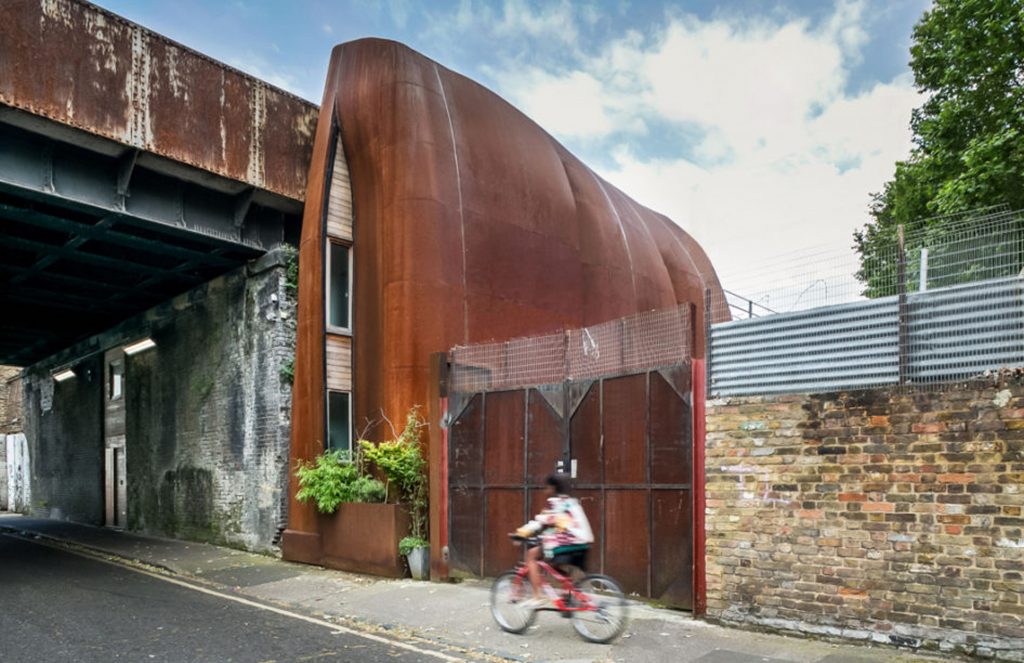
Archway Studios in London is a live-workspace built in and around a 19th-century railway viaduct, with a vaulted workshop linked to an atrium with residential alcoves — all designed by Undercurrent Architects. The design works with the contrast between the compressed, cavernous qualities of the arch – and the slender, ecclesial spaces of the atrium. It is built using a ring of slender steel foils that mold the narrow site, forming a protective acoustic shell ‘cupped around interior spaces’. Daylight is allowed into the deep recesses of the arch through slits in the segmented foils that also offer privacy.
The building’s unique design and appearance help it to stand out even when dwarfed by inner-city neighbours. As one of 10,000 arches that dissect neighborhoods across the UK capital, the architects say it is a model that can be adapted for broad community benefit.
The Multi-Generational Home sits on a narrow, urban infill site in the heart of ST Kilda, Melbourne in Australia. Its success is down to its large atrium that rises up through all the living spaces – allowing for natural light to fill the interior of the building.

1.8m Width House YUUA Architects
Matt Gibson Architects and DDB Design, have created a mixed-use residential and commercial building with a ground level that meets the council requirements of commercial zoning with its own dedicated entry and a six-car garage. The other floors offer a mix of living areas and bedrooms each with private ensuites and city or bayside views visible from every room with the entire development offering the flexibility of home, office, family or co-living use.
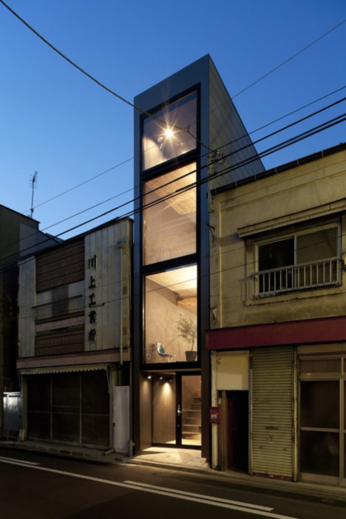
Japanese studio YUUA Architects designed this house to fit a 2.5-metre-wide space between two existing buildings. This four-storey residence uses split-level floors to create natural partitions between different spaces, reducing the need for walls inside the house, and making the small rooms feel more generous. The double-height living spaces and high-level windows allow in plenty of light penetrates the interior.