It’s often said that great architecture should complement its environment, so here are some wonderful examples of buildings that work with, rather than against, their locations. Which one is your favorite?
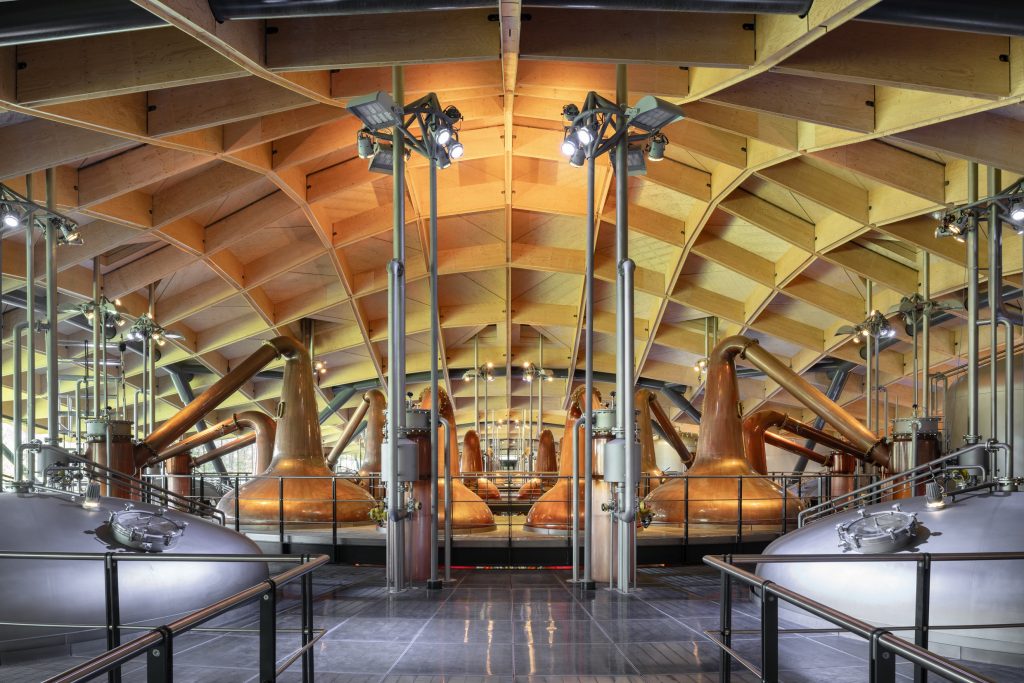
World-renowned architects Rogers Stirk Harbour + Partners earlier this year celebrated the completion of the Macallan Distillery and visitor experience in Speyside, Scotland, which is set into the landscape of the estate that has distilled the world’s leading single malt since 1824.
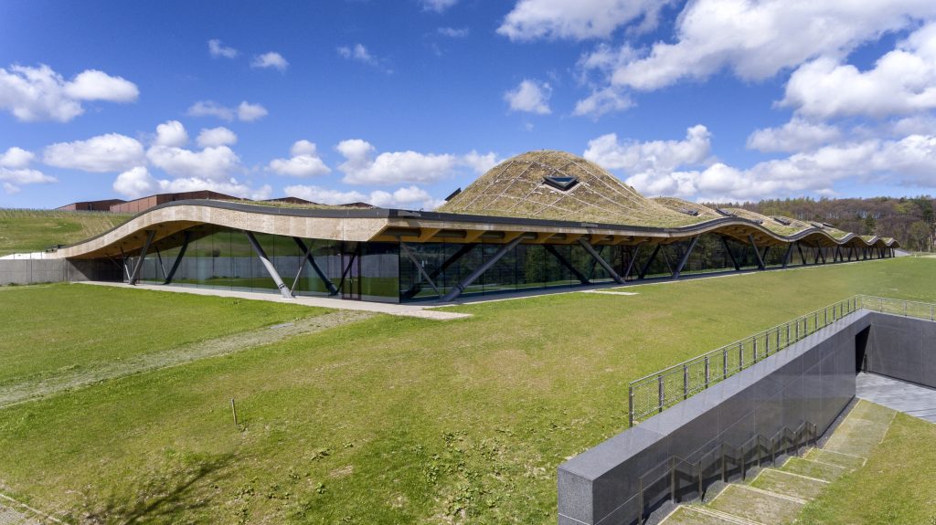
The Macallan is one of the most sought-after whiskies in the world and wanted to create a building that could reveal the production processes and welcome visitors while remaining sensitive to the beautiful surrounding countryside.
Set into the naturally sloping contours of the site, the design makes direct references to ancient Scottish earthworks while still capable of increasing production by a third when necessary. The new building comprises a series of “production cells” arranged in a linear format, with an open-plan layout revealing all stages of the production process at once.
The cells are reflected above the building in the form of a gently undulating timber roof topped with grass-covered peaks that rise and fall from the estate grounds.
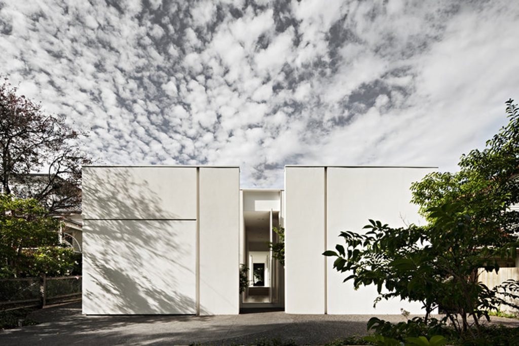
Melbourne-based architecture collective Studio Four placed a garden at the centre of an all–white family home in the city’s suburb of Glen Iris (above).
The clients – a professional couple with two young children – asked the architects to create a home to meet the needs of their busy lives, while also functioning as a calming sanctuary. The house’s architecture was kept deliberately understated to let the gardens take centre stage. “Our brief was to place as much significance on the landscape and outdoor spaces as to any of the internal living spaces,” explained the architects. “Our early workshops established that the landscape was to become not just the surrounds to the architecture but central to it. Capturing the northern light and achieving a high level of privacy was also paramount.”
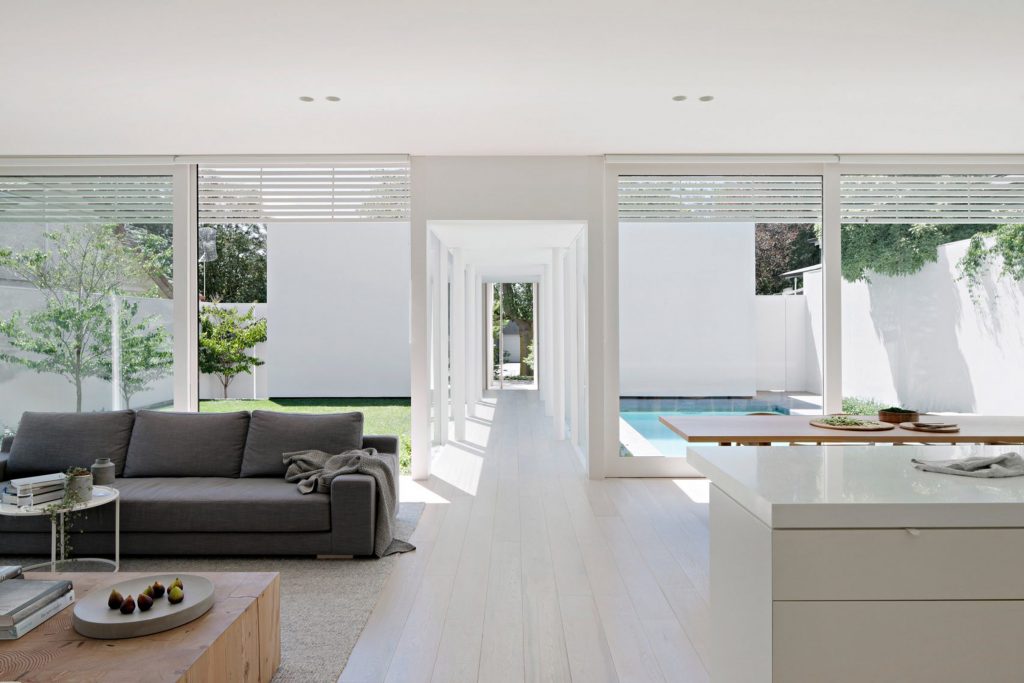
With the garden at its centre, the house’s form is split down the centre to allow northern light to enter without compromising the visual or acoustic privacy from the street.
The property’s blank front façade, which the architects liken to a canvas, captures the shadows and reflections of a large oak tree outside on the street. Inside, the garden must be passed through and experienced to reach the main areas of the house.
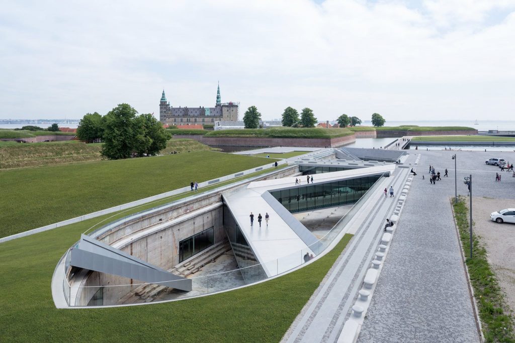
Experience a piece of iconic architecture built below ground around an old dry dock in front of Kronborg Castle at The Maritime Museum of Denmark (above).
This award–winning architecture is designed by the BIG – Bjarke Ingels Group on the site of what was once one of Denmark’s most significant and progressive modern shipyards.
From a distance the museum is almost invisible, but closer inspection reveals the abyss of an old concrete dry dock, traversed by glass and aluminium-clad bridges and stairs, arranged as a dramatic, multi-angular composition.
The museum’s galleries are arranged in a continuous loop around the old dock walls, the dock becomes the centrepiece of the exhibition, while the original dock space is left empty, so visitors can experience the size of the ship.
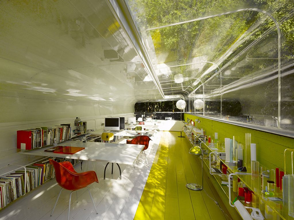
Selgas Cano office photo by Iwan Baan
Ever fancied working in a wooded ravine, surrounded by nature for inspiration? Well, this aerodynamic tube office, designed by Spanish architects Jose Selgas and Lucia Cano, allows workers to feel as though they’re working in the middle of a forest. The long glass tube sits in a little wooded area close to Madrid and has shutters over the clear roof are retractable. We love it!