Going to a dentist’s is probably not your idea of a pleasant pastime. Architects and designers aim to challenge this mindset as they create friendly dental offices in bright and welcoming hues with no place for anxiety or fear.
Go Orthodontistes Clinic in Quebec by Natasha Thorpe Design
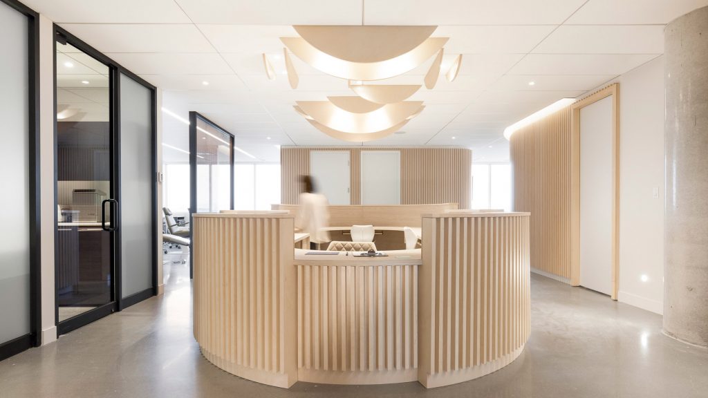
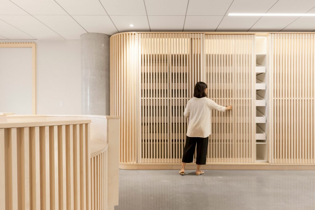
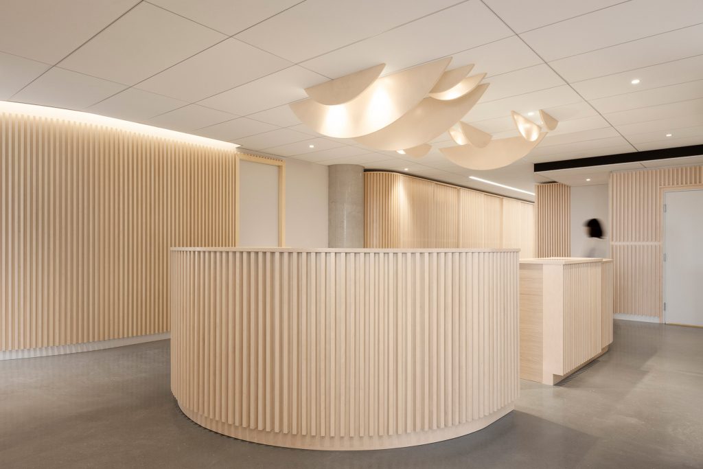
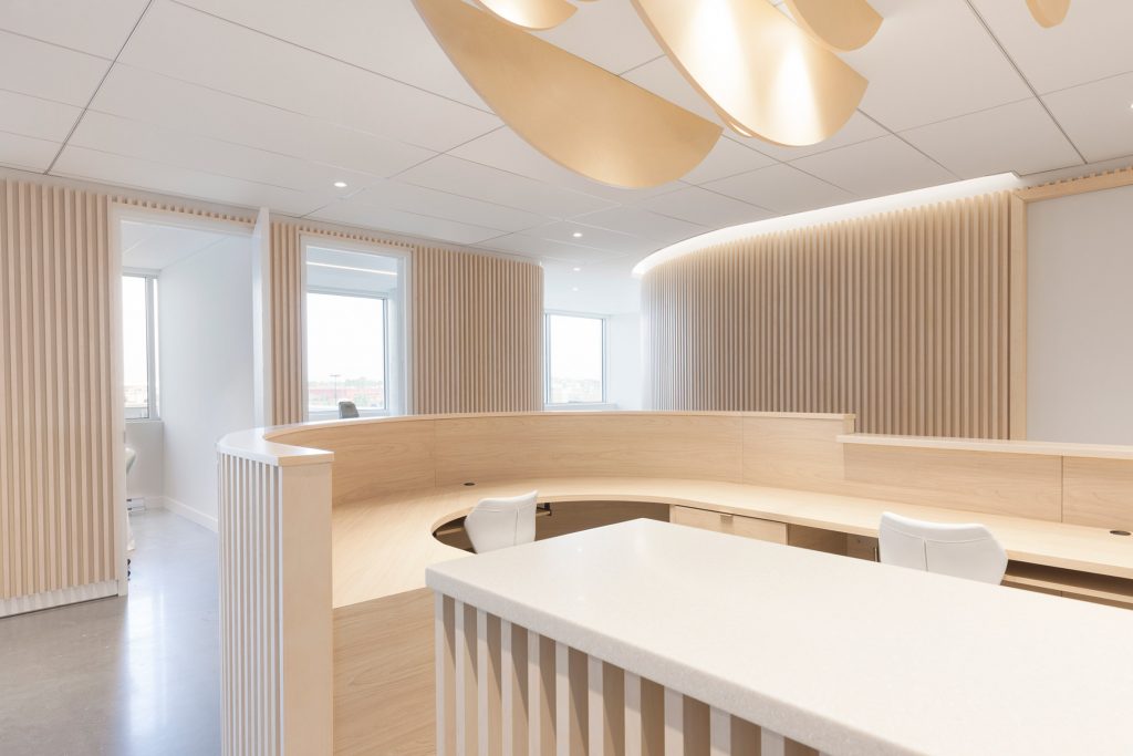
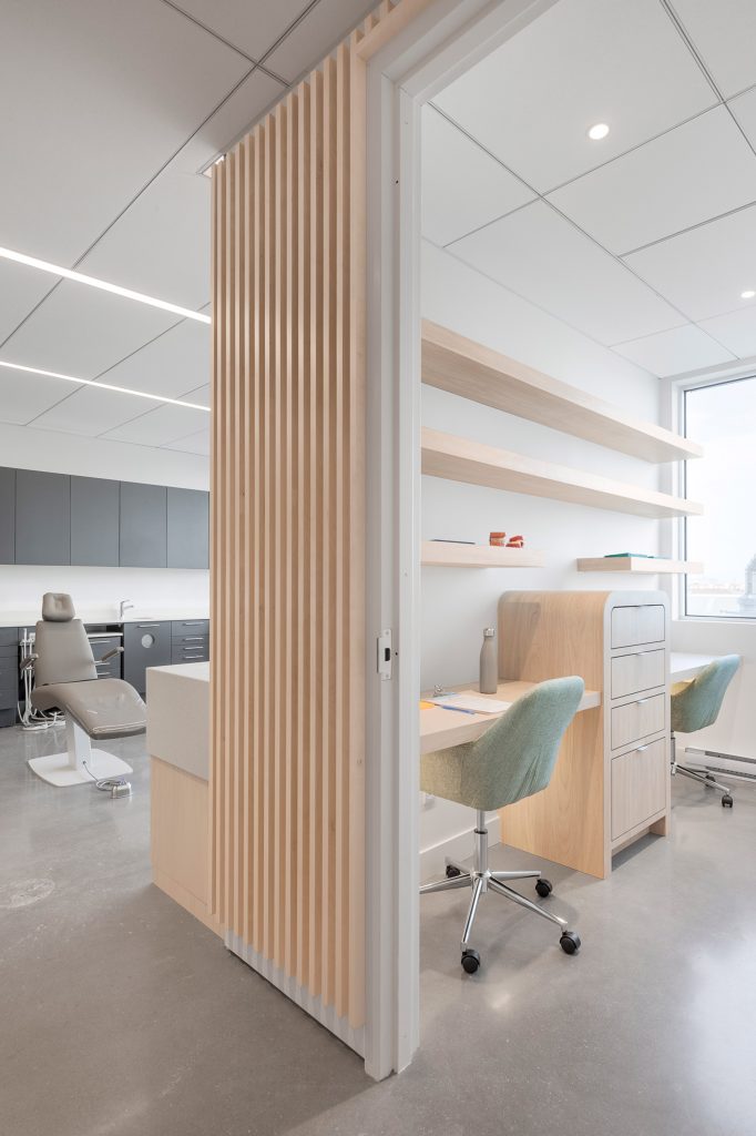
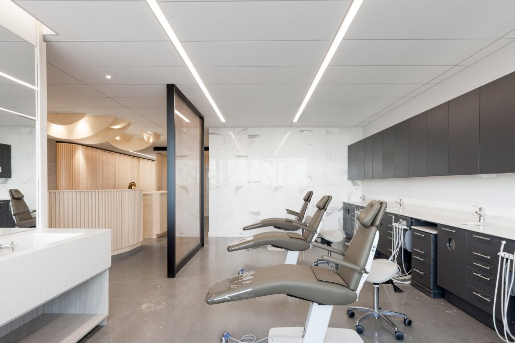
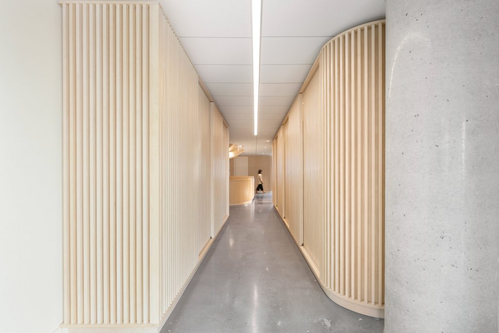
Aware of the feeling of anxiety that is often present in a dental clinic, Canadian designer Natasha Thorpe has used timber and ambient lighting to add a sense of comfort to the otherwise hygienic environment an orthodontist practice in Quebec. Aimed to make visitors feel more at ease, the space is lined with hundreds of slatted wood panels in a vertical arrangement that conceal storage units and service areas on both sides of a long corridor. The office is kept as open as possible to enhance visibility between patients and doctors.
Go Orthodontistes Clinic in Quebec by Natasha Thorpe Design
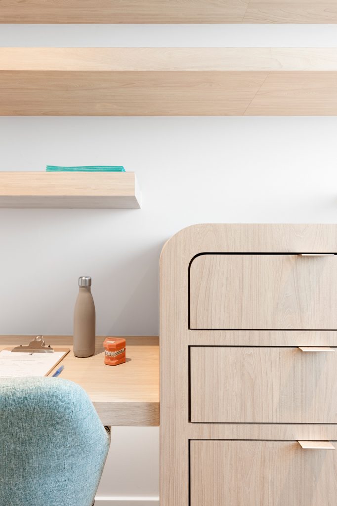
The designer has opted for Douglas fir as the primary material throughout the space, which together with a monothematic design is intended to enlarge the relatively small office, for the environment that might have otherwise felt claustrophobic.
Go Orthodontistes Clinic in Quebec by Natasha Thorpe Design
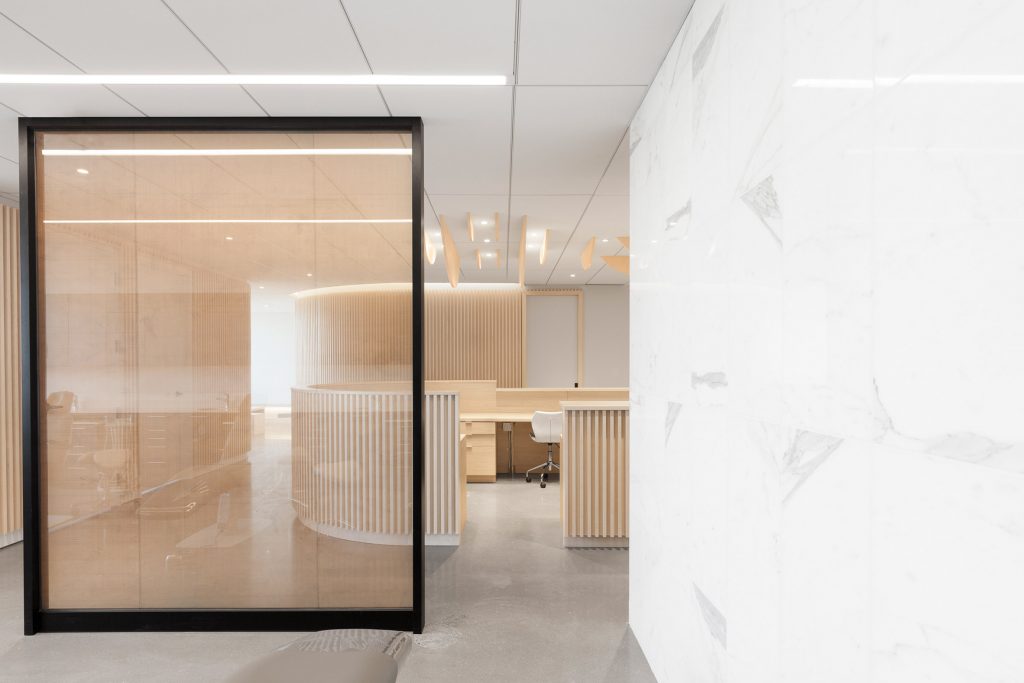
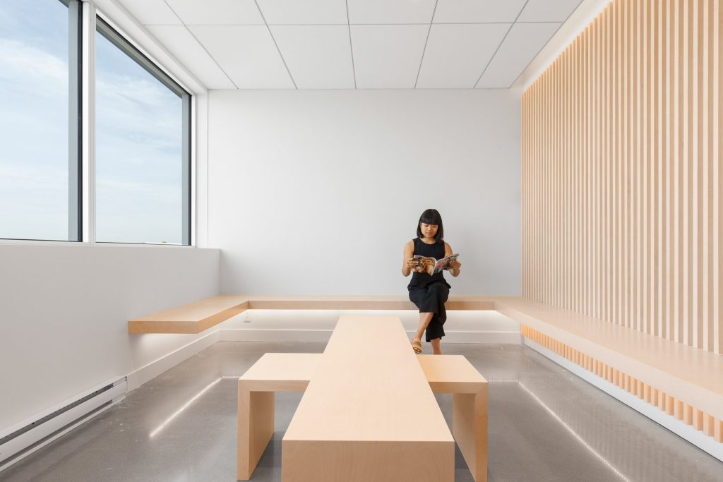
The treatment rooms are visible just beyond a circular reception desk, while the waiting room features large windows and wall-mounted benches with low backrests made from lightly stained Russian plywood to match surrounding timber designs. Matching low tables can be reconfigured, overlapped, and tucked away to create more space.
Go Orthodontistes Clinic in Quebec by Natasha Thorpe Design
All details are taken care of. LED under-lighting is meant to emphasise the geometry of the interiors and add depth. The palette of light natural tones creates a relaxing environment, while no seat is turned with its back to the entrance which reduces apprehension. To make X-ray chamber that is often mot associated with fearful experiences in orthodontist office less machine-like, Thorpe lined it in fir wood. Consultation rooms are fully enclosed, with dental chairs hidden behind a glass wall with a golden bronze mesh lining.
Dental clinic in Tianjin, China by RIGI Design
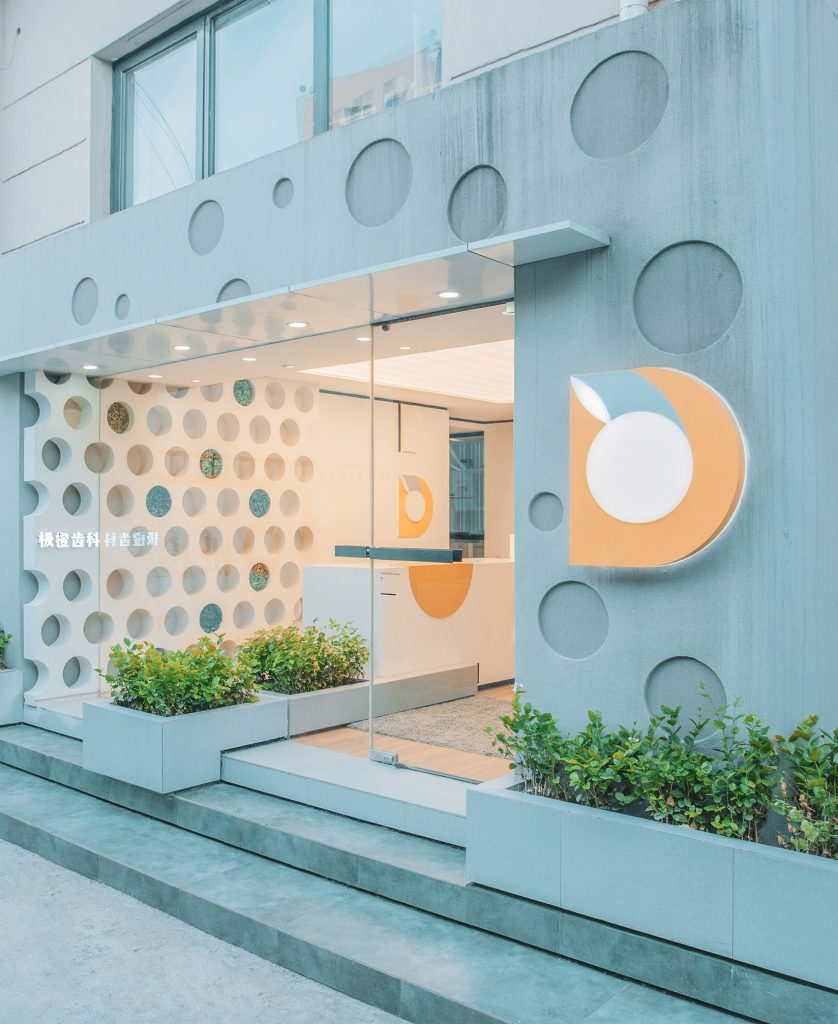
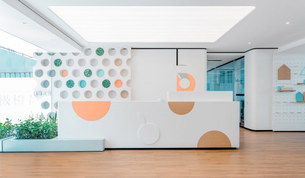
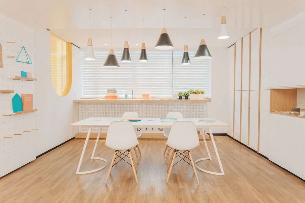
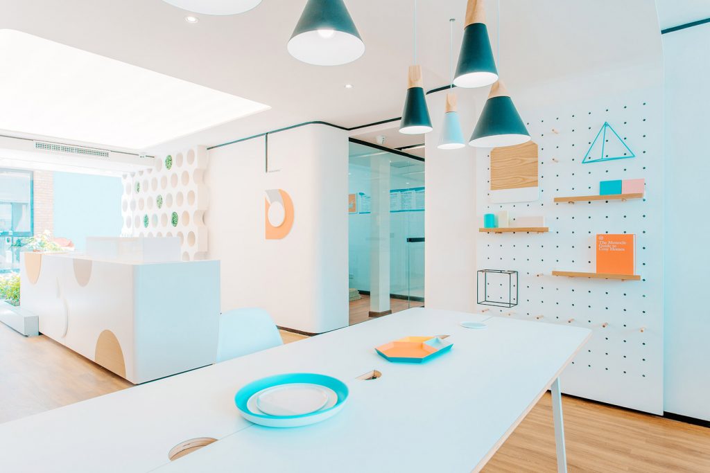
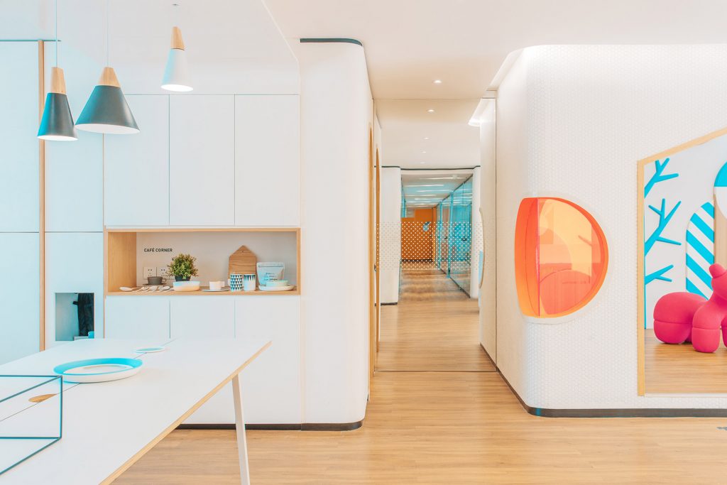
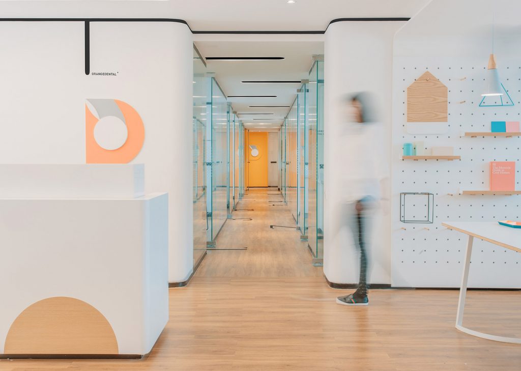
Similarly, intending to make visitors more relaxed in a dental clinic in the city of Tianjin, China, Shanghai-based practice RIGI Design has placed a dining table and play area for kids in the clinic’s waiting room. To make the interior warm and welcoming, the team has utilized informal furnishings, bright colours and low-key branding.
Dental clinic in Tianjin, China by RIGI Design
Waiting chairs in traditional hospitals are arranged in a parallel way, which enhances the unease of patients. To make the environment, the team has chosen to arrange the waiting area around a rectangular dining table instead, so that people could sit to face to face communicating with each other.
Dental clinic in Tianjin, China by RIGI Design
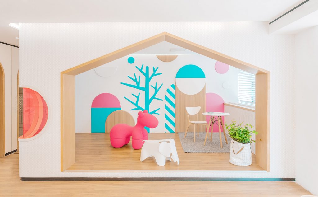
Another design feature intended to make visitors feel at ease is a children’s play area with animal-shaped furniture and a chalkboard wall. Both the play area and the table are placed right next to the reception desk. Treatment rooms are located along the corridor and numbered by oversized digits painted on the floor, so patients can easily find where they are going.
Dental clinic in Tianjin, China by RIGI Design
Pastel orange, bright blue and mottled green recur throughout the space, which is otherwise dominated by white and warm wood surfaces and furnishings.
The Urban Dentist clinic by Studio Karhard (also header image)
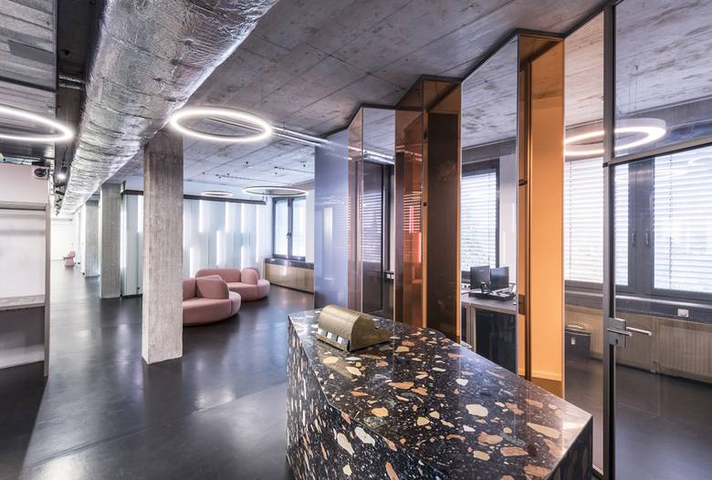
An original approach to creating an atmosphere where patients could feel relaxed and fearless has been chosen by Berlin Studio Karhard. The designers of the renowned electronica nightclub Berghain that occupies a former power plant were commissioned by the local Urban Dentist clinic to make the dental office to look more like a cool concept store or a trendy bar.
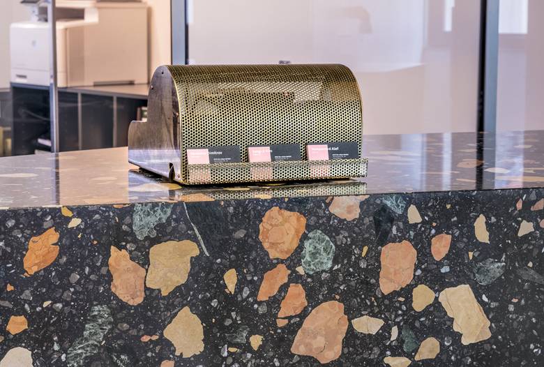
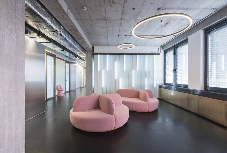
The Urban Dentist clinic by Studio Karhard
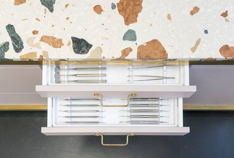
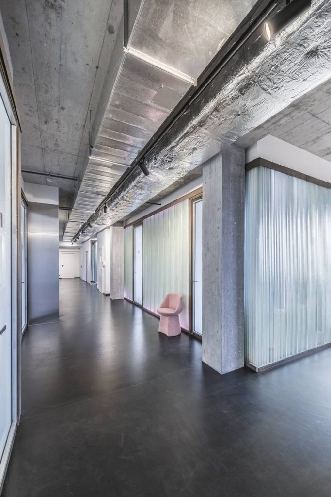
The team tried to avoid typical dentist colours like white and glossy surfaces and opted for their familiar ‘cool bar’ aesthetic instead. The design includes LED strip lights that can be programmed to change colour, mirrored partitions, and colourful stone surfaces with oversized aggregate.
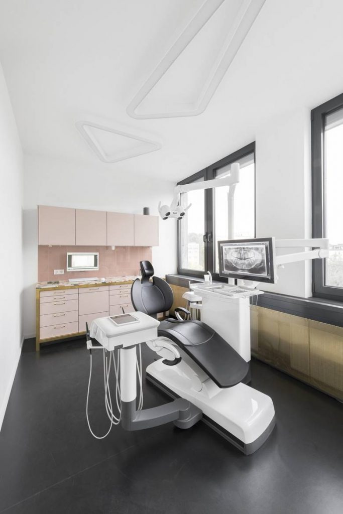
The Urban Dentist clinic by Studio Karhard
Extra ring-shaped lights are suspended from the ceiling, hanging above a pair of circular pink seating pods. Panels of fluted glass walls in the corridor are also bordered with strip lights. Even radiators are hidden from the eyes by shiny sheets of perforated gold-hued metal.