Summer moves on and we are going to miss the hot days spent with a scoop of the world’s most famous frozen treat. We have selected several design-minded ice cream shops that tempt by passers in and look good on Instagram.
Little Sky Gelateria by Ewert Leaf
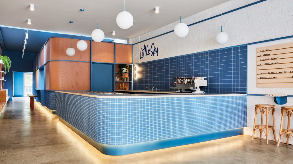
Little Sky Gelateria in Melbourne designed by local studio Ewert Leaf enables its customers to get a glimpse of gelato being made. Showcasing the art of gelato production was an integral part of the design brief, inspired from the clients’ studies in Northern Italy and their desire to share this tradition.
Little Sky Gelateria by Ewert Leaf
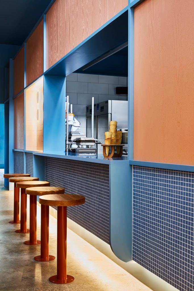
Located within a late 19th-century building, the 140-square-metre the ice-cream shop is a fanciful retail space in shades of blue and pink. To encourage customer engagement the “theatre of gelato” is captured via a large open window that punctuates the kitchen joinery wall. Directly in front is a row of stools where customers can watch staff preparing gelato through a service hatch.
Little Sky Gelateria by Ewert Leaf
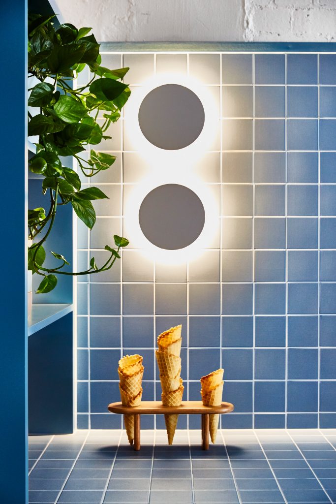
Raw, textured finishes of the original concrete floor and brickwork are contrasted to the curved glossy surfaces of the gelato counter and kitchen bar. The new insertion is visually connected to the restored parts of the building with blue horizontal strapping profiles tracing the interior. The profiles are echoed by the bold blue color of the tiles forming the base of the counter.
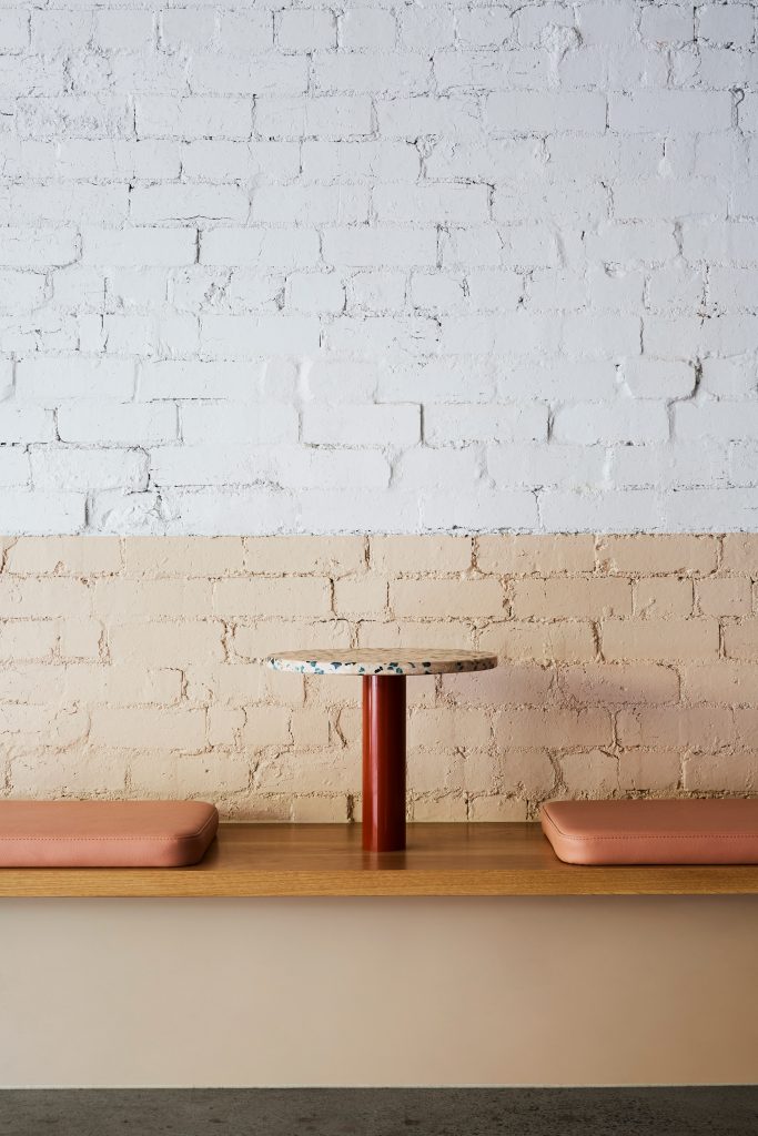
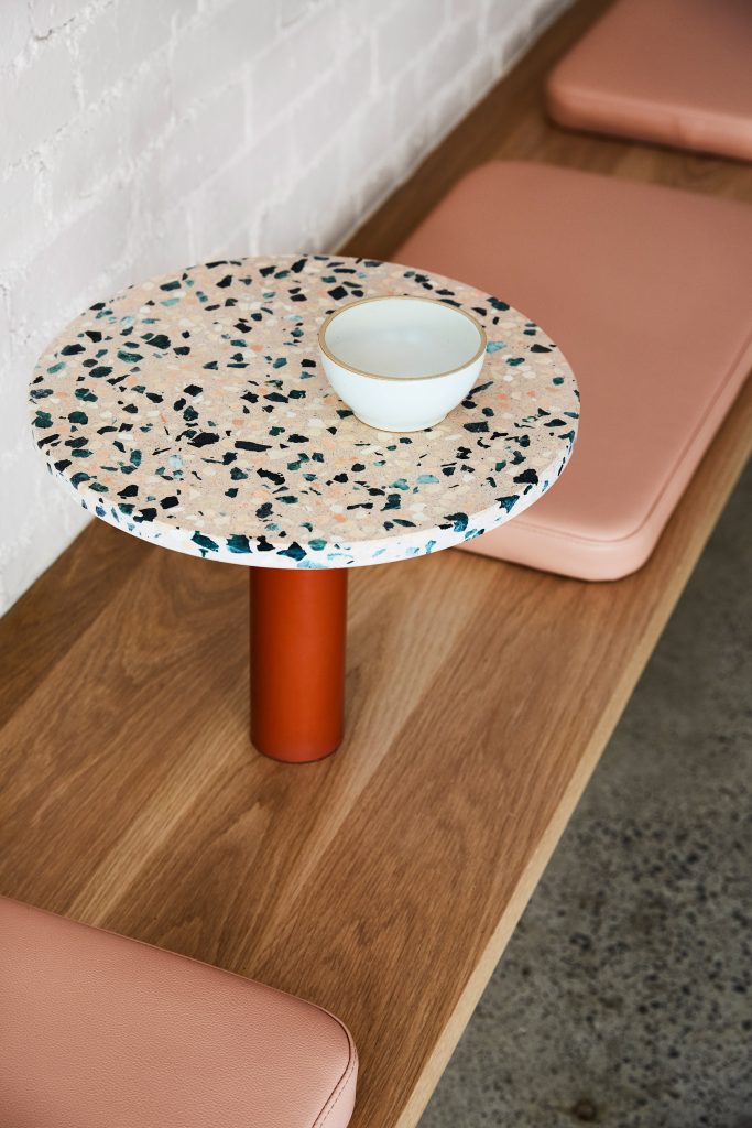
Topped with pink seat cushions and pink terrazzo tabletops on cherry red bases, a communal bench of solid oak extends the length of the interior encouraging customers to sit alongside each together and strike up conversations.
Little Sky Gelateria by Ewert Leaf
Attention to detail was achieved through the engagement of local artisans for all elements in the space, from the furniture and joinery to ceramics bowls used to serve gelato and timber waffle-cone stands hand-crafted from off-cuts of the timber bench. Implementing sustainable initiatives was equally important for the designers, which extended to take-away cups made from recycled paper and salvaged crystal glassware.
Milk Train store by FormRoom
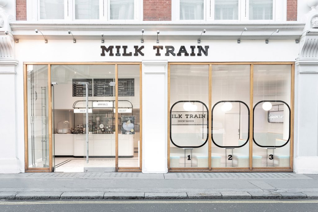
Milk Train ice cream store located in central London commissioned local studio FormRoom to design and produce an immersive space that would attract their diverse Instagram demographic who have propelled the brand to instant online fame. The brand has become popular for its wacky ice cream offerings, and until has exclusively traded out of pop-up food venues. It is the first retail space of the brand that is supposed to provide the core brand design blueprint, by which all future sites will evolve from.
Milk Train store by FormRoom
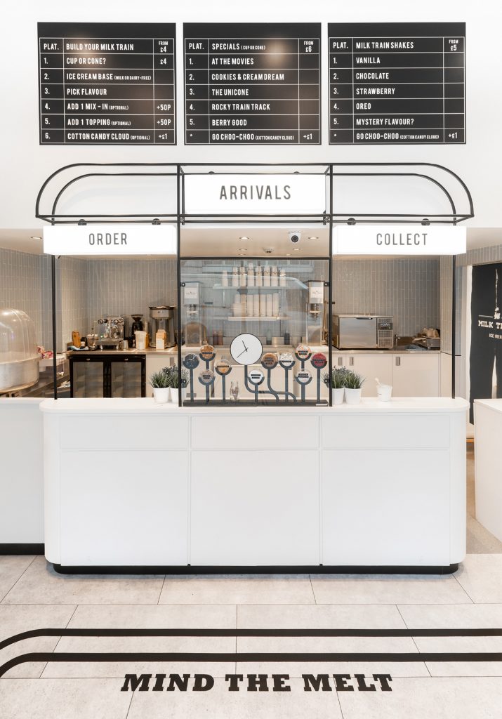
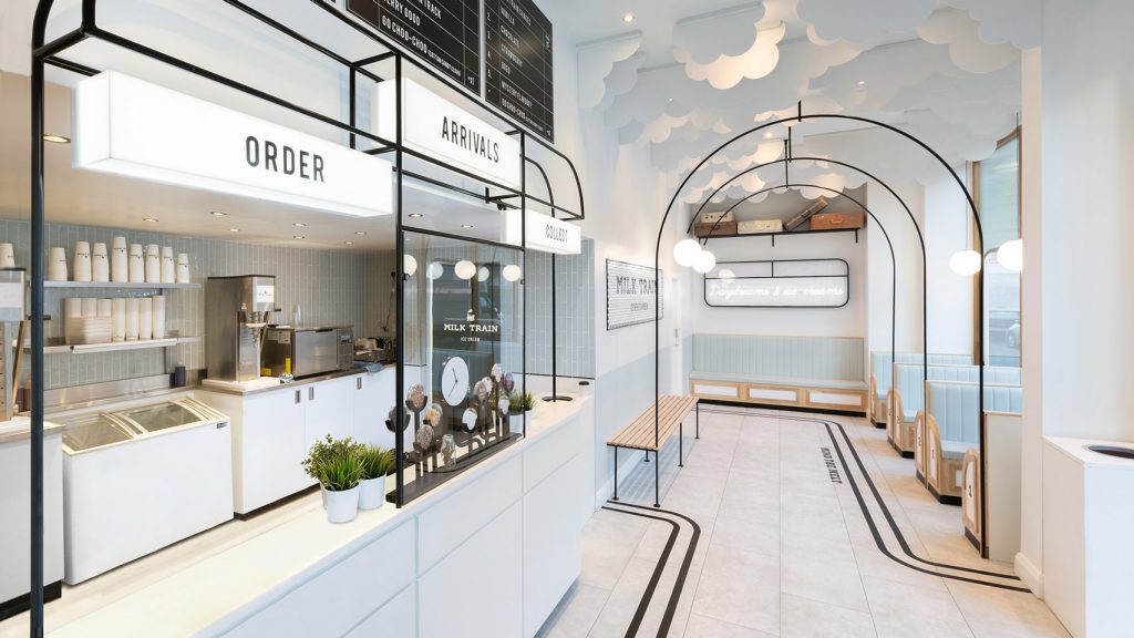
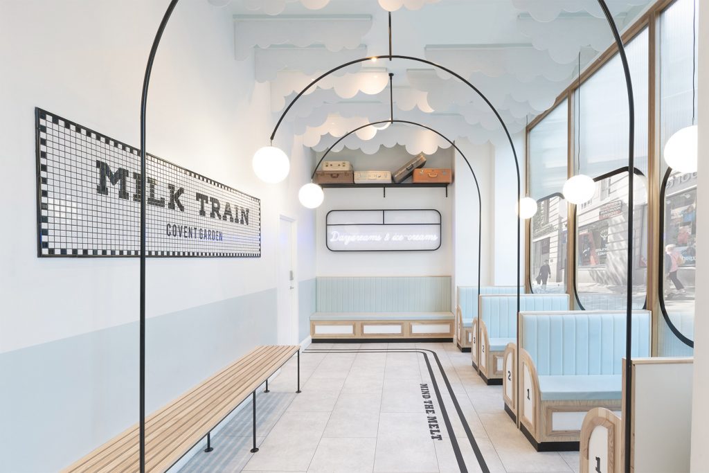
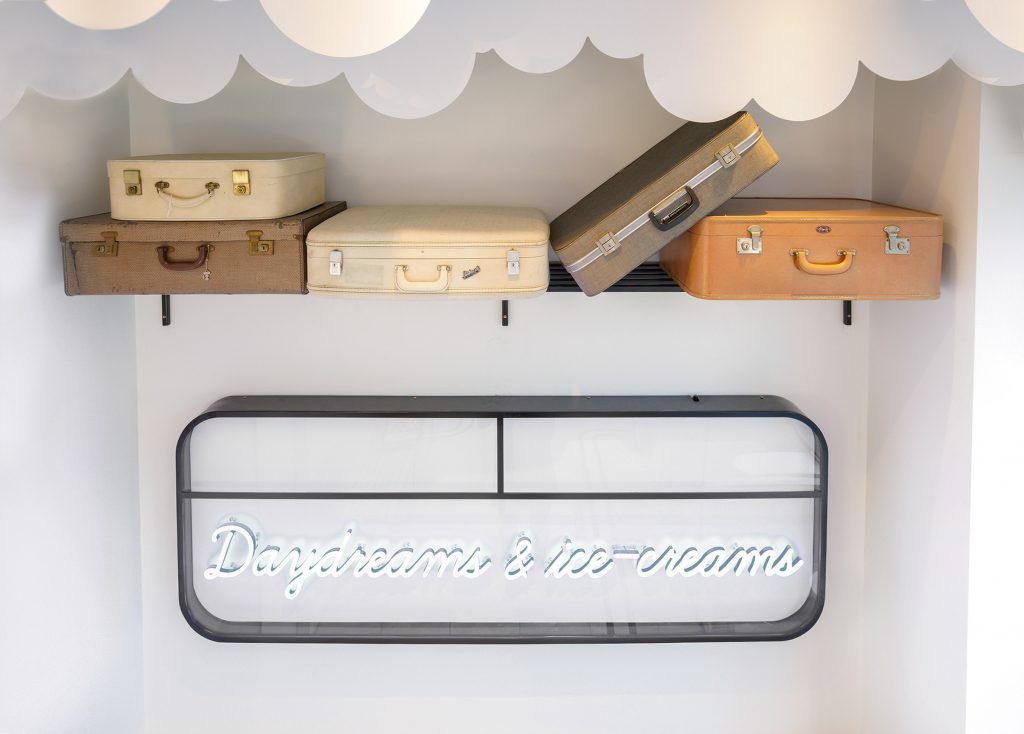
FormRoom created a unique, dream-like landscape with cloud-like ceilings and neon signage. The designers have played on the brand name. They chose to stick to the aesthetics of the Art Deco movement popularized amongst traditional train stations and platform iconography with its predominately monochromatic palette.
Milk Train store by FormRoom
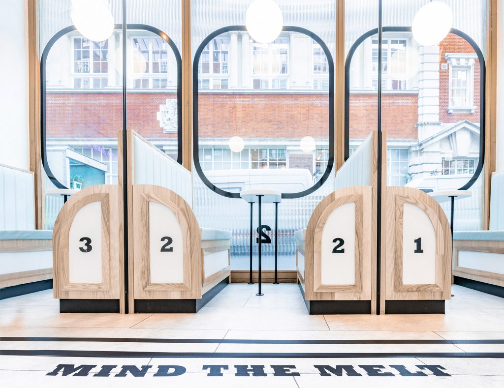
The menu is printed on blackboards in white block lettering, intended to look like typical split-flap display boards that show train departure times at a station, while seating booths are numbered like train platforms.
Milk Train store by FormRoom
The interchangeable design elements allow the brand interior to evolve as swiftly as Instagram trends do. Among Instagram-friendly features is, for example, pale blue leather upholstery paying homage to the pastel colour palette of the popular Instagram account Accidentally Wes Anderson, and ‘Mind the Melt’ phrase printed on the floor, which the studio hopes will encourage customers to engage with the app’s well-used hashtag #IHaveThisThingWithFloors. The phrase is in itself a nod to London’s common cautionary phrase Mind the Gap.
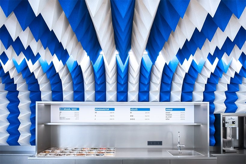
Perlan Ice Cream parlor by Atelier Tobia Zambotti (also header image)
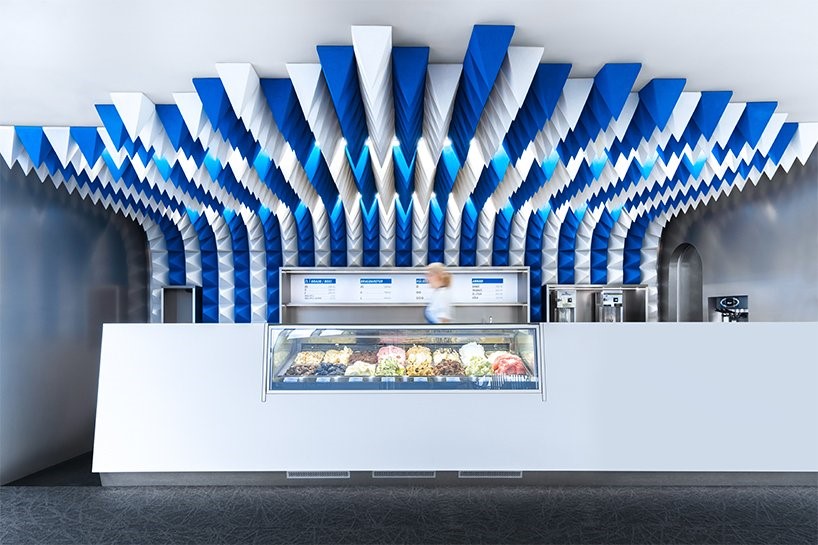
Another Instagrammable ice cream shop is the new Ice Cream parlor within the Perlan Museum of Reykjavík designed by local Atelier Tobia Zambotti. The brief called for one simple and economic gesture creating a space which is enveloping and ever changing while defining a clear and recognisable identity.
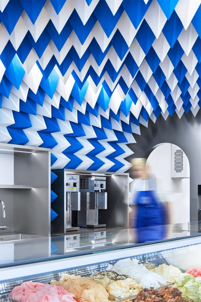
Perlan Ice Cream parlor by Atelier Tobia Zambotti
The design’s focal point is an eye-catching kaleidoscopic celilinh installation made of acoustic foam. The repetitive design of the geometric stalactite-like structure, inspired by the glacier caves and ever-changing reflections within them, creates an optical illusion which pulls the visitor towards the focal point – the ice cream trays, which is the only characteristic that breaks from the stark white and blue palette.
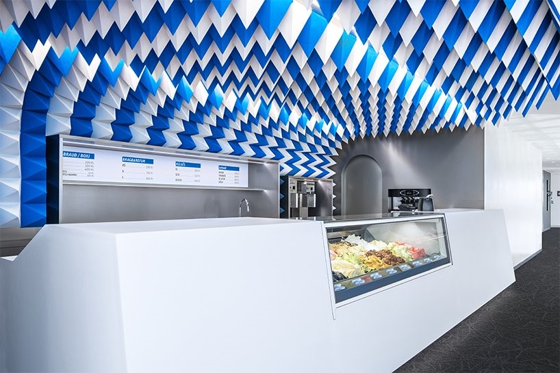
Perlan Ice Cream parlor by Atelier Tobia Zambotti
This simple spatial solution is conceived to communicate with its users while defining a clear and iconic design feature, which is reinforced by the stainless steel back-counter which reflects led strips tuned to a cool 4500K light.
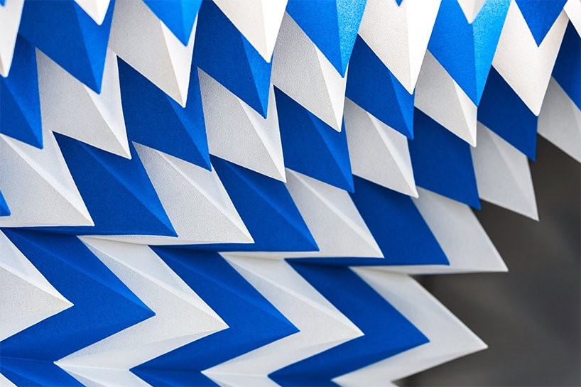
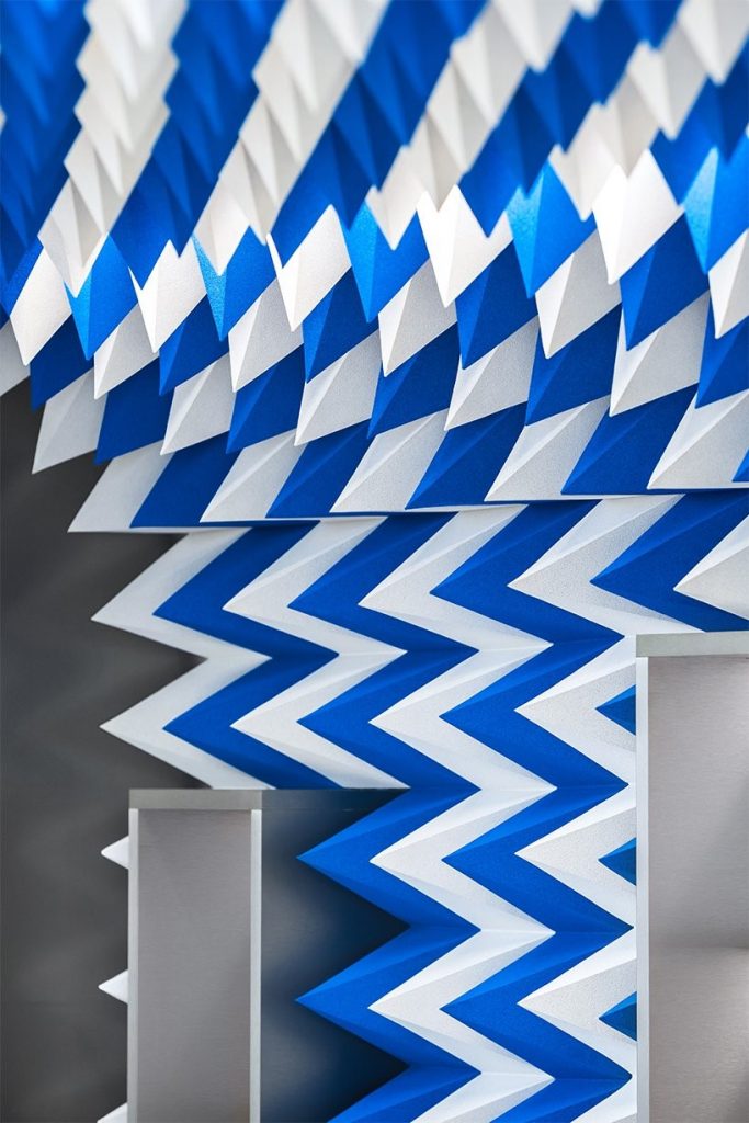
Perlan Ice Cream parlor by Atelier Tobia Zambotti
In a single sweep – pun intended – the ceiling installation defines the atmosphere of the space and guides the design of all other elements. Another element of the reimagined glacier is the white Corian counter, while the technical requirements of the project are also resolved following the same character. Cashier and all other clutter are hidden from view within the counter and the noise of the fridges is attenuated by the foam prisms of the ceiling.