Have you noticed that looking at a certain colour often alters your behavior and feelings? Environmental-behaviour research studies have brought us a new concept of changing the emotional reality around us through colour, which naturally get represented in design and architecture. The colour becomes a language, a visual cue, sending a certain message to people passing by.
Colour intervention may serve a means to transform the infrastructure of the city and draw attention to its certain areas, for aesthetical purposes as well as for practical ones. And more than that — it is a simple and uncostly way to get your idea through to the minds of people. Check out these outstanding examples of colour intervention created by both artists and architects.

Colourful Crossings has become an annual commission bringing colour and animation to Southwark Street, as a part of London Design Festival. This pedestrian crossing was created by Camille Walala in 2016.

Another pedestrian crossing from the project, created by Thierry Noir (via londonist)

An installation by the multidisciplinary team (fos) at the vegan restaurant at Lope de Vega street in Madrid. It has been illuminated for 4 days and nights by more than 250lm of yellow duct tape, painted décor items, pineapples and… a lamp (via cargocollective)
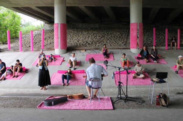
An underpass of Ottawa’s Queensway transformed into music lounge for ‘Set the Stage’ project.
Details at: beopensocial.com